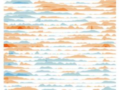
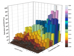
In this post, I will look through the many types of Area Graphs that exist, that I haven’t touched on in the past.
I’ve just completed the Russian translation of the website: Каталог Визуализации Данных, which is the 3rd language I’ve added (Chinese and Spanish being the other two).
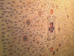
Back in early summer of 2016, I made a couple of discoveries in my travels around Estonia. I’m a keen beer drinker (as well other […]
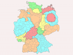
Instead of displaying data over geographical regions, Cartograms communicate data values by manipulating the forms of those geographical regions.
Previously, there were a lot of mistakes on both the website and the ebook, but I’ve had some time lately to proofread them.
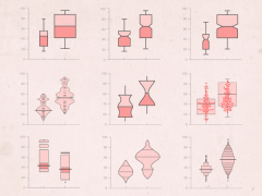
While I’ve already covered Box Plots, there are a series of Box Plot variations that can display the distribution of data over two, three or even more dimensions.
A data visualization course for those already experienced in using Illustrator and want to master the Graph Tools on the application. Read more here.
If you’re a data visualization practitioner that has no idea how to use Adobe Illustrator, but want to learn how to use this application, then read this.
Last autumn, Jon Schwabish and myself launched a pack of flash cards based off the Graphic Continuum project that we collaborated on.
Originally introduced and popularised by the American mathematician John Wilder Tukey, a Box Plot (also known as a Box and Whisker Plot) is a type […]
As I advertised a few months ago, I would provide a talk at the design conference Designers Fiesta on the subject of expanding ones data […]
The next language I’ve had the website translated into is Spanish. So please check out El Catálogo de Visualización de Datos and share it amongst […]
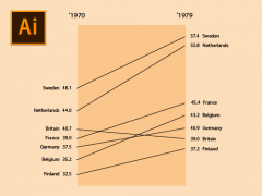
A Slopegraph is great for comparing the ‘before and after’ changes in quantities between two time periods. In this tutorial, I will show you how […]
I’ve now had the website translated into Chinese (Mandarin Simplified), so that my work can be made available to the Chinese speaking world. Check it […]
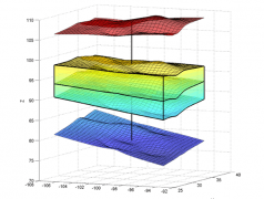
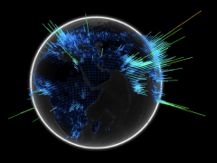
In the last two posts (#1 and #2), I specifically looked a range of 3D charts, but didn’t included any 3D maps to display geographical […]
On September 15th 2017 I will be delivering a seminar titled Expanding Your Data Visualisation Vocabulary with the goal of providing attendees a more versatile […]
Just for a bit of fun, I posted a survey asking my Twitter subscribers what were their five favourite charts (in no particular order). What’s […]
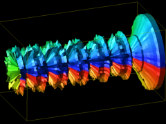
In Further Exploration #1, I looked at charts that visualise data in 3D. In this post, I will continue to showcase and catalogue the different […]
I’ve recently created a new YouTube channel dedicated to displaying all the chart reference pages in a video format. I’ve never really used YouTube as […]
While it appears that I’ve covered a huge number amount charts on the main page, there is still an abundance of different charts out there that I have […]
You’ll be surprised what you find on the Web. A number of let’s say, enthusiastic people have permanently imprinted into themselves tattoos in the form […]
