While it appears that I’ve covered a huge number amount charts on the main page, there is still an abundance of different charts out there that I have yet to research into and display. I already know of a multitude of additional chart types, but time and life itself has restrained me from studying into them in depth.
Still, I would like to lightly touch on each chart I’ve discovered, just to show there’s more out there.
In this post, I have grouped together charts that are all 3D. While many of these charts are flawed visually and some are particularly atrocious, my goal here isn’t to show what’s good, but to simply showcase what’s out there.
3D Bar Chart
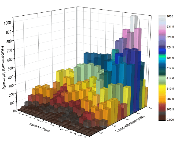
This chart works in the same way as a Bar Chart but with the bars drawn in 3D. While a 3D Bar Chart offers the option for an additional axis, it lack the comparability factor that the 2D version has. Also the smaller bars tend to get lost behind taller ones.
3D Pie Chart
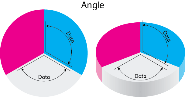
Image credit: Drew Skau
Many software packages offer the ability to generate 3D Pie Charts, so its appearance is common. But beware, it’s also notoriously bad.
Extruding the depth and rotating a Pie Chart causes the area of the pie segments to become distorted. Some segments will appear bigger, while others will appear smaller. Because of this, you need to avoid this chart like the plague.
3D Line Graph
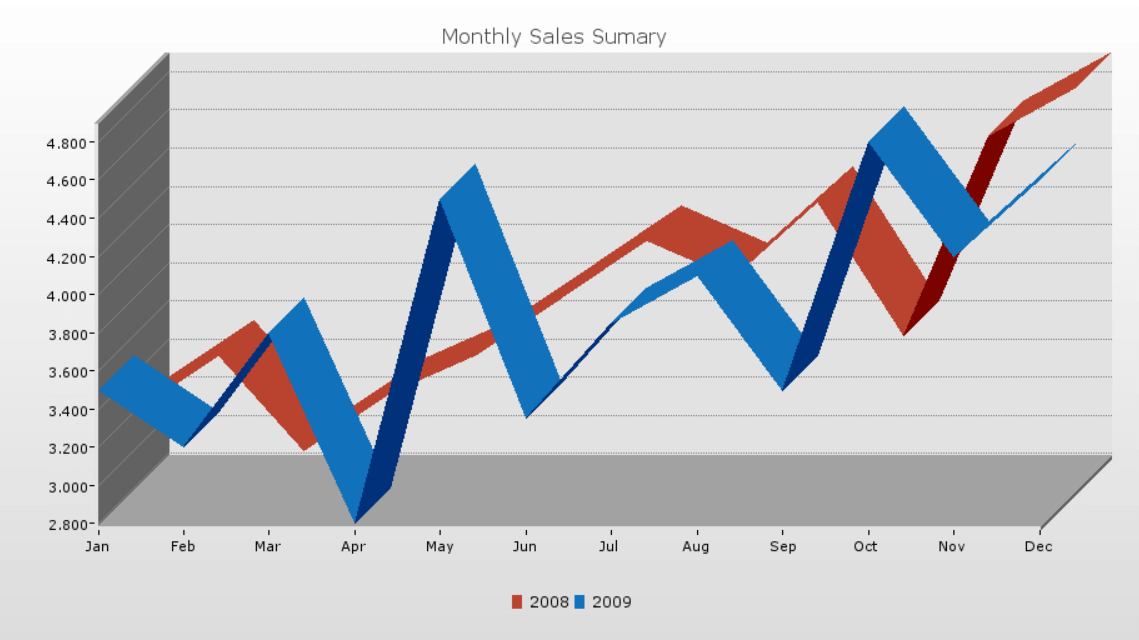
Rendering a Line Graph in 3D and presenting as a flat image looks like a monstrous creation. I can’t see this working at all. The only exception I can think of, is to have the visualisation as an interactive 3D piece, where you visualise movements tracked in 3D space.
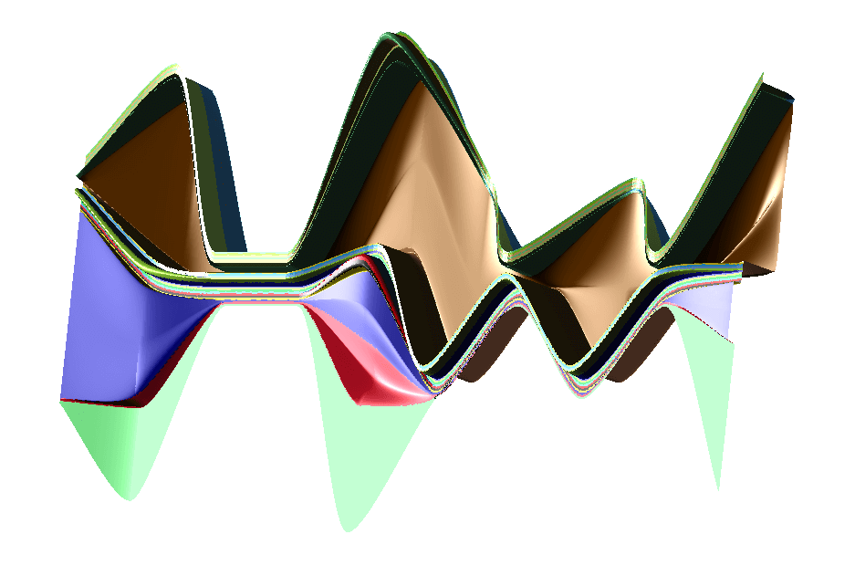
3D Area Graph
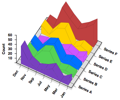
Plotting an Area Graph in 3D allows you to display multiple data series alongside side each other. However, reading any of the values is a difficult task and like with 3D Bar Charts, the larger shapes tends to obscure the smaller ones behind them. Transparency can help remedy this problem, but only to a certain amount.
3D Themeriver / Streamgraph
Even Stream Graphs have their own 3D manifestation, which was created by Peter Imrich in his paper Interactive Poster: 3D ThemeRiver. In this chart, the x-axis still represents time, the y-axis is used for a variable and z-axis is used to display an additional variable.
Further reading:
– 2D’s Company, 3D’s a Crowd
– Making 3D Kosher: Physical Visualizations

