 Page top
 Previous
 Homepage
 Next
Next
Line Graph
Description
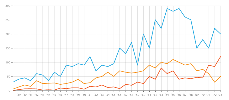
This chart is used to display quantitative values over a continuous interval or time period. A Line Graph is most frequently used to show trends and analyse how the data has changed over time.
Line Graphs are drawn by first plotting data points on a Cartesian coordinate grid, and then connecting a line between all of these points. Typically, the y-axis has a quantitative value, while the x-axis is a timescale or a sequence of intervals. Negative values can be displayed below the x-axis.
The direction of the lines on the graph works as a nice metaphor for the data: an upward slope indicates where values have increased and a downward slope indicates where values have decreased. The line's journey across the graph can create patterns that reveal trends in a dataset.
When grouped with other lines (other data series), individual lines can be compared to one another. However, avoid using more than 3-4 lines per graph, as this makes the chart more cluttered and harder to read. A solution to this is to divide the chart into smaller multiples (have a small Line Graph for each data series).
Functions
When grouped:
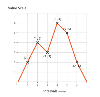
Anatomy


Tools to Generate Visualisation
Code-based:
amCharts (JS)
AnyChart (JS)
CanvasJS (JS)
Chart.js (JS)
D3.js Graph Gallery (D3.js)
Envision.js (JS + HTML5)
FusionCharts (JS)
Google Chart (HTML5)
Highcharts (JS)
JSCharting (JS)
Mike Bostock’s Block (D3.js)
Plotly (JS)
Python Graph Gallery (matplotlib, seaborn or plotly)
R Graph Gallery (R, ggplot2)
Vega
Vega-Lite
ZingChart (JS)
Webapp:
Apache ECharts
Charticulator
Datawrapper
Datylon
Flourish
Google Docs
Infogram
Online Charts
RAWGraphs
Slemma
Vizzlo
Desktop App:
Adobe Illustrator
Apple Numbers, Keynote, Pages
Microsoft Office, PowerBI
Tableau
Check out our fast-paced, data visualisation-themed card game:

Merchandise & other related dataviz products can be found at the store.

