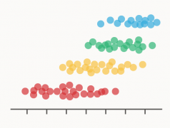
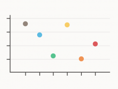
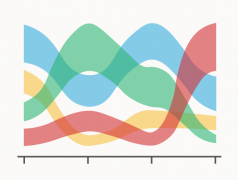
This graph provides a better view of overlapping data points by randomly jittering their position.
Posts related to my documented research into the different charts types that I’ve discovered.
While I’m no longer updating the main page with new visualization methods, I’m still continuing to research into different chart types, which you can find in these posts below.
This graph provides a better view of overlapping data points by randomly jittering their position.
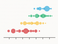
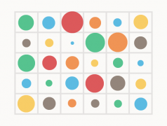
A variation of the Strip Plot / Dot Distribution Plot that plots circles of varying area size.
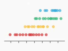
A plot that visualises the data distribution across multiple categories by plotting dots.

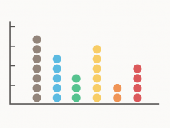
An axes-less variation of a Dot Plot/Unit Chart that organises units into groups to display quantities between categories.
Visualisations that use dots or shapes to plot data points along a value scale.
A simple visualisation that plots dots to compare the values of a variable across multiple categories.
A tabular form of data visualisation used for cross-examining multivariate data.
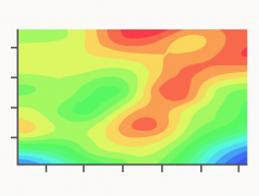
A visualisation method used to represent a 3D plotted surface onto a 2D graph.
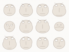
A chart used to visualise multivariate data by assigning each variable to facial feature, which changes in proportion to the data values.
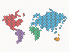
A variation of the Mosaic Cartogram that uses hexagons instead of squares to make up regions.
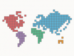
A data map where the regions are made up of square tiles, resembling a piece of mosaic art.
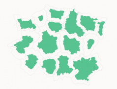
A type of Cartogram where the regions are resized based on a numerical variable, while borders’ shapes are preserved and not connected.
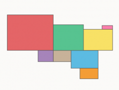
A Cartogram variation where the regions are represented with rectangles sized in proportion to their values.

A Cartogram variation where each geographic region is a circle, sized in proportional to a data value.

A Cartogram variation where each geographical region is represented by a square, with the area of the square proportional its value.
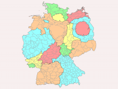
A data map that distorts the geometry of geographical regions in proportion to the data value associated with that region.
A Bump Chart variation that displays the rank plus an additional quantitative variable changing over time.
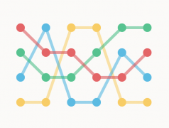
A visualisation that shows how the rankings of different categories or entities change over a time period.


