In the last two posts (#1 and #2), I specifically looked a range of 3D charts, but didn’t included any 3D maps to display geographical data. So in this post, I want showcase all the 3D maps I’ve found so far.
Stepped / Prism Map
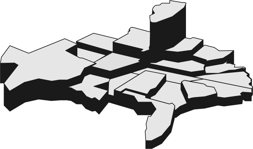
Also known as a Stepped Map, this 3D Map elevates geographical regions to visualise values. The larger the height of the region, the higher the magnitude of its value.
Because it’s difficult to accurately read any values off this type of data map, I would really advise against using it. Especially on flat print and screen work. The exception to this of course, is this really cool physical interactive piece, Touch That Data:
This animated electronic map was created by Alessandro Masserdotti in the OpenDot Fablab in Milan. The device uses Arduino and 3D printed parts to visualise regional statistics across Italy. I could imagine this device being a useful installation piece showing the changes in geographical data over time.
3D Choropleth Map
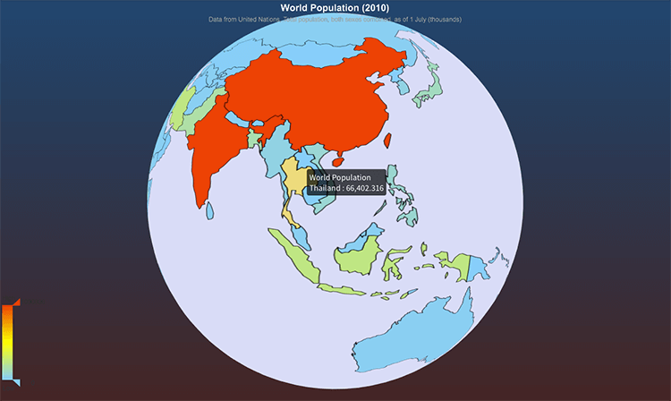
If you were to layer a Chorepleth Map on a 3D globe, this is the result you would get. This example visualises the World population in 2010, using data from the United Nations.
While it’s a nice interactive feature, you can’t see the “big picture” and compare all the other geographical regions together. Every time you turn the World, you lose some information on the other side.
3D Dot or Bubble Map
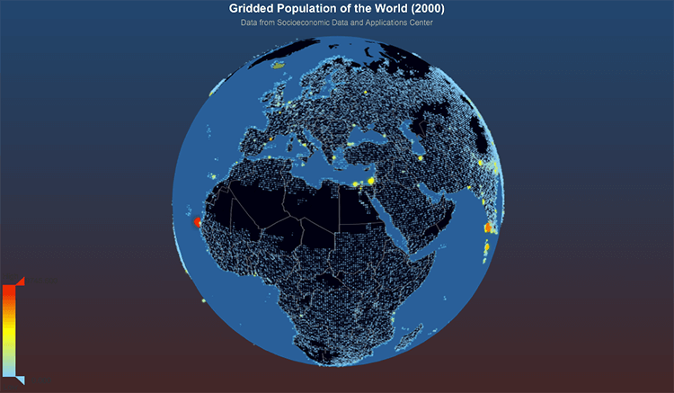
Again, another visualisation that projects data on to a globe. The example above displays the Gridded Population of the World (2000).
3D Bar Chart Map
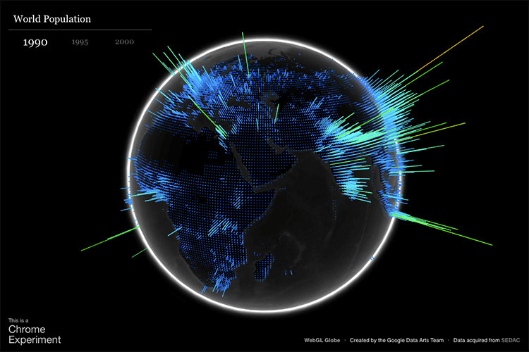
This example is from Chrome Experiments’ The WebGL Globe, which visualises the World population (in 1990, 1995 and 2000). While it’s beautiful to look at, it’s of course no where as effective as a Bar Chart in making comparisons or accurately reading values. Still, it’s a useful way of seeing where values are concentrated and distributed across the Globe.
3D Wind Field Map
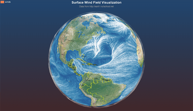
The Above 3D map displays via animation and interaction, the directions and concentration of the Earth’s wind currents. The is data taken from earth.nullschool.net (visualisation below), which is another 3D Map project that visualises global weather conditions forecasted by supercomputers.
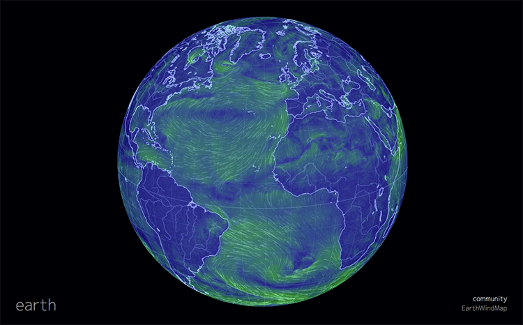
You can also see an array of other geological and climate based data that produce some beautiful visualisations by tweaking the settings in the bottom-left corner.
3D Connection Map
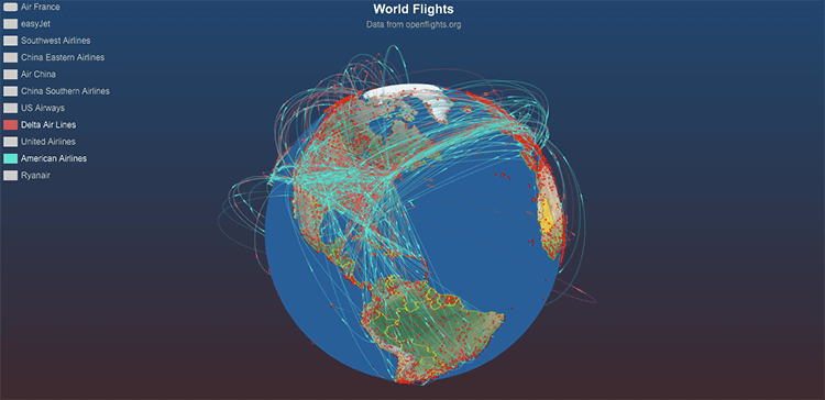
Using the same concept of a Connection Map, this visualisation projects geographical connections onto a 3D globe. As the Earth spins around, you can get a good sense of where connections occur and where they are concentrated through the clustering of lines.
This is exemplified in the example above that displays animated flight patterns across the World. From this visualisation you can see which nations have largest amount of airline activity in their airspace. Also, controlling which airline companies you want to display via filtering, allows you see where each company has their routes concentrated.

