Originally introduced and popularised by the American mathematician John Wilder Tukey, a Box Plot (also known as a Box and Whisker Plot) is a type of chart ideal for visually communicating the distribution of numerical data through their quartiles and their averages.
While I’ve already covered Box Plots and its variation, the Violin Plot on the main part of the site, I want to touch on the other Box Plot variations in this post.
In my research, the best source of information I found online was a paper by Hadley Wickham and Lisa Stryjewski titled 40 years of boxplots. Wickham and Stryjewski explain why the Box Plot has evolved into the many different variations we see today:
One of the original constraints on the boxplot was that it was designed to be computed and drawn by hand. As every statistician now has a computer on their desk, this constraint can be relaxed, allowing variations of the boxplot that are substantially more complex. These variations attempt to display more information about the distribution, maintaining the compact size of the boxplot, but bringing in the richer distributional summary of the histogram or density plot. These plots can overcome problems in the original such as the failure to display multi-modality, or the excessive number of “outliers” when n is large.
– Pg. 5, 40 years of boxplots
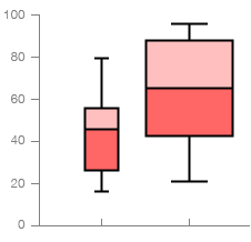
Variable Width Box Plot
Works the same as a standard Box Plot, but uses the width of the box to represent the size of the data within each group (each data series). So a group with a larger total in the data will have a larger width. Making the box width proportional to the square root of the size of the group is a popular practice with this chart.
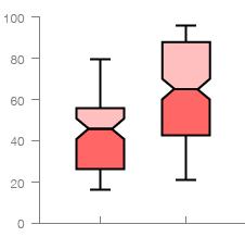
Notched Box Plot
Again, works the same as a standard Box Plot, but has a narrowing of the box around the median value. This acts a handy visual guide to help read and compare the differences between the median values across each data series.
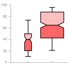
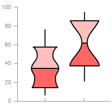
Variable Width Notched Box Plot
As the name states, this variation combines both attributes of the last two Box Plot variations listed.
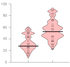
Vase Plot
This variation predates the Violin Plot in its application of density estimates, but only displays the middle section of its shape:
The first variation to display a density estimate was the vase plot (Benjamini, 1988), where the box is replaced with a symmetrical display of estimated density. Violin plots (Hintze and Nelson, 1998) are very similar, but display the density for all data points, not just the middle half.
– Pg. 5, 40 years of boxplots
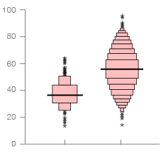
Bean Plot
This variation takes its inspiration from nature and employs the use of the use of a Rug Plot AKA Barcode Plot and Density Plot to visualise the distribution of values:
The bean plot (Kampstra, 2008) is a further enhancement that adds a rug that showing every value and a line that shows the mean. The name is inspired by the appearance of the plot: the shape of the density looks like the outside of a bean pod and the rug plot looks like the seeds within. Kampstra (2008) also suggests a way of comparing two groups more easily: use the left and right sides of the bean to display different distributions. […]
– Pg. 5-6, 40 years of box plots
Further reading on Bean Plots:
– Boxplots & Beyond IV: Beanplots, R-bloggers
– Beanplot: A Boxplot Alternative for Visual Comparison of Distributions, Peter Kampstra
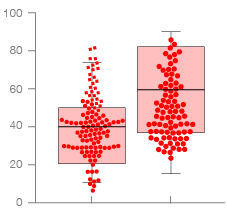
Bee Swarm Box Plot
Also in my research, I stumbled upon a post Beeswarm Boxplot (and plotting it with R) on the r-statistics blog, which describes the chart as:
[…] a one-dimensional scatter plot which is like “stripchart”, but with closely-packed, non-overlapping points; the positions of the points are corresponding to the frequency in a similar way as the violin-plot. The plot can be superimposed with a boxplot to give a very rich description of the underlaying distribution.
– Beeswarm Boxplot (and plotting it with R), r-statistics.com
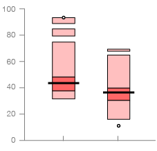
Highest Density Region (HDR) Box Plot
Another variation I discovered from the work of Wickham and Stryjewski is the HDR Box Plot, which they describe as:
The highest density region (HDR) boxplot (Hyndman, 1996) is a compromise between a boxplot and a density boxplot. It uses a density estimate but shows only two regions of highest density: the top 50% and 99%. These regions do not need to be contiguous and make it easy to spot multi-modality. The disadvantage of HDR boxplots is a less-sophisticated definition of extremes, making the outliers less useful for non-normal data. Figure 6 shows the HDR boxplot for the four distributions previously described.
– Pg. 7, 40 years of boxplots
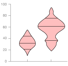
Box-Percentile Plot
This variation is similar to a Violin Plot but with the graphical markers inside the middle of the density shape removed. Instead, a Box-Percentile Plots use line markers to indicate where the median, upper and lower quartiles occur.
Further reading on Box-Percentile Plots:
– Pg. 8, 40 years of boxplots, Wickham and Stryjewski
– The Box-Percentile Plot, Warren W. Esty and Jeffrey D. Banfield
Letter-Value Box Plot
This variation is a solution to limitations of Box Plots when it comes to visualising large datasets:
The letter-value boxplot (Hofmann et al., 2006) was designed to overcome the shortcomings of the boxplot for large data. For large datasets (n 10, 000), the boxplot displays many outliers, and doesn’t take advantage of the more reliable estimates of tail behaviour. The letter-value boxplot extends the boxplot with additional letter-values apart from the median (M) and fourths (F): eigths (E), sixteenths (D), …, until the estimation error becomes too large.
– Pg. 8, 40 years of boxplots
Further reading on Letter-Value Box Plots:
– Letter-value plots: Boxplots for large data, Heike Hofmann, Karen Kafadar, Hadley Wickham
– – –
All of these charts are one-dimensional. When doing the research into Box Plot variations, I discovered that there are in-fact two-dimensional and multiple-dimensional Box Plot variations, which I plan to cover in a future post.

