Last autumn, Jon Schwabish and myself launched a pack of flash cards based off the Graphic Continuum project that we collaborated on.
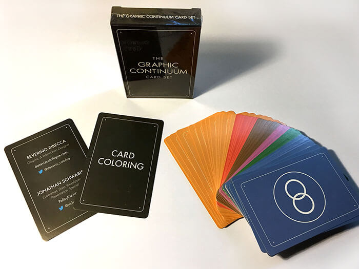
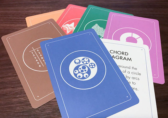
The pack of 54 (each 3” x 4.5”) contain a colourful selection of cards that each feature on one side an icon representing a chart and on the other a short description of it. The cards are coloured and organised based on the 6 function categories from the original project: Comparing Categories (orange), Distributions (brown), Time (red), Geospatial (green), Part-to-whole (purple) and Relationships (blue). Although many of the charts serve multiple functions, for simplicity’s sake we decided to colour-code the cards based on their main function for communicating.
Each pack contains:
14 x Comparing Comparisons Cards
13 x Relationships Cards
7 x Time Cards
7 x Distributions Cards
6 x Geospatial Cards
5 x Part-to-whole Cards
1 x Colouring Guide Card
1 x Information Card
How should I use these cards?
That’s a good question and one that I can’t give you a definitive answer to.
When we were first coming up with ideas for these cards, we weren’t sure what their function would be. At first we were thinking to just do a series of data visualization themed playing cards or to create our own game system. But we settled on making the cards into something educational and practical.
So we created a series of flash cards that could be used in multiple ways.
One of those ways is to use them as flash cards and there’s a reason the image is on one side and text on another. Either by going through the pack yourself or having someone else pick them out for you, you can use the cards to help you memorise and learn each of the 52 chart types included in the set. The colour-coding here can also help you memorise what functions each chart is useful for. By using the cards in this way, you’ll be effectively expanding your visualisation vocabulary.
Another way to utilise the cards, is to have them as a reference tool to look up on different chart types. Much in the same way the main part of this website functions or like the other Graphic Continuum products. Because of its small size, the card deck could be handy as a pocket reference tool.
You could also use the cards for inspiration in a data-focused project. By going through the cards, you can use them to spark new ideas on how to visualise a dataset or figure out what charts you could use in a project and weigh them out against each other.
However, I’m curious how other people are using our cards. If you’re using them in a different way, then please let me know in the comment section below. Maybe I can even feature these methods here or try them out myself. I think it would be interesting to hear how and what the cards are being utilised for. Maybe as Robert Kosara has suggested, someone has developed their own drinking game out from the cards!
