Just for a bit of fun, I posted a survey asking my Twitter subscribers what were their five favourite charts (in no particular order).
What’s your 5 favourite charts? https://t.co/pPPbCfOMGG
— Dataviz Catalogue (@dataviz_catalog) February 16, 2017
While I only got a meagre 13 responses, I thought I’d post the responses anyway, since some people actually gave up some of their time to respond.
Here are the results:
5th Place:
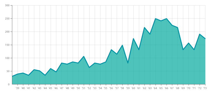
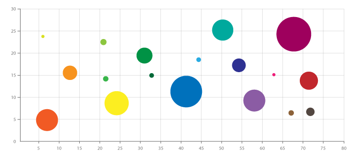
Bubble Graphs + Area Graphs
4th Place:
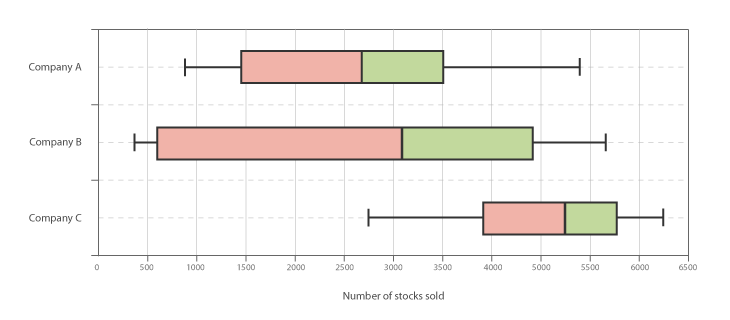
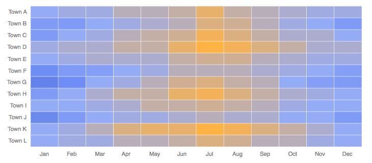
Heatmaps + Box & Whisker Plots
3rd Place:
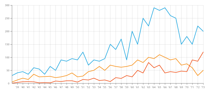
Line Graphs
2nd Place:
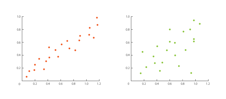
Scatterplots
1st Place:
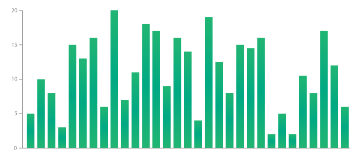
Bar Charts
So as you can see, the most well-known charts have come out on top. The only one I would consider unusual is Box & Whisker Plot because it’s a fairly complicated chart that’s typically used just by statisticians.
Other charts mentioned in responses include: Sunburst, Bee Swarm, Treemap, Line-Range Chart, Connected Scatterplot, Spider Chart, Slopegraph, Stacked Bar Graph, Lollipop Chart, Flow Map, Area Graph, Dendrogram, Network Diagram, Flow Chart, Cartogram, Histogram, Bullet Chart.

