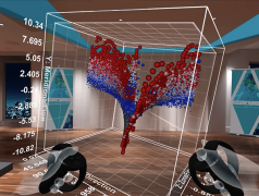
My chat with Suzanne on her project and the benefits of immersive data visualization.
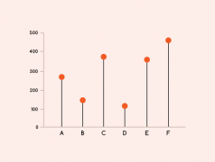
Looking at: Lollipop Chart, Triangle Bar Chart, Back-To-Back Bar Chart, Progressive Bar Chart, Waterfall Chart, Change Bar Chart, Pareto Chart and more.
Already, there are quite a few start-ups on the market offering to bring data visualization to the VR realm.
I started some research into the application of data visualization in virtual reality (VR).
Here are 34 different charts that you can combine a Proportional Area Chart with.
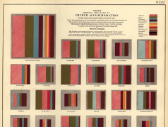
Exploring some of the different ways Proportional Area Charts can be used.
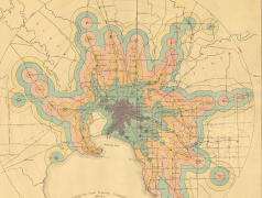
Exploring the many variations of Isochrone Maps from both the past and present.
I wanted to document all variations of Tile Grid Maps that I’ve come across and also draw combinations that I think are possible.
For those who haven’t learnt how to use Data Illustrator, I’ve provided a tutorial on how to construct Bar Charts in the Application.
I was invited to give a talk at a UX / UI Design conference CIEMNA STRONA #4: Stranger Things, which took place on 21st March in Kraków, Poland.
I’m getting quite excited about a new application that I recently discovered: Data Illustrator. Although still in its early stages, it looks very promising
I recorded an online interview with Finn Fitzsimmons explaining his projects in more detail.
In collaboration with Jon Schwabish, I would like to announce our new product: The Graphic Continuum Match It Game.
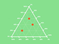
This post explores the various kinds of triangular (tri-axes) graphs that are currently being used. Most notably, Ternary Graphs are their variations.
Looking back at the past year, which of the chart reference pages were the most visited on the website?
I’ve just done a complete overhaul of the design of the Resources page and included a much larger collection of useful data visualisation resources.
The Turkish version of the website has now gone live, thanks to the efforts of Pinar Dağ and her students.
Here I’ve demonstrated and experimented with 30+ ways you can combine a timeline with other forms of data visualization.
This is my first post touching on the phenomenon I’ve observed of which I like to describe as ‘Fusion Charts’ and ‘Chimera Charts’.
Here will I look into visualizing data in calendars by experimenting with different combinations of calendars with other types of charts.
So I made an appearance on the PolicyViz Podcast, hosted by Jon Schwabish to discuss some of the projects I’ve been working on lately.

