For a long time now I’ve been meaning to explore the combining of charts or graph markers together. I would like to investigate more into what I would describe as “chart fusions” or “chimera charts”, but I will save this for another time. Because in this post, I want to explore the combination of calendars with other forms of data visualization.
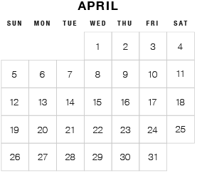
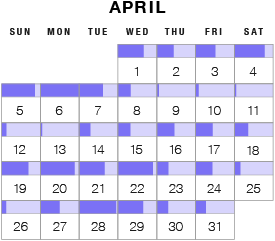
Although you would never describe a calendar as a form of data visualization, it is for sure a type of “chart”. Calendars are a visual tool used for planning and organizing, that have been used by humans for thousands of years. The above image is a simple example of a typical Gregorian calendar, which is the type of calendar I will use and combine with other forms of data visualization to produce different results.
I will just be focusing on a single month rather than an entire year, just to keep things simple. Looking at an entire year would affect the outcomes for this kind of experimentation, as it would be more relevant for larger data sets and allow for more elaborate visualizations. So maybe it’s possible for me to revisit experimenting with calendar combinations in the future, but for bigger data sets.
Some of the combinations may turn out to be bad forms of data visualization, but this isn’t the purpose of this post. The purpose of this post is to document some the possibilities I’ve found or came up with from playing around with different combinations.
Maybe this post and others like it will serve as a form of inspiration for some. The data I have used is just dummy data because I wanted to focus more on visual forms. Also, I won’t focus too much on how these chart combinations can be used or what they’re good or bad for, as I want to focus more on the possibilities that manifest.
Showing connections and/or flow
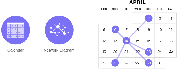
I first tried experimenting with diagrams, with the example below being a combination of a Calendar and a network diagram. I guess this type of chart could be useful in showing how dates are connected within a month.
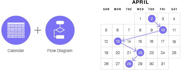
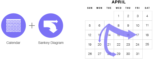
The next chart is somewhat similar to a flow chart in the way it shows with arrows the sequencing of events. Here you can visualize how certain dates connect and lead to another.
Of course, as well I think it’s possible to combine a Sankey diagram with a calendar to show the transfer of quantities from one date to other dates.
Visualizing quantities
Graphical markers can be displayed within each date cell to visualize values occurring on a particular date. By combining different forms of data visualization with a calendar, you can see how values change over the month in a tabular format.
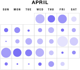
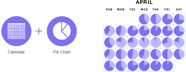
This chart below uses the area of a circle to visualize values, like in a proportional area chart. However, the chart below also resembles a correlation matrix, but functions in a different way (visualizes data changing over time rather than displaying correlations).
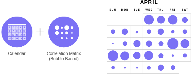
A third variable can be added to this chart by varying the shading or coloring of each circle in proportion to the data.
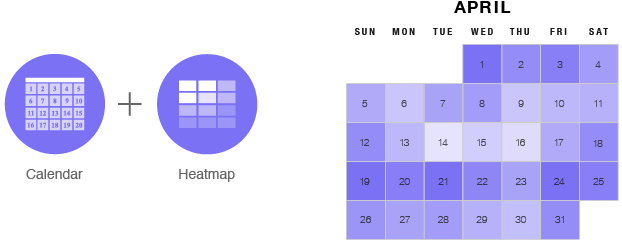
Varying the color shading in each cell is how a heatmap matrix functions. So the tabular layout of a calendar makes it an ideal candidate to be combined with a heatmap.
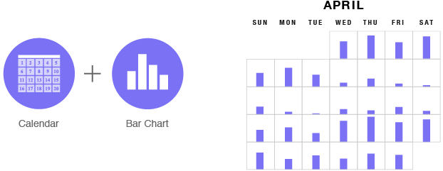
When visualizing and comparing quantities, the bar chart is the go-to chart. When combined with a calendar, each date cell contains a bar to represent the value for that single date.
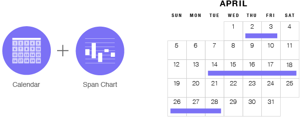
If you turn the bars horizontally, you can span them over multiple days to display the duration of events. Many calendar applications already employ this feature to visualize entries spanning over multiple days.
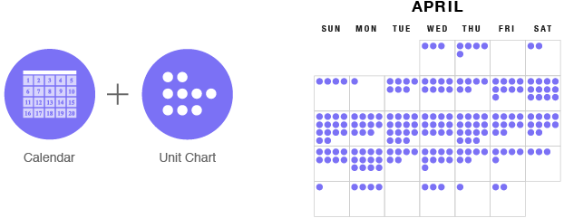
Small, discrete quantities can be visualized nicely by combining a calendar with a unit chart. This also includes other unit chart variations such as a pictogram chart or dot matrix chart.
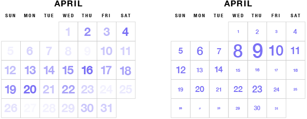
Quantities can also be visualized without using abstract graphical markers. Two ways you could do with is by varying the color shade of the dates (left) or by varying the size of the date numbers (right).
Increases and decreases in values can be visualized by using green up arrows to signify increases and red down arrows to signify decreases. Varying the size of the arrows in proportion to the changes can also be useful in emphasizing the amount of change.
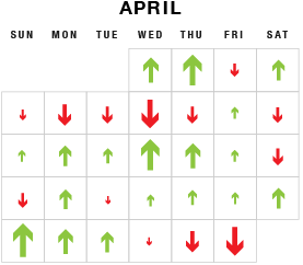
When I drew a calendar with the arrows, it also reminded me of wind charts. Although it’s probably not possible to see the wind forecast for the entire month, I think applying a wind chart to calendar could be useful.
Multivariate data
Each facial feature of a Chernoff face relates to a variable. I thought this type of chart would combine well with a calendar.
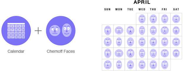
Looking at this, it’s obvious you could also use emoticons in each cell to track emotions changing over the month.
Part-to-a-whole chart combinations
It’s possible to combine a calendar with a 100% bar chart by filling in each cell based on the percentage you need to represent.
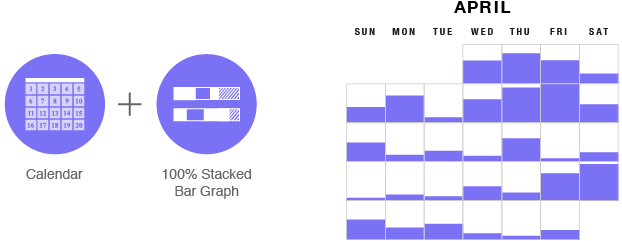
The bars on this chart could be made a lot small to allow for the date number to be displayed.
Pie charts are a popular way of visualizing part-to-a-whole relationships and fit nicely into a calendar’s cells.
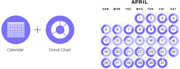
If you can combine pie charts with a calendar, then you can be sure donut charts will work as well. Here the dates can be placed in the donut chart’s gap.
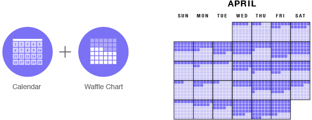
Waffle charts are a better alternative to a pie chart and can be combined easily with a calendar.
Visualizing data over time
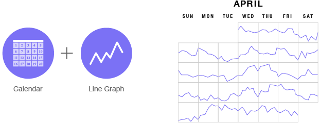
While calendars visualize time, they don’t visualize data changing over time. One solution to this is to combine a calendar with a line graph.
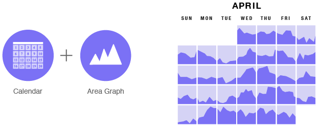
You could also combine a calendar with an area graph to visualize values changing over each day of the month.
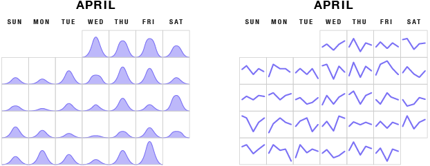
In the previous two chart combinations, data is running continuously throughout the month. However, it might be possible to display small multiple charts in each cell. Below shows a density plot (left) and smaller multiple line graphs (right).
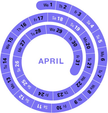
Radial Calendars
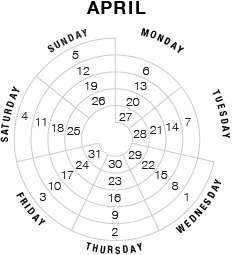
I tried experimenting with drawing a calendar on a polar grid, but as you can see below, it doesn’t translate so well into this layout. It’s hard to follow the dates as the order is confusing and unintuitive.
A better solution I found was to draw the calendar on an Archimedean spiral. If you were to combine a spiral calendar with another chart, for example, a line graph, then the result would resemble a spiral plot.