 Page top
 Previous
 Homepage
 Next
Next
Dot Matrix Chart
Description
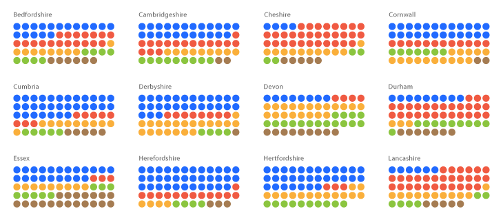
Dot Matrix Charts display discreet data through a series of organised dots, each coloured to represent a particular category and grouped in a matrix. They are used to give a quick overview of the distribution and proportions of each category in a data set. Dot Matrix Charts are also used to compare distribution and proportion across other datasets, to discover patterns.
When only one category is used in the dataset and all the dots are the same colour, a Dot Matrix Chart can be used to primarily show proportions.
Functions
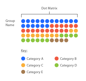
Anatomy
Similar Charts

Tools to Generate Visualisation
Code-based:
ZingChart (JS)
Amit Kapoor’s Block: Multiple, Rectangular (Vega-Lite)
Webapp:
Datylon
Flourish
Infogram
Vizzlo

