Recently, I’ve touched on some concepts that I’ve been wanting to talk about for a few years now. It’s a phenomenon I’ve observed of which I like to describe as ‘Fusion Charts’ (or Combination Charts) and ‘Chimera Charts’. In this post, I want to try to clarify what I mean by these terms.
So what do I mean when I say ‘Fusion Charts’ or ‘Chimera Charts’, and why do I give them those names?
For starters, Fusion Charts, Fused Chart, Combination Charts, or whatever you want to call them, are a combination of two different charts combined together into one. Think of it like nuclear fusion, where two or more atomic nuclei join together to form a larger nucleus.
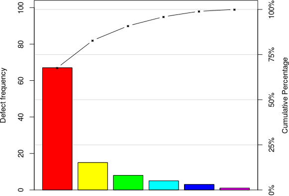
Source: What is a Pareto Chart?
One of the oldest and most well-known examples of a Fusion Chart is the Pareto Chart, which combines both a Bar Chart and Line Graph into one chart. However, in recent times, people have come up with some fantastic and interesting combinations of charts, such as this Scatterplot of Line Graphs from The New York Times:
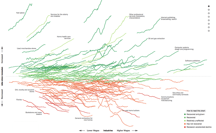
Source: How the Recession Reshaped the Economy, in 255 Charts, The New York Times
In my last post, Chart Combinations: Visualizing Data in Calendars, I looked at many different ways you could combine a calendar with different forms of data visualization. As a designer, I found the process of both researching and also coming up with ways to combine calendars with other charts a fun process. Not all the combinations produced are something useful or effective, but it was enjoyable to explore all the different possibilities. I will continue to do more posts like this but with other charts.
Chimera Charts
So what am I referring to when I say Chimera Charts? Well, what I mean by this, is the type of charts that compose a visualization out of multiple graph markers (bars, points, lines, etc). When I think of these charts, I think of the Chimera: a mythical beast composed of a lion, goat, and snake. But don’t want to refer to charts as some kind of monstrous abomination! The term ‘chimera’ is often used to describe something composed of multiple entities while functioning as one.

Chimera Charts visualize multiple datasets, but instead of providing a chart for each dataset, Chimera Charts have been designed to fit together multiple data sets into a single chart. This technique is often used to compress a lot of different data to produce an infographic that is often visually complex and data-dense.
The Chimera Chart style of producing infographics is noticeably popular amongst Italian design studios, agencies, and infographic designers. A great example of this is the series of infographics Accurat did for La Lettura. Below is an example of one of these infographics titled Brain Drain, which visualizes the phenomenon of brain drain in academic research across 16 countries:
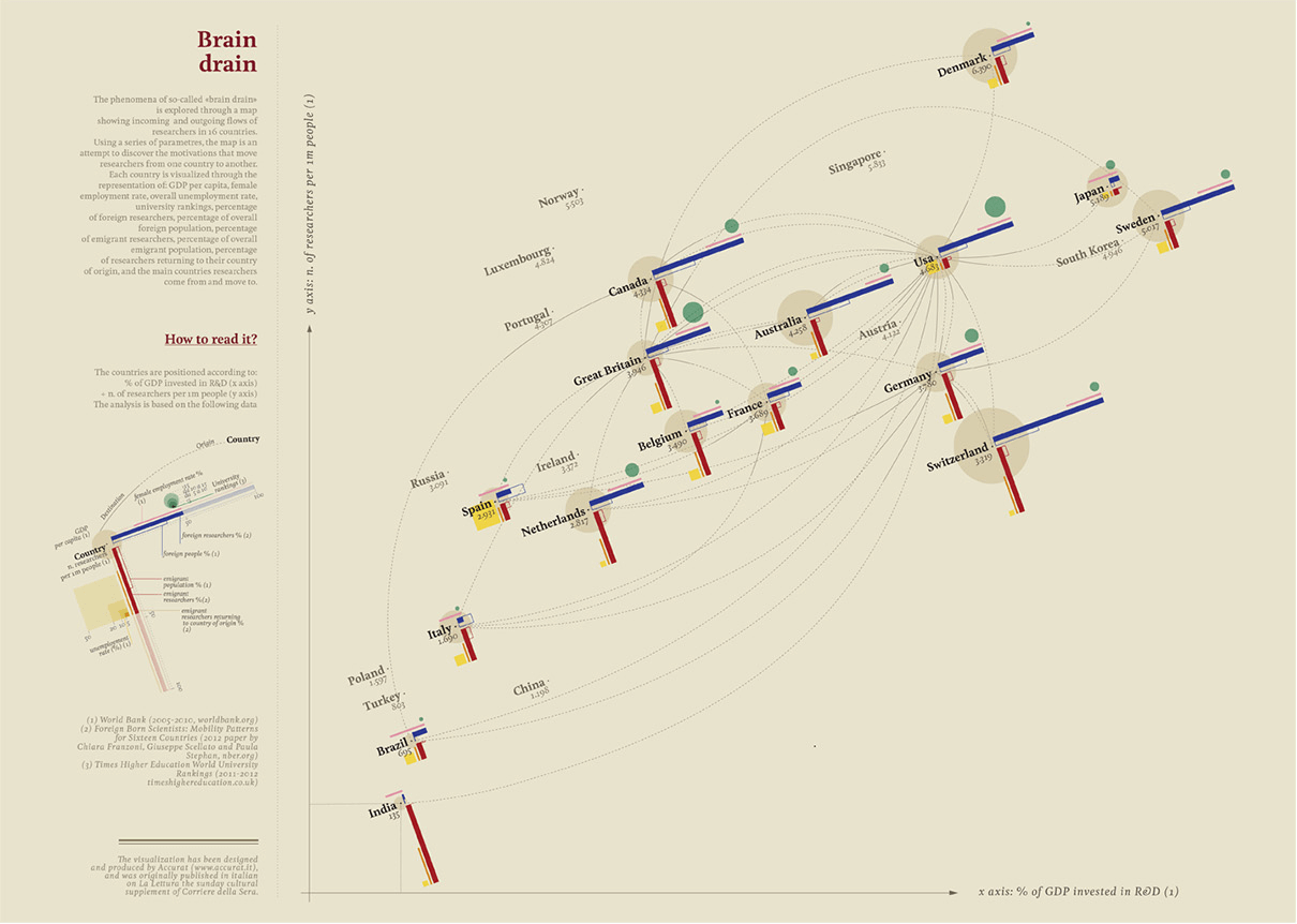
Source: Brain Drain, Accurat
If you’ve not seen this infographic before, then it will take a bit of time to decipher. A key is provided on the side to help you read this visualization:
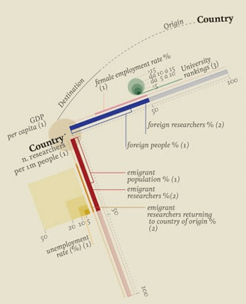
Each country is also positioned according to the % of GDP invested in R&D (x-axis) and the number of researchers per 1m people. But as you can see, this infographic visualizes 12 different variables using various visual encoding methods:
| Variable | Visual Encoding | Graph Marker |
| % of GDP invested in R&D | Position (x-axis) | Point |
| Number of researchers per 1m people | Position (y-axis) | Point |
| Origin & Destination Country | Connection | Line: dashed for origin, solid for destination |
| GDP per capita | Area | Circle |
| Foreign researchers % | Length | Bar |
| Foreign people % | Length | Bar |
| Female employment rate % | Length | Ranged Bar |
| University rankings | Area | Circles |
| Emigrant population % | Length | Bar |
| Emigrant researchers % | Length | Bar |
| Emigrant researchers returning to country of origin % | Length | Ranged Bar |
| Unemployment rate % | Area | Squares |
So a lot of different data has been compacted together by combining multiple graph markers together to form a unique chart. I think this the main difference between what a Chimera Chart is (a mixture of graph markers combined together to form a new type of visualization) and a Fusion Chart (two different charts combined together).
For now, I won’t comment on the functionality and effectiveness of these charts, but instead, I want to just focus on the design aspect of creating Chimera Charts. The reason I’ve gotten interested in this subject is that the practice of combining and playing around with multiple graph markers to create charts is fertile ground for developing new forms of data visualization. If we’re to look at the creative and innovative ways contemporary designers are designing charts, I believe it might provide some insight into the design process of creating new charts.
I’ve also come to the conclusion that it’s going to be a never-ending process to completely catalog every form of data visualization out there. With the examples I’ve provided, I’ve shown that the possibilities are almost endless. There are so many ways you can combine and place graph markers together to visualize data.
This is one of the main reasons I stopped to update the main part of this website. I’ll be still researching into the different chart types out there, but I think I need to take a different angle on my research and look at chart construction on a more fundamental level.
Anyway, if you’re not familiar with the work of Accurat, especially the work they did a few years ago for La Lettura, you can check their projects here on their Behance page.
I hope in the near future I can spend more time on this subject and get back with some writings on my research and thoughts. But if anyone has any of their own thoughts on this, then please share it in the comments section below.
