In a previous post, I looked at combining a calendar with other forms of data visualization to explore the possibilities available. I want to continue this process, so in this post, I have decided to explore combining a timeline with other visualization methods.
Timelines display a list of events in chronological order, typically with a line and with markers (typically using points) on that line to indicate specific points in time or events. These events marked out along timeline can be elaborated on with further information such as text, numbers, images, and icons.
The two main types of timeline are a sequential timeline and a scaled timeline. There’s also a span timeline, which I will cover further on in this post.
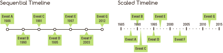
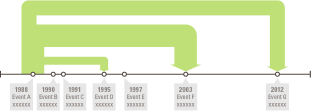
A sequential timeline simply displays a list of events chronologically, with a uniform distance between the event markers. So there’s is no sense of scale here, just a simple listing of events, which can be useful if space is limited.
On the other hand, a scaled timeline displays a scale for time and positions event markers on the dates that those events take place. This allows you to see how events are distributed over time and to see if any patterns appear over a certain time period.
Regardless of the type, the function of a timeline is to communicate time-related information, in order to visually present a story or view of history. Further analysis of the sequence of events can be enhanced through the display of additional, but relevant data. This can be done of course, by combining a timeline with other forms of data visualization, which is showcased throughout this post.
The first chart I combined a timeline with is an arc diagram:
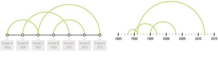
In this chart, arcs are used to display the connection between events and as you can see, it doesn’t look too dissimilar to the original arc diagram. On the left, I used a sequential timeline, while on the right, I used a scaled timeline to test if it made a difference. This combination chart could, of course, be enhanced through the use of arrows or varying the thickness of the arcs in proportion to some quantitive data.
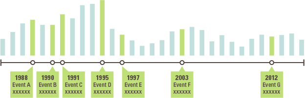
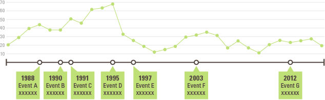
Next up, I looked at combining a timeline with a bar chart, to the visualize the quantitive values linked to each event:
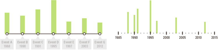
My worry with the first (left) chart is that it could be a bit misleading because although the spacing between the bars is uniform, the time between them isn’t. This issue is remedied with the chart on the right, which visualizes the bars on a scaled timeline. This version of the chart helps to show how the events and data are distributed, but it looks as if it’s an incomplete chart.
If I fill in the blank years in another color and label the bars for the events I get this chart:
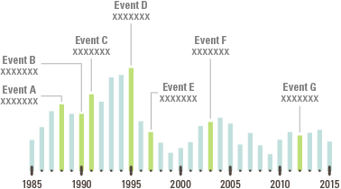
However, this chart looks more like a regular histogram and doesn’t resemble a timeline much. So I redrew this chart and removed the scale while keeping the event markers in-scale to each other:
This to me looks better, as the timeline is now more visually prominent. Of course, for the bars, you could make them readable by adding a value scale with gridlines or by displaying the values on top of each bar. But for the rest of the chart combinations that I’m displaying in this post, I don’t want to constantly dive into the charting design details.
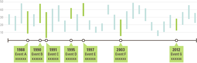
Anyway, moving on from your regular bar chart, let’s look at using ranged bar charts, also known as span charts, to show how ranged values can be displayed on a timeline. On my first test, I produced a chart similar to the previous bar chart example, but instead, comparing ranged data changing over time:
Using the length of bars to visualize ranged data can be applied in other ways. One way is to use the length of a bar to visualize the duration of events. Some digital calendars like Apple’s Calendar application will mark bars for events that occur over the entire day or for multiple days. This same technique can be used on timelines to show how long events will last and if they overlap with other events. This type of timeline can be found in Google Charts and Docs.
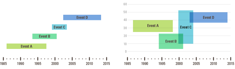
The above second chart on the right is an experiment where I tried to combine this type of span chart timeline with a value scale. So the length of the rectangles is proportional to the duration of the event and the height is proportional to a quantitive, range-based value that’s assigned to it. But as you can see, there’s an issue with overlapping…
Ranged bars can be arranged on a single line to function as the actual timeline, to become a span timeline. See on Google Charts.

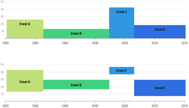
I also tried to add a value scale to span timeline: the first variation visualizes values like on a bar chart, while the second variation visualizes ranged values like on a span chart:
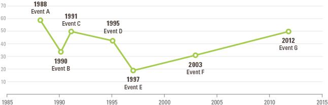
After experimenting with bars, I moved onto combining a timeline with a line graph:
From doing this, I thought, why not make the line graph into the timeline itself? So in the chart below, I plotted where the events occur in time and then connected to the points to create a timeline:
This is not to be confused with a connected scatterplot, which plots and connects points sequentially in chronological order over a pair of variables on each axis. I would recommend for you to check out Alberto Cairo’s post, In praise of connected scatter plots, which has some nice examples of connected scatterplots being used as a sort of timeline infographic.
Returning back to the line graph timeline, I want to show a wall mural I found in my research, which was created by Stefen Helling in his collaboration with the German Studio ART+COM. On a section of the wall mural, you can see the timeline merges into a line graph to visualize the change in unemployment over time, while still continuing to be a timeline:
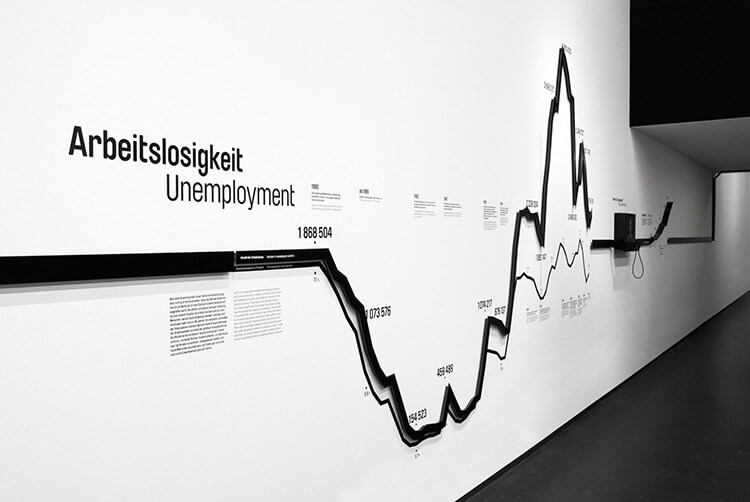
STATISTICS STRIP, German Hygiene Museum, Dresden, 2009 with ART+COM Studios | Source
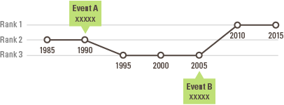
I also experimented with another chart similar to a line graph, known as a bump chart. In this chart you can see the change of ranking between categories over time:
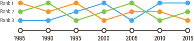
Like I did with the line graph timeline, you can also convert a “bump path” into the timeline itself:
A proportional area chart can also be combined with a timeline in a couple of ways:
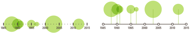
The first variation plots the data directly onto the timeline, with the center of the circle being at the position of the date associated with the data. The second variation plot the data above the timeline, but uses a line marker to more clearly display what date it corresponds to. As you can see with these two variations, there’s a lot of overlapping taking place between the bubbles. One solution to this is to use the second variation and vary the vertical positioning of all of the bubbles so that none of them overlap.
Pie charts and donut charts can be incorporated into a timeline by placing them on the date and event markers:

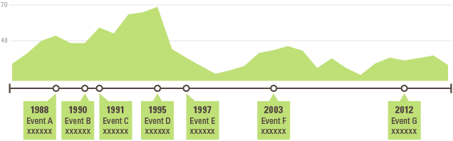
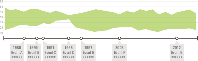
If a line graph can be combined with a timeline, then you can be sure that an area graph can:
A great example of an area graph + timeline combination is Information is Beautiful’s Mountains Out of Molehills interactive piece. This timeline visualizes the intensity of various media-induced fearmongering for various themes.
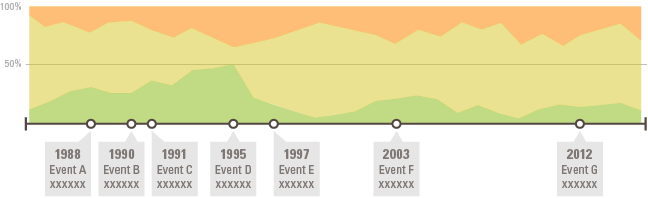
100% stacked area graphs also fit well onto timelines (see my post on area graph variations) and can be used to show the changes over time for part-to-the-whole relationships between categories:
You can also show the change over time for ranged data with a ranged area graph:
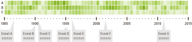
Heatmaps work well for visualizing data over time (see WSJ’s Battling Infectious Diseases in the 20th Century), making heatmaps an ideal match with a timeline:
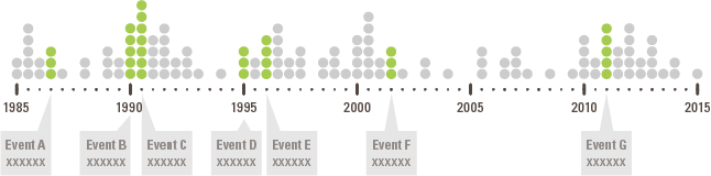
A unit chart or pictogram chart can be combined with a timeline to visualize the distribution of data over time while highlighting key events with callouts:
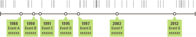
Another chart great for visualizing the distribution of values is a barcode plot:
Let’s move on to combining timelines with diagrammatical charts. First up, here’s a timeline combined with a flow chart, which I found from looking at the cover of the exhibition catalog Cubism and Abstract Art from MoMA in 1936:
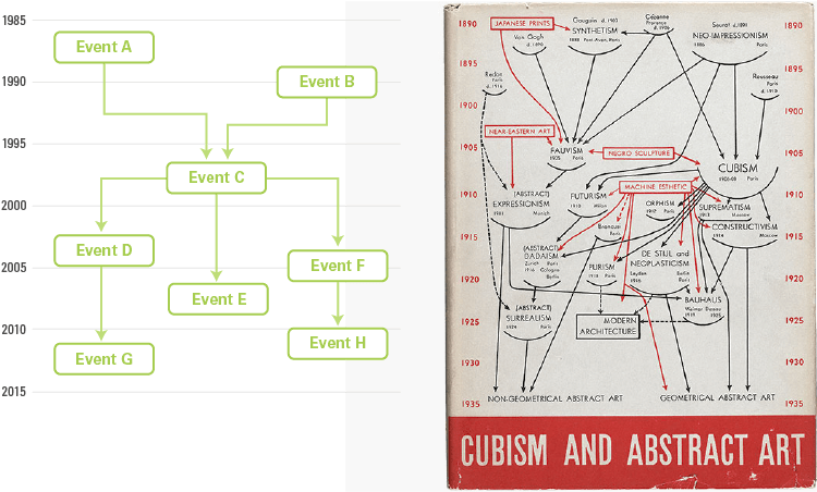
Normally in a flow map, you see the logical mapping out of a process or system and its sequential steps. When you combine a flow chart with a timeline, you can display where in time each step takes place. In the MoMA cover example, you can see when a particular artistic movement occurred in time and how it influenced other movements further down the line.
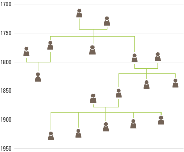
Tree diagrams are great for visualizing family trees. If you combine a tree diagram with a timeline, you can for example, plot out when certain family members were born and when their offspring (if they have any) were born:
A Sankey diagram can be combined with a timeline to show quantities flowing from one event to others:
Or you could use a Sankey diagram to show the flow of quantities over time and label significant events:
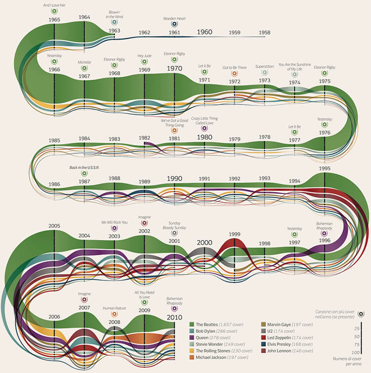
A chart similar to a Sankey diagram is an alluvial diagram, which DensityDesign used to visualize the album sales over time for various famous musicians:
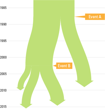
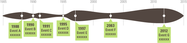
Looking at charts such as a Sankey diagram and the above alluvial diagram made think if it was possible to just vary the width of a timeline itself. So the width of the timeline line would be proportional to a dataset. Here’s an illustration of that concept:
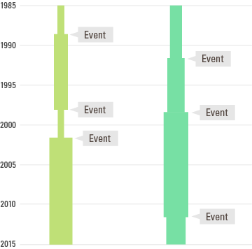
I did another version of this idea but with multiple timelines and more rigid edges:
I think I’ve produced enough timeline combinations for now, as I could go on for awhile doing this. But If you’ve got any examples of timelines combined with other forms of data visualization that I haven’t covered, then please post it in the comments section below.
