 Page top
 Previous
 Homepage
 Next
Next
Pie Chart
Description
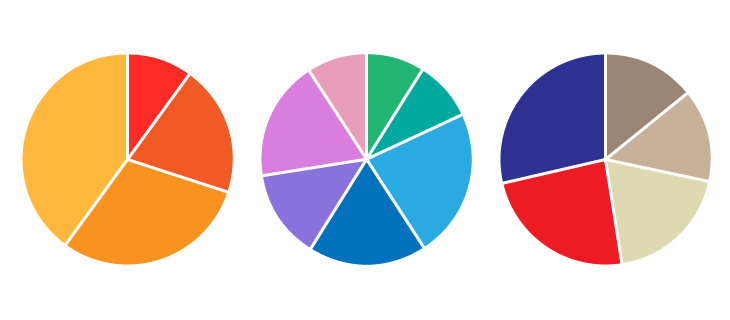
Extensively used in presentations and offices, Pie Charts help show proportions and percentages between categories, by dividing a circle into proportional segments. Each arc length represents a proportion of each category, while the full circle represents the total sum of all the data, equal to 100%.
Pie Charts are ideal for giving the reader a quick idea of the proportional distribution of the data. However, the major downsides to pie charts are:
They cannot show more than a few values, because as the number of values shown increases, the size of each segment/slice becomes smaller. This makes them unsuitable for large datasets with many categories.
They take up more space than their alternatives, for example, a 100% Stacked Bar Chart. Mainly due to their size and the usual need for a legend.
They are not great for making accurate comparisons between groups of Pie Charts. This is because it is harder to distinguish the size of items via area when it is for length.
Despite that, comparing a given category (one slice) within the total of a single Pie Chart, then it can often be more effective.
Functions
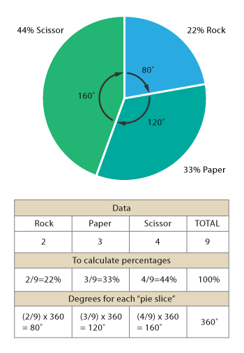
Anatomy


Tools to Generate Visualisation
Code-based:
amCharts (JS)
AnyChart (JS)
Apache ECharts (JS)
D3.js Graph Gallery (D3.js)
FusionCharts (JS)
Google Charts (HTML5)
Highcharts (JS)
JSCharting (JS)
Mike Bostock’s Block (D3.js)
Plotly (JS)
Python Graph Gallery (Python: matplotlib)
R Graph Gallery (R or ggplot2)
Vega
Vega-Lite
ZingChart (JS)
Webapp:
Columns.ai
Datamatic
Datavisual
Datawrapper
Datylon
Flourish
Google Docs
Infogram
Chartle
RAWGraphs
Slemma
Vizzlo
Desktop App:
Adobe Illustrator
Apple Numbers, Keynote, Pages
Microsoft Office, PowerBI
Tableau

