 Page top
 Previous
 Homepage
 Next
Next
Span Chart
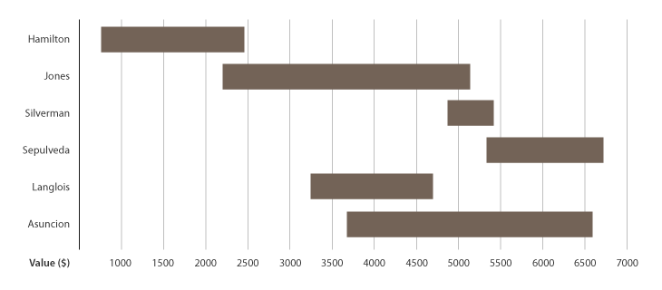
Description
Also known as a Range Bar/Column Graph, Floating Bar Graph, Difference Graph, High-Low Graph.
A chart used to display dataset ranges between a minimum and maximum value. Span Charts are ideal for comparing ranges, typically between categories.
Be aware that Span Charts focus the reader on only the extreme values and give no information on the data points between the minimum and maximum values, such as on the averages or the data distribution.
Functions
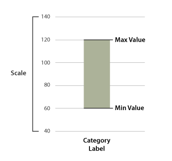
Anatomy


Tools to Generate Visualisation
Code-based:
AnyChart (JS)
Arpit Narechania’s Block (D3.js)
JSCharting (JS)
Vega-Lite
ZingChart (JS)
Desktop App:
Tableau

