I recently wrote about a new data visualisation drawing application in development Data Illustrator, which I believe to be very promising. But in this post, I want to give those who don’t time the time to go through the entire Getting Started guide a taste of what Data Illustrator has to offer. So to do that, I’ve written a tutorial on how you can construct a simple Bar Chart.
Note: Before you get started, I would recommend that you at least familiarise yourself with the annotated image of the application’s interface, so that you know the names of each interface section.
First, in the Data Variables Panel, press Open Dataset File and select your data (you can select Olympic Medals if you don’t have any).
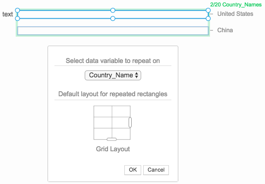
In the Left Tool Bar, select Rectangle (r) and draw out a rectangle with a Width of 350 and Height of 15.
![]()
Next, select Text (t) in the Left Tool Bar and click once onto the Canvas to create a piece of text. Position this piece of text next to the beginning of the bar (either on the left or right side) so it appears like so:
![]()
Select the rectangle and press the Repeat button in the Right Tool Bar. From the Select data variable to repeat on from the drop-down menu, select the category variable (in this example I’ve selected Country_Name). Then press OK.
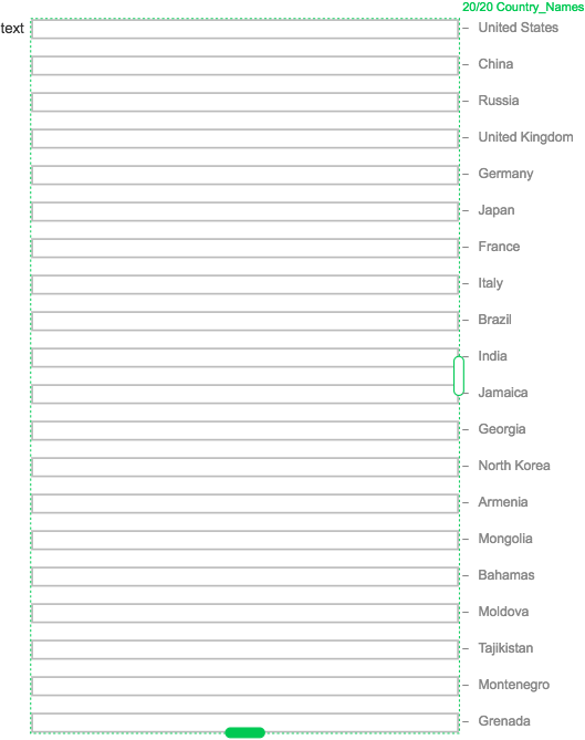
Drag the bottom handle on the grid layout until all the bars have been repeated for each category:
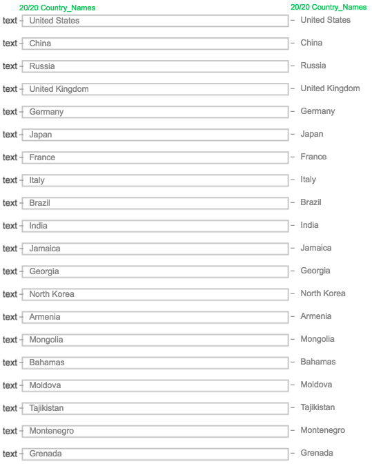
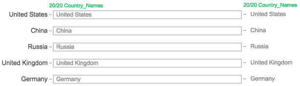
Next, deselect the rectangles and then select the text. Repeat steps 4 and 5 for the text labels.
You will probably have to adjust the text labels align with the bars. In this example, you will need to go into the Property Inspector on the right and enter 15.6 for the Row Gap (under LAYOUT). The end result should look like this:
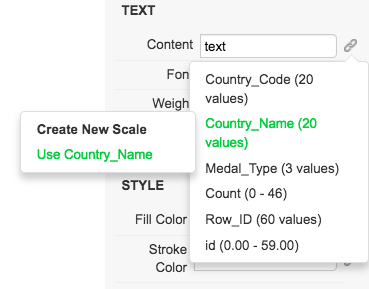
Double-click on one of the pieces of text (not the category/country names) so that it’s only selected. Then, in the Property Inspector on the right, bind the Content to the data by clicking on the link icon and selecting the category variable (Country_Name in this example).
The text labels will probably be overlapping with the bars. To solve this problem, make sure you still have a single text label selected and then at the bottom of the Property Inspector, set the Horizontal alignment to Right (Under ALIGNMENT IN CELL).
Move the labels leftwards, so that that are positioned correctly next to the bars like so:
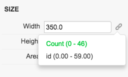
Now we need to bind the data to the bars. With Select, double-click one of the bars and then in the Property Inspector, under SIZE, press the link icon next to Width and select the numerical data for the categories (in this example I used Count).
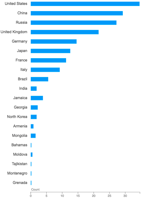
Finally, select the all the bars and in the Right Tool Bar press Break Grid. Repeat this process for the text labels as well. Your Bar Chart should be now complete. You can colour and customise it as you see fit.
After your Bar Chart is complete, you can save the project for future use by going File > Save Project. Or you can import to an SVG by going File > Export SVG so that you can display the chart on a website or you can further edit the chart in a vector-based image editing application, such as Adobe Illustrator.
Anyway, I hope that was useful and I will try to do more of these tutorials.

