In recent times, I’ve seen that a lot of charts used together with Tile Grid Maps (also known as Tile Cartograms or Mosaic Cartograms). So I wanted to document all variations of this chart that I’ve come across and also draw combinations that I think are possible.
Tile Grid Maps often work like small multiples of that visualisation, but with the charts arranged in a map formation. Of course, there are some exceptions to this, as you will see further on in this post.
I’m not 100% sure whether I would describe the charts presented in this post as examples of chart combinations or just variations of the same type of chart, but I don’t think that’s too important.
Commonly, I’ve seen Tile Grid Maps use the United States map where each block represents an individual state. I’ve stuck to this format when drawing my own combinations, but of course, Tile Grid Maps can be applied to any country.
So without further ado, are all the various kinds of Tile Grid Map that I have discovered or imagined:
+ Heatmaps
The most common kind of Tile Grid Map I’ve come across varies the colour of each region block in proportion to a variable, like in a Heatmap. Sometimes this chart uses hexagons instead of squares.
See also: the code to create a Tile Grid Map with D3.js
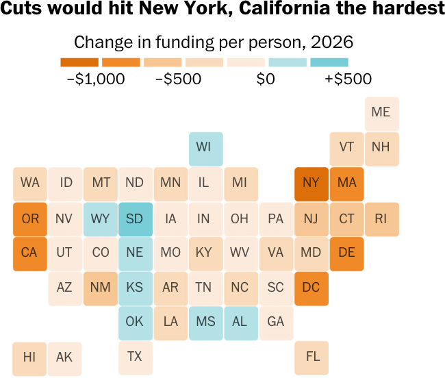
Source: There’s one Obamacare repeal bill left standing. Here’s what’s in it,
The Washington Post
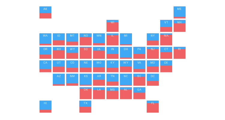
+ Colour Coding
The region blocks in Tile Grid Maps can also just be colour-coded by categories. Like in this Tile Grid map of Slovakia, which displays the election result between three different parties:
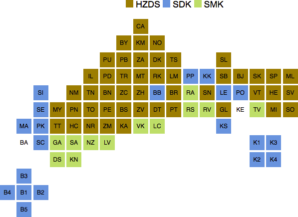
Source: Okresní víťazi parlamentných volieb (pseudo-Demers cartogram), Atd’
+ Bar Charts
I combined a simple Bar Chart with a Tile Grid Map, as I’ve not yet seen any real examples of this chart combination:
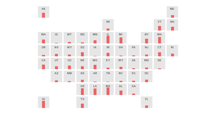
Here’s a variation of a simple Bar Chart that uses full-width bars:
+ Histograms
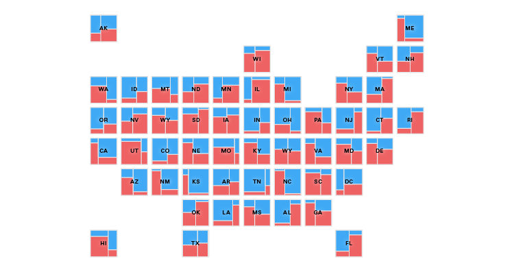
This map by The Washington Post visualises in each US state, the difference between the share of the national population and the state’s share of votes in the electoral college between 1960 to 2016.
In this chart, each bar represents an election year. When the bars are coloured blue and above the line, then that state had gotten a greater share of electoral votes than it does in proportion to the entire US population. Whereas, when the bars are below the line and coloured orange, then the opposite is true.
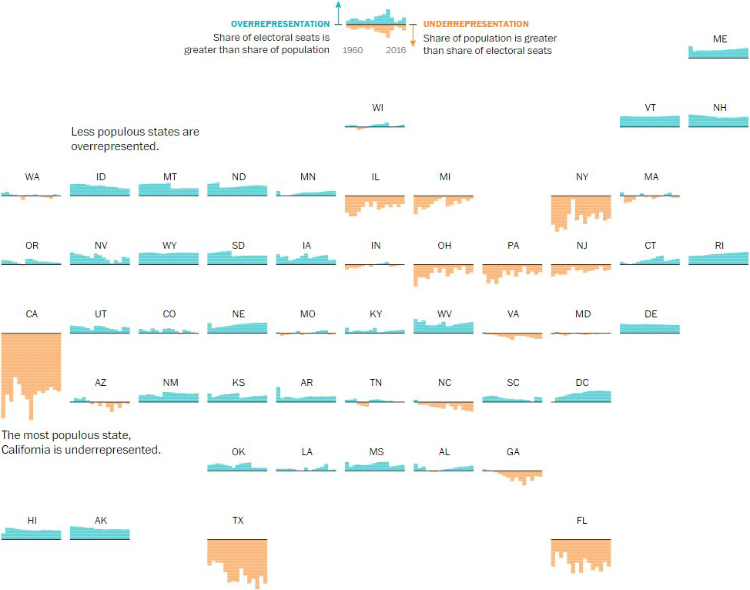
Because of how the Electoral College system is set up, your vote carries more ‘weight’ the less populated the state you vote in is it. Making your vote effectively overrepresented in proportion to the rest of the country’s population.
From looking at this map, you can see by how much the vote in each US states was overrepresented (in blue) or underrepresented (in orange) has changed over time. You can also see that US states with shorter bar don’t have such an extreme disparity in voting power.
+ 100% Stacked Histogram
Here’s another Tile Grid Map related to US elections drawn by Jon Schwabish. Here the ratio between Republican and Democrat presidential voting is visualised over time and across all 51 states.
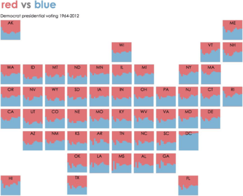
Source: Small Multiple Tile Grid Map, PolicyViz Blog
+ Percentage Bar Charts
In this chart, the bars are used to visualise a part-to-the-whole relationship between each region on the map using multiple 100% Stacked Bar Graphs. Because all the region blocks in a Tile Grid Map are all uniform in size, it allows this kind of variation work.
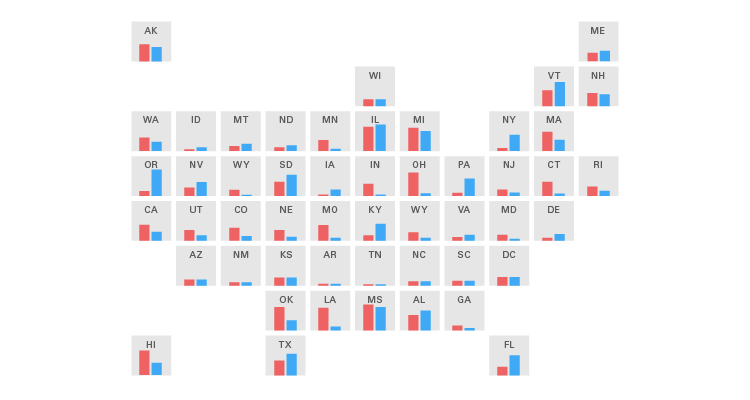
+ Multi-set Bar Charts
Displaying graph symbols on a geographically accurate map can often get cluttered, especially with small regional areas. Because Tile Grid Maps display each region at an equal size, placing graphs such as a Multi-set Bar Chart on each region isn’t an issue.
+ Marimekko Charts
I thought it would be interesting to experiment with having small multiples of Marimekko Charts on a Tile Grid Map.
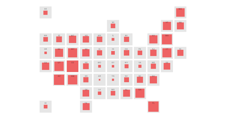
+ Proportional Area Charts
Here, squares are place in each state and their area size is proportional to the value related to that state. Working effectively like a Proportional Area Chart. Circles can, of course, be substituted for squares.
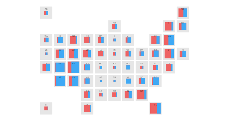
Below, I’ve drawn a variation of the above chart, that also visualises an additional percentage-based variable by splitting the squares into two colours (for each category).
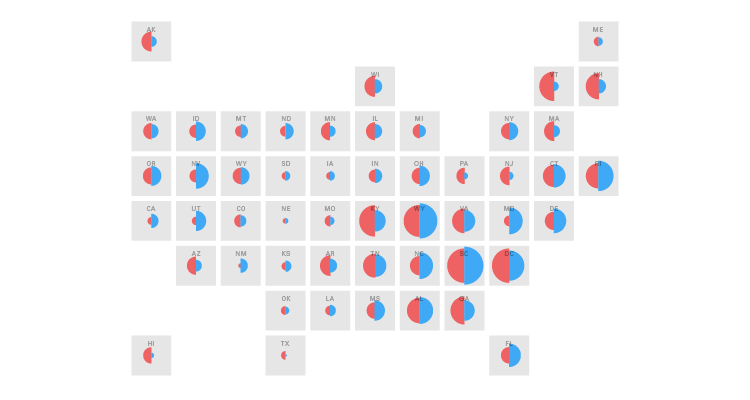
This chart below is still using a shape’s area to visualise values, but the circles have been split in half, where each half (and colour) represents an individual variable. This would make this chart better suited for comparing the proportions of two different variables over a geographical region.
+ Line Graphs
The example map below was from a tweet by Justin Wolfers. In this chart, Wolfers has visualised the change in unemployment over time (2004 to 2016) across the United States.
If you use Stata and want to generate this chart, then Jon Schwabish has a guide here.
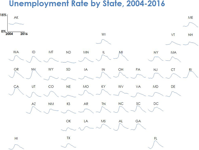
Source: Justin Wolfers
The below map has taken the uses of Line Graphs a step further and has visualised a multi-series chart on flu activity in the US. Here, each line represents a year (from 2003 – 2018) and the current year is highlighted in red.
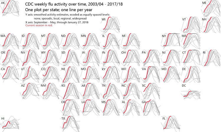
Source: Updated US flu activity trends, r/dataisbeautiful
+ Area Graphs
Matt Chambers created a map that visualises the most visited US national parks using small multiples of Area Graphs.
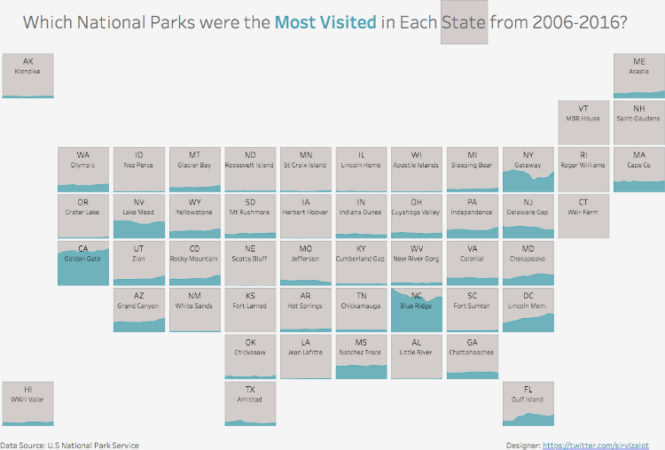
Source: Makeover Monday: Most Visited National Parks by State 2006-2016, Sir Viz-A-Lot
Matt has also drawn a 100% Area Graph version of a Tile Grid Map on his post on Republican and Democrat voting patterns:
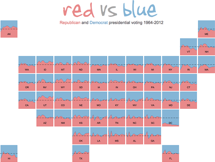
Source: How To: Small Multiple Tile Map in Tableau, Sir Viz-A-Lot
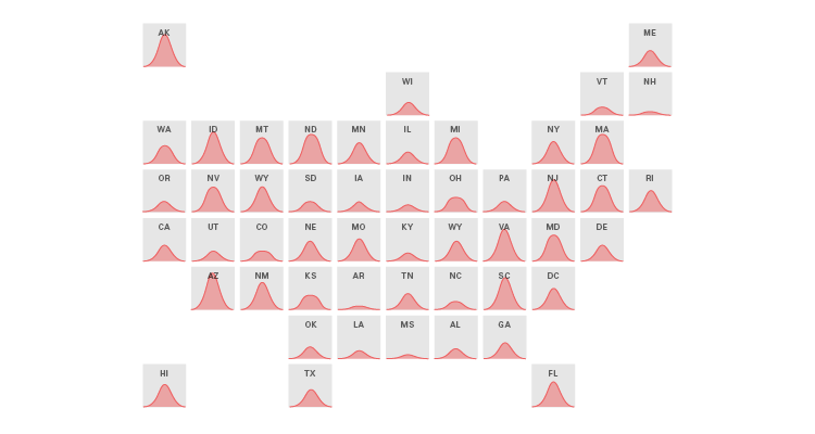
+ Density Plots
If it’s possible to use Area Graphs, then for sure Density Plots could be applied to a Tile Grid Map to visualise the different data distributions across a country.
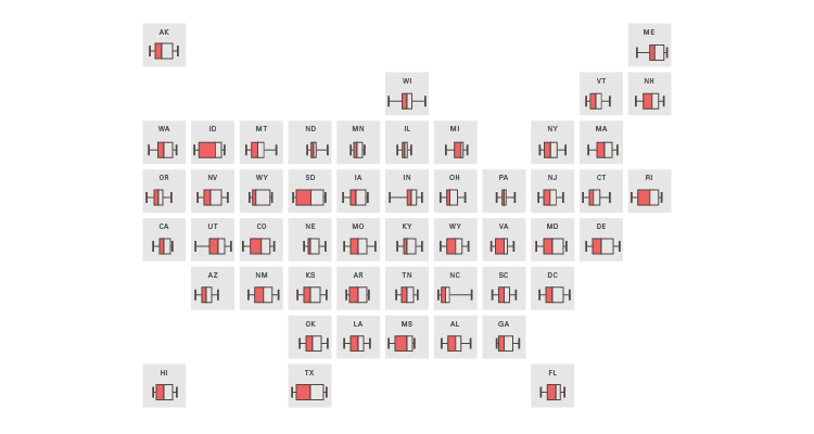
+ Box Plots
You could also use Box Plots to visualise distribution data over geographical regions:
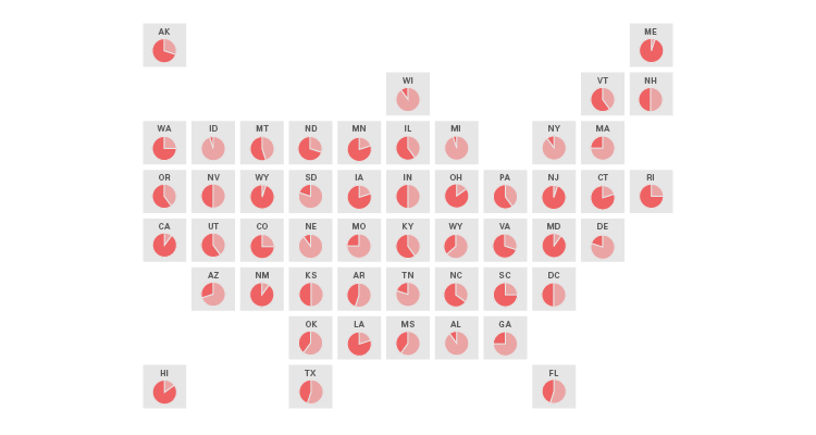
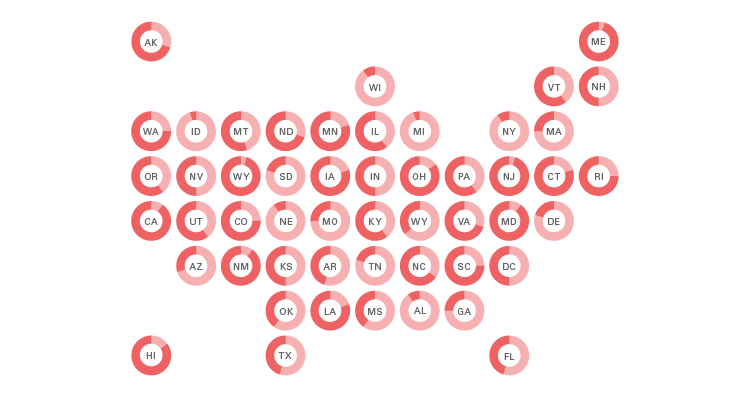
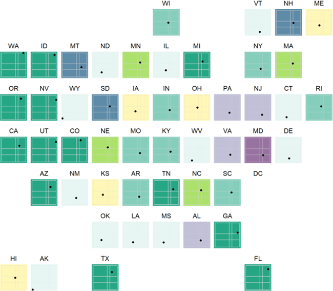
+ Pie Charts and Donut Charts
Small Pie Charts can fit on well to a Tile Grid Map, but only when you limit the number of slices to two:
You can slice out the centre and place the state names inside of Donut Charts, however, the slices are now harder to compare to each other:
+ Waffle Charts
A better alternative to using Pie or Donut Charts would be to use a Waffle Chart instead. The ONE Campaign published this map of Africa in a feature that explains why access to the internet is key to getting people, especially girls and women out of poverty.
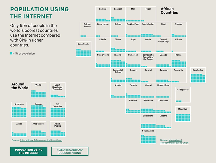
Source: Making The Connection: How The Internet Can Help End Extreme Poverty, one.org
If you want to create this chart, then I’d recommend checking out Jon Schwabish’s guide on how to replicate it in Excel.
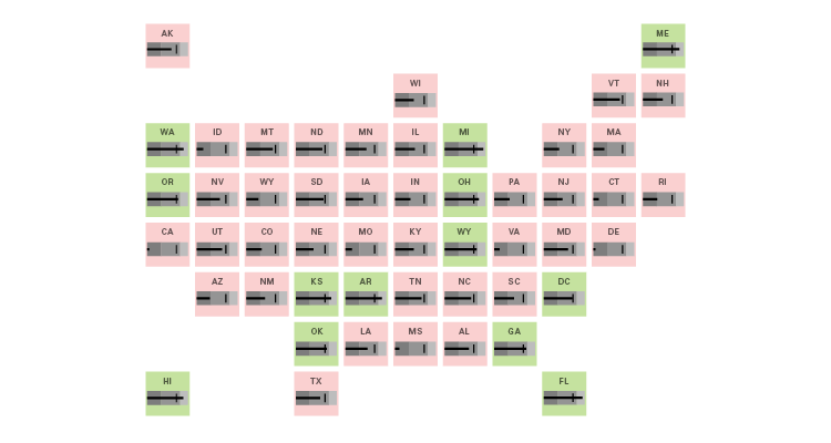
+ Bullet Graphs
Performance data can be visualised geographically by combining a Bullet Graph with a Tile Grid Map. In the example below, each target range is brightly coloured in order to be better read at a small size. To keep things consistent, the quantitive range scores and comparative measure for the target value are the same across all states.
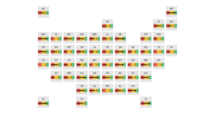
However, in order to quickly see which states have hit their targets, I came up with a variation that colours the state blocks red when they miss the target and green when they reach or pass the target. The quantitative range scores are greyed out to avoid too much colour-coding.
+ Unit Charts
Icons or small shapes such as dots can be used to visualise small amounts of discrete data on a Tile Grid Map. Much in the same way you do with Unit Charts, Dot Matrix Charts or Pictogram Charts.
In the example below from Bloomberg, a dot is used to represent each lawsuit that has been placed against the Trump administration by attorney generals in each state.
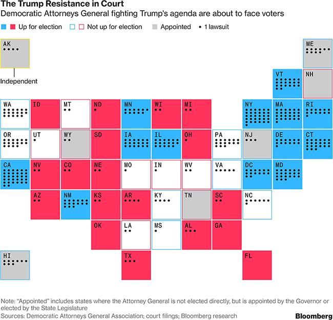
Source: Blue State AGs Fight for Their Jobs While Fending Off Trump, Bloomberg
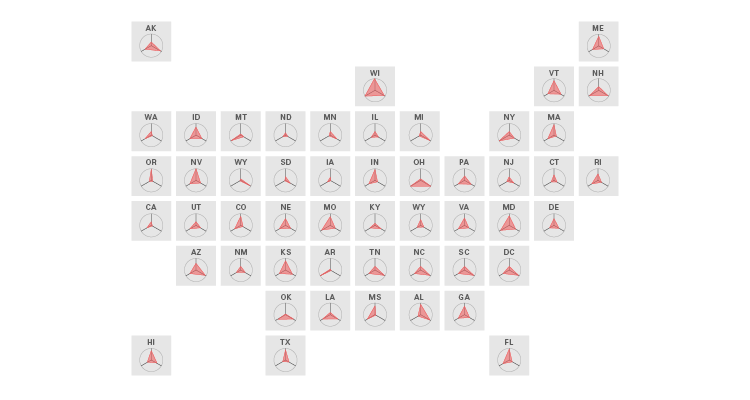
+ Radar Charts
One way to visualise multi-variable data on a Tile Grid Map could be to use Radar Charts. However, these charts would need to be made as simple as possible by not adding in too many variables or polygons.
+ Chernoff Faces
Another way to display multi-variable data could be through the use of Chernoff Faces. In the below example, the variables visualised are:
- Health uninsured rate (face colour)
- Unemployment rate (eyebrows)
- Percentage of adults over 25 with a bachelor’s degree (eye size)
- Percentage getting enough sleep (bags under eyes)
- Poverty rate (mouth)
- Obesity rate (chin)
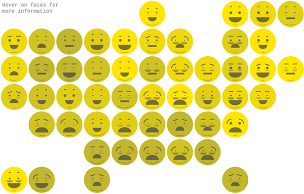
Source: The Emoji States of America, Axios
Although not technically Chernoff faces, the chart below uses smileys to show which countries are the happiest:
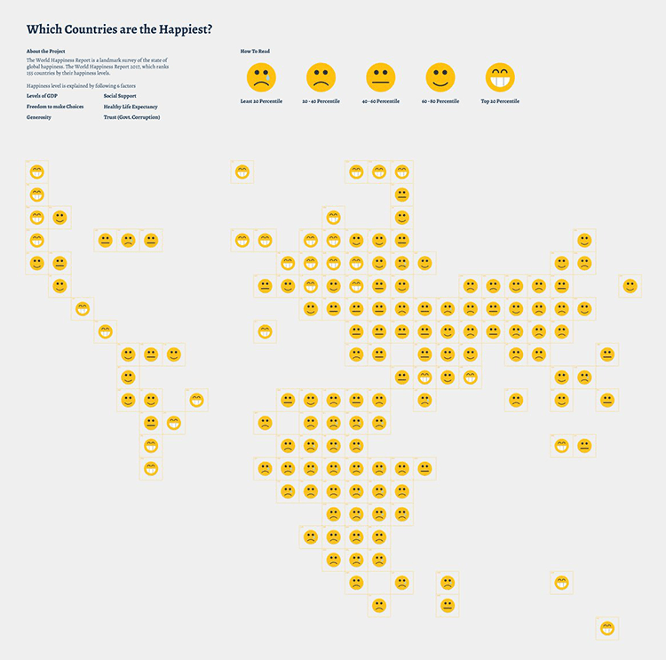
Source: Mustafa Saifee
+ Happiness Flowers
Here’s a variation of the previous chart, which uses a custom chart design to display in detail the metrics that related to how happiness in a country is measured.
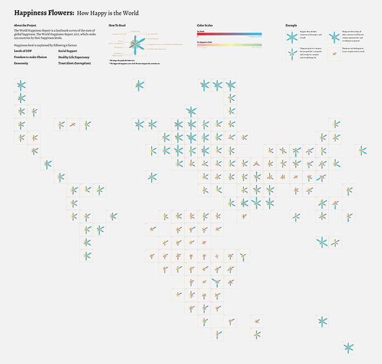
Source: Mustafa Saifee
+ Bivariate Tile Grid Map
I’m not familiar with this type of chart, but somebody used it together with a Tile Grid Map:
Source: Xenographics
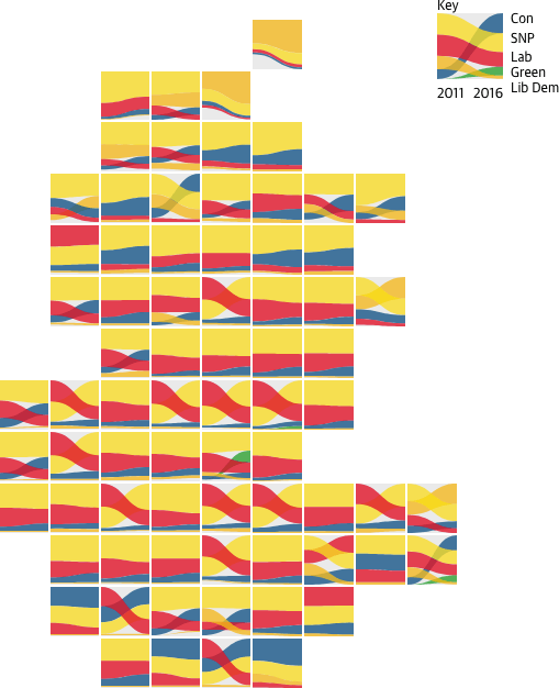
+ Alluvial Diagrams
This map by The Guardian visualises the change in the percentage of vote share in Scotland for the main five political parties between the years 2011 and 2016.
Source: Holyrood elections see the rise of ‘Team Ruth’ and demise of Labour vision,
The Guardian
As you can from this map, the Labour Party lost a lot of ground in those few years. This particular variation of a Tile Grid Map seems to be good for comparing the changes between two time periods and also the proportions between them.
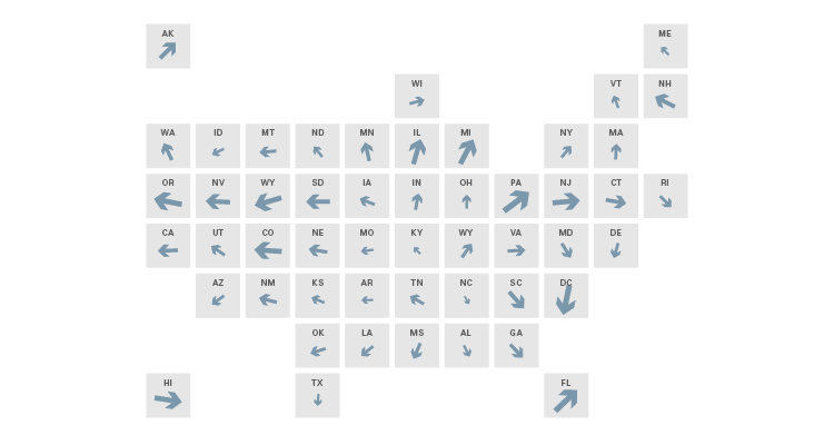
+ Wind Map
This variation could be used to visualise the wind strength and direction across geographical regions:
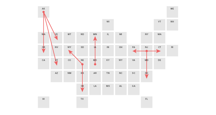
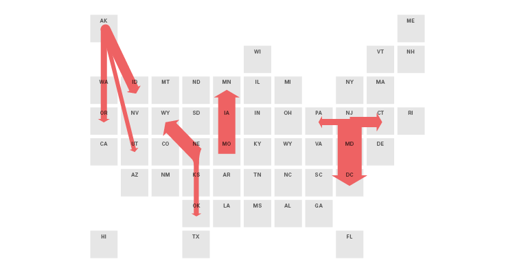
+ Connection Map
If Connection Maps were to be in the Tile Grid Map format, then I believe they would look something like this:

To visualise the direction of the connections, for example, to show movement, then arrows can be applied:
You can also add magnitude to the map and convert it into a Tile Grid Flow Map:
If you interested in reading more about Tile Grid Maps and how to draw them, then you should check out Jon Schwabish’s blog. He’s written a lot about this chart type and how to construct it in MS Excel.

