 Page top
 Previous
 Homepage
 Next
Next
Radar Chart
Description
Also known as: Spider Chart, Web Chart, Polar Chart, Star Plots.
Radar Charts are a way of comparing multiple quantitative variables. This makes them useful for seeing which variables have similar values or if there are any outliers amongst each variable. Radar Charts are also useful for seeing which variables are scoring high or low within a dataset, making them suited for displaying performance.
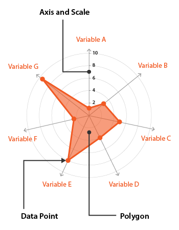
Each variable is provided with an axis that starts from the centre. All axes are arranged radially, with equal distances between each other, while maintaining the same scale between all axes. Grid lines that connect from axis to axis are often used as a guide. Each variable value is plotted along an individual axis and all the variables in a dataset and connected to form a polygon.
However, there are some major flaws with using Radar Charts:
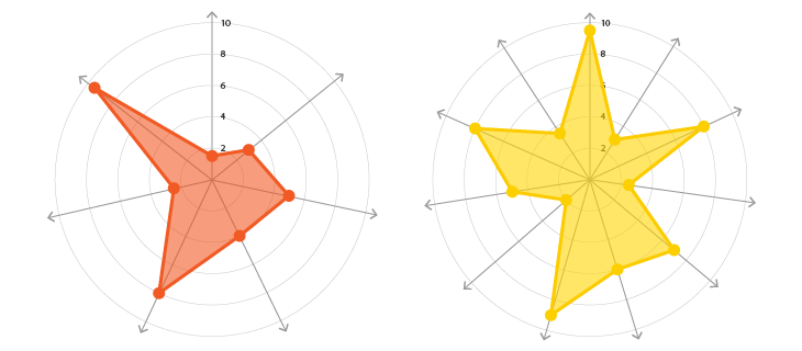
Having multiple polygons for each data series in one Radar Chart can make it hard to read, confusing and too cluttered. Especially if the polygons are filled in, as the top polygon covers all the other polygons underneath it. Transparency can remedy this problem, but having too many polygons will still produce a chart that is overcluttered.
Having too many variables creates too many axes and can also make the chart hard to read and complicated. So it's good practice to keep Radar Charts simple and limit the number of variables used.
Another flaw with Radar Charts is that they’re not so good for comparing values across each variable. Even with the aid of the spiderweb-like grid guide. Comparing values all on a single straight axis is much easier.
Functions
Anatomy
Similar Charts

Tools to Generate Visualisation
Code-based:
amCharts (JS)
AnyChart (JS)
Apache ECharts (JS)
Chart.js (JS)
Froala (JS)
FusionCharts (JS)
Highcharts (JS)
jChartFX (JS)
JSCharting (JS)
Nadieh Bremer’s Block (D3.js)
Plotly (Python)
Python Graph Gallery (Python: matplotlib)
R Graph Gallery (R: fmsb)
Vega
ZingChart (JS)
Webapp:
Columns.ai
Flourish
Google Docs
Chartle
Vizzlo
Desktop App:
Adobe Illustrator
Apple Numbers
Microsoft Office, PowerBI

