In this Further Exploration post, we will look through some variations of the classic Bar/Column Chart.
Previously, I had already produced a significant number of reference pages on other Bar/Column Chart variations such as the Multi-set Bar Chart, Stacked Bar Chart, Radial Bar Chart, Radial Column Chart, 3D Bar Chart, Bullet Graph, and Span Chart. However, there are still quite a few other variations of the Bar/Column Chart that I had not covered, which are now listed in this post.
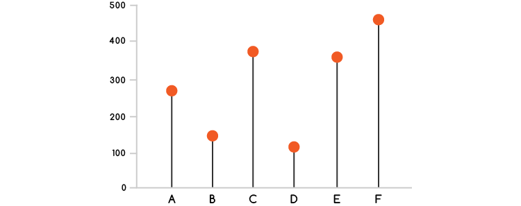
Lollipop Chart
As the name suggests, this chart resembles the hard candy on a stick and is used as a more eye-candy alternative to a Bar/Column Chart. Lollipop Charts plot a small, often colourful circle, plotted against a value axis while having a line that connects each circle to the category axis.
It’s often claimed that Lollipop Charts provide a better alternative to a Bar/Column Chart when all of the values in a data set are high. This is because a Bar/Column chart containing all tall bars is more visually domineering than the thin lines of a Lollipop Chart, which is easier on the eyes and reduces the amount of ink (or pixels) on the chart.
However, critics of this chart mention that it is less precise in reading values off of because the circle extends beyond the value it presents. Plus, it’s not always clear to those unfamiliar to Lollipop Charts whether it’s the end edge of the circle or its centre which is used to represent the value. Also, the straight edge of a bar is easier for the eye to scan across to the axis than a circle’s round edge.
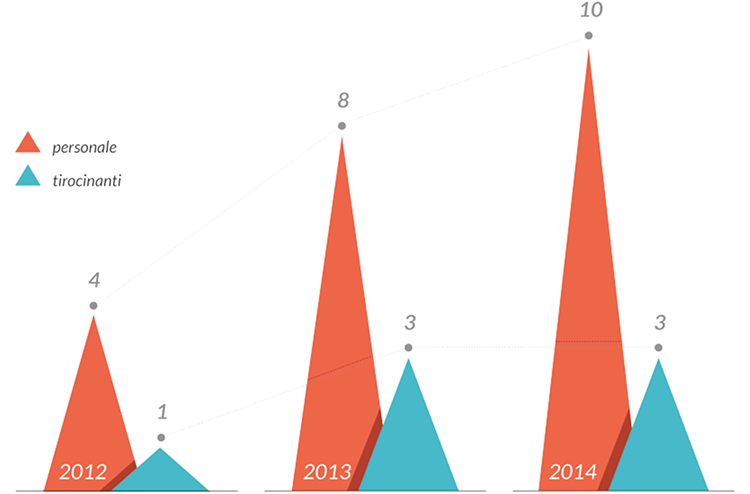
Triangle Bar Chart
This novel variation of a Bar/Column Chart simply uses the height of a triangle as a substitute for bars. The downside to using this is that the small, top tip of a triangle is not as good at reading values off of then a bar’s straight edge. But you could always remedy this by adding value labels on the end like in the example below:
Source: The Visual Agency
Curved Bar Chart
This is another novel variation, which uses the height of a curved shape that is proportional to the data values it represents.
Source: SlideBazaar
Back-To-Back Bar Chart
Also known as Paired Bar Chart, Butterfly Chart, Tornado Chart, or Deviation Bar Chart.
Not to be confused with a Population Pyramid Chart, which is, in fact, a back-to-back pair of Histograms. Back-To-Back Bar Charts instead a split pair of Bars that visualise a diverging set of categorical dimensions for a compare and contrast effect.
The bars on this chart can also be segmented or stacked to display a part-to-a-whole breakdown of the quantitive values. The chart below from the Pew Research Center is a good example of this:
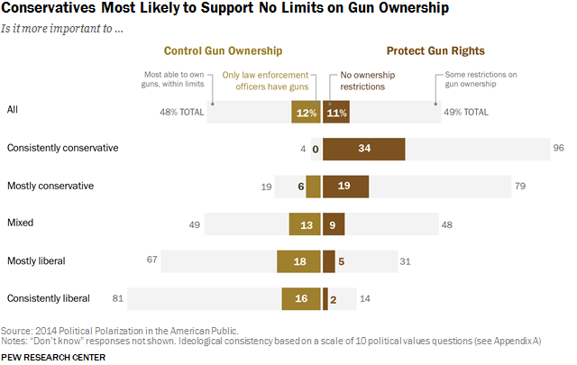
Source: Conservatives Most Likely to Support No Limits on Gun Ownership, Pew Research Center
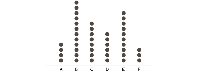
Unit Chart
This chart is very similar to a Pictogram Chart, however, instead of using more detailed icons, a Unit Chart uses simple shapes to display quantities. Here, each shape represents a unit (a single circle = 10 for example).
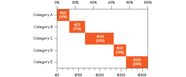
Progressive Bar Chart
Also known as Stepped Bar Chart, Step-by-Step Bar Chart, or Staggered Bar Chart.
A Progressive Bar Chart is essentially a 100% Stacked Bar Chart but with the individual segment bars displaced vertically or horizontally (depending on chart orientation) from each other. This displacement is done to add more visibility and focus to the individual segments, while still conveying a part-to-a-whole relationship between all of them.
Waterfall Chart
As known as Flying Bricks Chart or Mario Chart.
Originally popularised by the strategic consulting firm McKinsey & Company, Waterfall Charts help illustrate the cumulative effect of incrementally introduced positive or negative values. These values can be either category or time-based.
Waterfall Charts are commonly used in finance as an analytical tool to reveal and communicate the changes in revenue or profit over a time period for a particular financial entity.

Source: Wikipedia
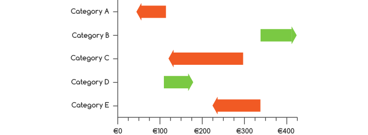
Change Bar Chart
This chart displays the amount of change between the before and after data points in the dataset. So the flat edge of the bar represents the before/start data point and the after/end data point is represented with an arrow edge, which helps to show the direction of change. Colour-coding can also be used to show where there has been an increase or decrease. Additionally, value labels can be added to each bar to display the amount of change.
Pareto Chart
Although strictly speaking this chart is just a combination of a Bar/Column Chart and Line Graph, a Pareto Chart is usually identified as a chart of its own. The bars are used to show the individual values in the dataset organised in descending order, with its value scale being displayed on the left axis. The line plotted represents the cumulative total with its axis being on the right side.
Pareto Charts are used (typically in quality control) to highlight what is important within a (usually large) set of factors. So for example, a Pareto Chart is useful in detecting and locating the most common source of defects or flaws within a product or service.

Source: Wikipedia
Column Sparkline
This chart is basically a variation of a Sparkline that uses bars instead of lines to visualise values.