 Page top
 Previous
 Homepage
 Next
Next
Population Pyramid

Description
Also known as an Age & Sex Pyramid.
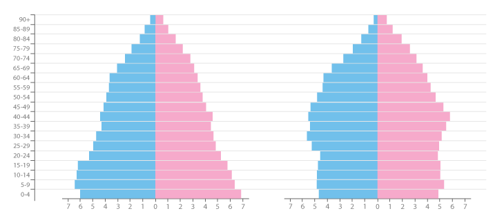
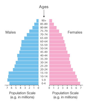
A Population Pyramid is a pair of back-to-back Histograms (for each sex) that displays the distribution of a population in all age groups and both sexes. The x-axis is used to plot population numbers and the y-axis lists all age groups.
Population Pyramids are ideal for detecting changes or differences in population patterns. Multiple Population Pyramids can be used to compare patterns across nations or selected population groups.
The shape of a Population Pyramid can be used to interpret a population. For example, a pyramid with a very wide base and a narrow top section suggests a population with both high fertility and death rates. Whereas, a pyramid with a wider top half and a narrower base would suggest an ageing population with low fertility rates.
Population Pyramids can also be used to speculate a population’s future development. An ageing population that is not reproducing would eventually run into issues such as having enough offspring to care for the elderly. Other theories such as the “Youth Bulge” state that when there’s a wide bulge around the 16-30 age range, particularly in males, this leads to social unrest, war and terrorism.
This makes Population Pyramids useful for fields such as Ecology, Sociology and Economics.
Functions
Anatomy

Tools to Generate Visualisation
Code-based:
amCharts (JS)
AnyChart (JS)
Vega
Vega-Lite
ZingChart (JS)
Webapp:
Datylon
Flourish
Desktop App:
Tableau


