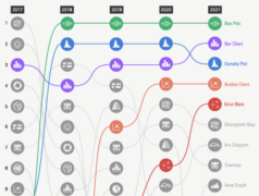
Reviewing the website statistics for the past year to see which chart reference pages are the most popular.

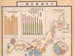
Exploring some historical examples of Japanese data visualisation and the charts that were invented there.
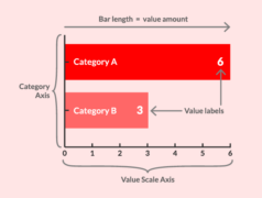
Demonstrating the potential new content structure being implemented on the Bar Chart visualisation reference page.

Recently I’ve been thinking about changing the content on the site and how to structure it…
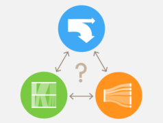
An attempt at clarifying their differences.
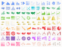
For a while, I had been sitting on a load of chart icon designs, which just needed to be adjusted to the right format and […]

Which chart type do I select to communicate a particular message and/or analyse the property of a dataset?

Explaining the lack of activity on the website and where the project stands.

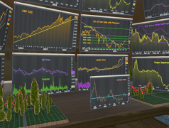
Also, demonstrating the usefulness of VR in multi-dimensional data analysis and finance.

Looking at projects that have used 3D Treemaps that use extrusion to visualise an additional variable.
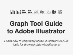
Learn to master the Graph Tools in Adobe Illustrator for infographic and data visualization work.
Continuing on at exploring 3D Treemaps, this post takes a look at Treemaps that use spheres or cyclinders in their design.

Here we’ll explore whether this claim is correct and what evidence exists.
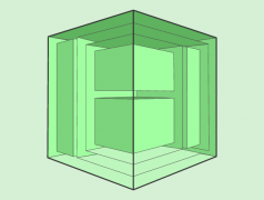
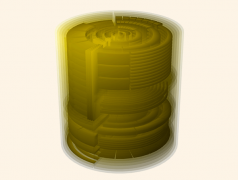
Looking through 3D Treemaps that use a cube design, such as the Information Cube, the Treecube, and the Magic Treemap Cube.

Does VR enable more natural interactions with data? Is there any effect on analysis?

