Below is a guest post from Andy Maggio, the founder of DataView VR. He’s here to explain his vision of the future with dashboards and workspaces from utilising virtual reality (VR) technology. Andy will also demonstrate how VR can be useful in multi-dimensional data analysis and in the financial industry.
During my 14 years at Morgan Stanley as an investment analyst, by far my biggest challenge was trying to process the incredible amount of data and information that was available to me daily. Even though I had charts and dashboards at my disposal, it was still tough to make sense of it all. Especially when it came to multi-dimensional data.
Then in around 2016, I first started using VR hardware and from there I had two thoughts: first, that VR is going to be the most revolutionary technology of my lifetime; and second, that VR can make the process of data analysis and presentation much easier (especially in my job as an investment analyst).

Specifically, I believed VR could make data analysis faster, more effective, significantly improve my information organization capacity, and make the presentation of my analysis much clearer and memorable. Also, not to mention the fact that VR can drastically cut travel expenses by allowing you to work remotely.
So over the last two years, I put together a team that has endeavoured to create a product that accomplishes this vision.
The end result was DataView VR, a comprehensive VR based workspace, which harnesses VR, AR and AI in an immersive space that is designed specifically for analysts to provide them insights into complex data, improve productivity, and facilitate virtual collaboration. I believe DataView VR is the next step in the evolution of analysis and presentation software.
DataView’s “Workspace of the Future” is a virtual desk space that provides a combination of two-dimensional and multi-dimensional tools and displays in order to facilitate deeper, faster analysis.
I’ve implemented DataView in my own work and find it an excellent way to organize investment information, do data discovery and create predictive models. I feel it has both saved me time and allowed me to come to more profound conclusions. That being said, I did design the product to specifically address frustrations I had as an analyst.
Of course, when we speak with potential users, inevitably we are asked about specific applications of this platform. How can VR actually improve investment analysis?
Well, let me demonstrate to you a couple of examples of how DataView VR users are currently leveraging the platform.
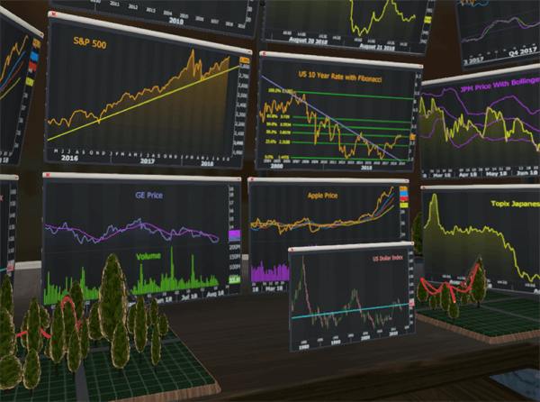
The HyperDesk
In DataView VR, the “HyperDesk” is a saveable 18-monitor display that provides a great way to organize displays and then refer back to (and present) information about specific topics.
For example, an investor might have a saved HyperDesk configuration that is solely devoted to the Chinese Economy. It would include live feeds showing various relevant performance charts, custom charts, local news feeds and social media.
Over the course of the day the investor can also jump from the “Chinese Economy” room to a “Eurozone” room configuration, then after to a “Portfolio Performance” room showing price charts for all active positions. This allows for flexibility when working and is something impossible to do with a physical desk.
Give Presentations Anywhere
VR also opens an entirely new frontier of communication and presentation. For example, perhaps a client wants an update on an analyst’s work on a specific stock. The analyst can simply invite the client into the DataView VR Hyperdesk and have an immediate, face-to-face interaction, showing off research that combines both 2D and multi-dimensional analysis.
Better Display of Multi-dimensional Data
An important caveat: it’s much easier to view and work with multi-dimensional representations in VR than on a flat screen. DataView VR allows users to create multi-dimensional data representations in VR.
In the videos below are examples of specific applications of the platform when displaying multi-dimensional data. Using video is a pale representation of an immersive VR environment, but it can still give you a sense of the functionality. However, bear in mind that VR is really something that needs to be experienced to be fully understood.
Application #1: Searching for investment ideas based on multiple criteria
Here, each object in a visualization can represent a stock, and the characteristics of that stock communicate whether that stock is cheap vs history, whether its margins are depressed, whether it has strong earnings growth, whether it has a high dividend yield, what sector it is in, whether it has excessive leverage, etc.
It’s very intuitive for an investor to search for graph objects that are tall, fat, in a certain quadrant, of a certain
Application #2: Creating and visualizing multi-variable relationships, which is particularly useful in creating predictive models
To build a model to predict US corporate earnings growth, a user can input history for several dozen macro factors into DataView. After, a few things will happen:
- DataView’s AI engine will automatically tell display 3-6 variables that have best predicted US earnings growth (after allowing the user to impose any restrictions on the data).
- The user can actually see the output of the model in multiple-dimensions.
- DataView provides relevant regression statistics related to the model and relevant 2D charts for reference.
The multi-dimensional visualization aspect of this process is powerful because there are certain investment relationships that are very important, but that simply can’t be seen unless it is possible to view more than two variables simultaneously.
VR drastically increases the effectiveness of multi-dimensional displays, which are very difficult to work with and understand on flat screens.
In this US corporate EPS model example, the USD dollar is an important historical driver of US EPS growth. However, in a 2D chart of the USD YoY vs EPS YoY like the in scatterplot below, you can’t see as much of a relationship.
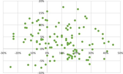
In contrast, a VR multi-dimensional display that includes US GDP growth, the USD, and other macro factors, allows a user to very clearly see that a weak dollar drives stronger earnings when controlling for economic growth.
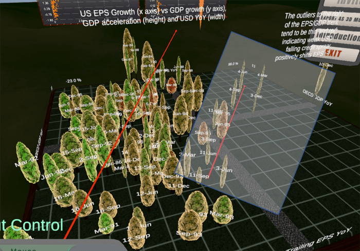
You can see that trees move from bottom left to top right because EPS growth correlates with GDP growth (EPS on X, GDP on Y). To the right of this trendline you can see a string of skinny trees: the skinnier the tree, the weaker the dollar was in that quarter. The weak dollar shifts the EPS/GDP relationship to the right, showing that a weak dollar boasts EPS growth.
This type of visualization allows decision makers to more confidently act on their predictive models, as the model becomes something that can be seen rather than just an equation on a page.
Application #3: Quickly understanding market performance dynamics
In a multi-dimensional display, a user can quickly see many aspects of the performance of a portfolio of stocks.
For example, for each stock in the S&P 500, performance can be overlaid simultaneously with several factors, providing a quick answer to questions like:
- What’s been driving out-performance/under-performance?
- Is EPS growth relevant right now?
- Is a market cap a driver?
- Is performance concentrated in specific sectors?
- Is momentum important?
- Are investors hiding in safe stocks?
And so on.
I strongly believe that VR, AR and AI are going to revolutionize the way that people interact with data and information over the coming years. So right now I’m working hard to make this transformation a reality for investment professionals like myself.