2019 has been a busy year for me, hence the lack of posts on this blog. I’ve had a couple of fantastic opportunities to develop some data visualisation learning materials. However, I would still like to continue producing content for this blog and not neglect it.
But now that 2019 is over, I had to take the time to cover the most popular chart reference pages on this website for the year. Also, we’ll explore some of the data from the previous years and how the popularity of each chart reference page has changed over time.
The data for this post uses the website’s analytics page views statistics from 1st January 2019 – 31st December 2019, and the previous years follow the same date range. Also, the data is only taken from the English language reference pages.
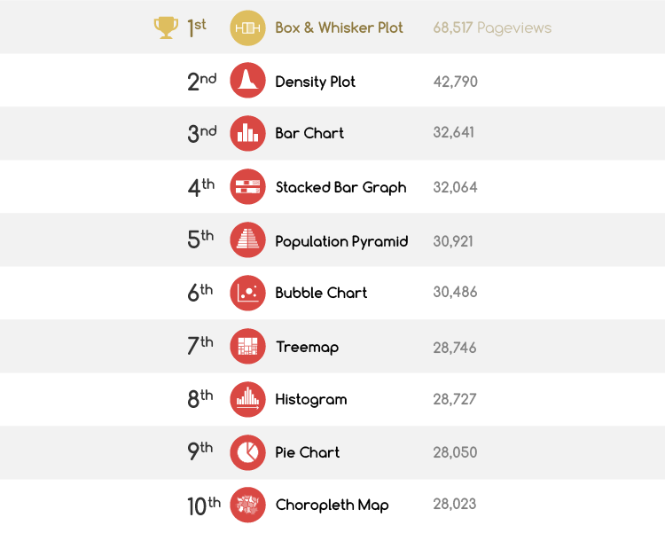
So here are the top ten chart reference pages for 2019:
However, how do these results compare to the previous year? Below is a table with some statistics between the two years:
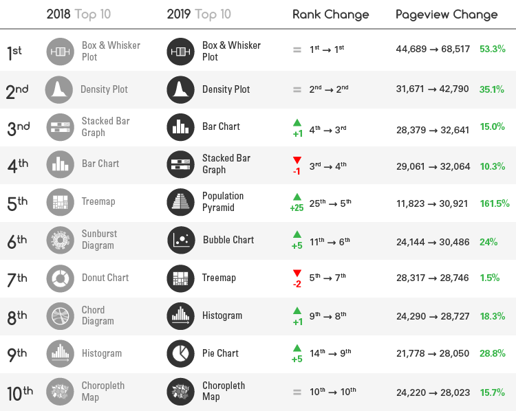
Straight away you can see that the Box & Whisker Plot and Density Plot reference pages have still maintained their 1st and 2nd place positions from the previous year. The Bar Chart and Stacked Bar Graph reference pages have switched positions, but are still at the top with 3rd and 4th place.
Overall, there hasn’t been a major change in positioning – apart from the sudden jump in popularity for the Population Pyramid reference page, which had an increase of 162% in page views from last year. This allowed the Population Pyramid page to jump a whopping 25 places to 5th place for 2019.
If we look at a chart of the daily page views for this page over the entire year (2019), you can see a sudden spike on 28th September, which has contributed to an overall increase in page views for the rest of the year:
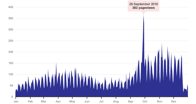
After digging around on Google Analytics to find the cause of the spike, I found that the traffic coming in on 28th September comprised of:
- 84% new visitors to the site.
- 95% organic traffic from Google.
- 87% of people coming from India who were mostly around the ages of 18-34.
Apart from this, I don’t have any more information on the source of the influx. If I were to take a guess, then it must have come from a university lecture or course based in India.
Returning to 2019’s top ten charts, here’s a look at the yearly change in page views for 2017, 2018 and 2019:
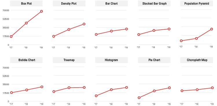
The page views of the Box & Whisker Plot page has just continued to skyrocket over the past 3 years, while the Density Plot page has been steadily increasing as well. The rest have slowly increased in comparison and the Choropleth Map page has been almost stagnant over the years.
If we view the same data but in the view of a Bump Chart, we can get a better view of how the rankings have changed over the 3 years:
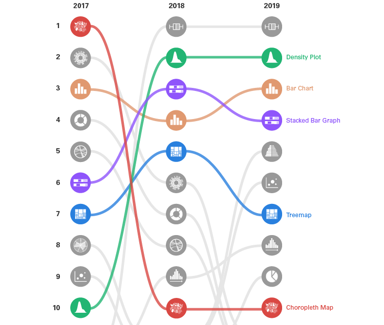
As you can see, only five charts (Bar Chart, Density Plot, Choropleth Map, Stacked Bar Graph and Treemap) have been able to stay in the top 10 over a 3-year period. The rest have either fallen off at some point or have jumped up from lower positions.
. . .
So I hope that this was interesting. I certainly found it fun to go through this data and generate some charts with it. I actually rarely look at the website’s analytics data, so this is a great excuse to do so as there is some purpose to it.
Happy New Year!
Related posts:

