Many of us in the western data visualisation community may think of data visualisation as a field that primarily emerged out of the West. If you were to name key historical practitioners of data visualisation, likely, the names Charles Joseph Minard, Florence Nightingale, William Playfair or Charles Dupin come to mind.
But you’re unlikely to know that the Japanese have been using charts since the 1800s to aid in market trading. There’s also some beautiful and complex visualisations and infographics produced in Japan in the 1900s.
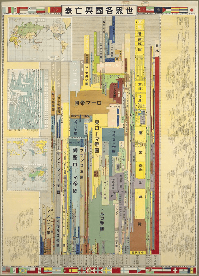
One such example from 1926 is this chart by Hosuke Nagase, whose title has been translated as World’s Rise and Fall Table:
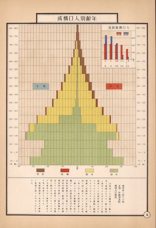
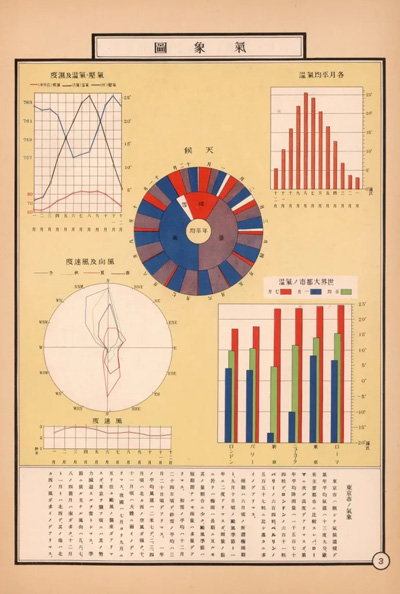
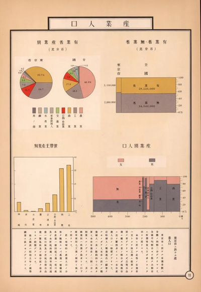
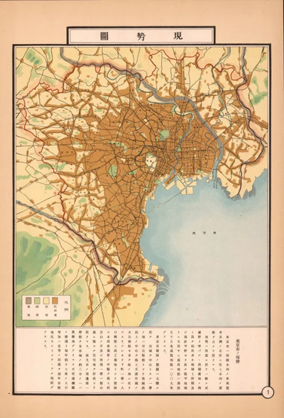
In 1935, The City of Tokyo published the Tokyo Shisei Zuhyo, a statistical atlas of the city of Tokyo at the time. It was printed at Kyodo Print Co. Ltd. under Kokichi Ohashi (it’s unclear who was the designer). This Atlas made use of Isotype to produce an amazing collection of maps and charts, which provided a detailed view of pre-war Tokyo. David Rumsey has an online collection of Ohashi’s work, which you can view in detail here.
So far, much of the research on data visualisation history has documented mainly the works of authors from Western nations. This is a problem due to a few factors, such as interest in data visualisation history being a recent phenomenon with very few individuals engaging in it.
Another barrier to researching is language. Japanese for example is a difficult language to learn, especially for English-speakers. Any research into Japanese data visualisation history would require the help of someone from Japan or a fluent Japanese speaker, who also lives in the country.
Any research into old charts would also require spending time physically going to libraries or archives to hunt them down. Just researching on the internet using Google translate is not good enough.
But despite these limitations, I’ve managed to find some nuggets of Japanese talent to share with you all. Let’s go through some of the visualisation types that rose out of the Land of the Rising Sun:
The Candlestick Chart
This type of visualisation is commonplace on trading platforms, apps and websites, as it’s a popular tool for trading and analysing price movements over time. Candlestick Charts are also known as “Sakata Charts” after the city Sakata in Japan, from which this chart type is related.
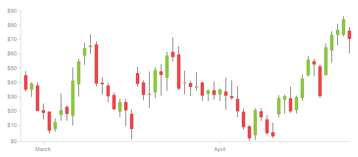
Candlestick Charts were largely unknown to the West until Steve Nison popularised them through his 1991 book Japanese Candlestick Charting Techniques (although Nison mentions that he revealed Candlestick Charts in 1989*).
Munehisa Homma (also known as Sokyu Homna) was a rice merchant from Sakata who is usually attributed to being the “grandfather of Candlestick Charts”. However, there’s hardly any evidence that Homma ever used the chart. Steve Nison, who dedicated a lot of in-depth research into Candlestick Charts and other Japanese charting methods mentions that:
“Although they are shrouded in mystery, the candles probably started in the early part of the Meiji period (from 1868)”
– Beyond Candlesticks, 1994, p. 18
Homma only lived from 1724-1803, so this is way after his death. Nison also mentions that:
“It is more likely that the candle charts we know today and all the techniques associated with them tended to be a process of cumulative authorship by several people over many generations.”
– Beyond Candlesticks, 1994, p. 14
Therefore, the principles that Homma developed heavily influenced the creation of Candlesticks Charts, but so far there is no evidence of a single ‘inventor’.
You can find more on Candlestick Charts on this dedicated page here.
* Japanese Candlestick Charting Techniques, Second Edition, p. 5
The Anchor Chart
This visualisation is considered the predecessor to the Candlestick Chart, but not too much is known about it.
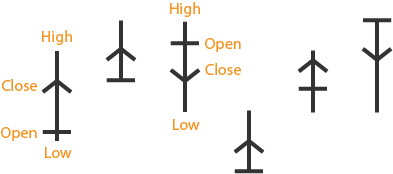
Nison gives some background on Anchor Charts and explains their construction:
“Named as such because it looks like an anchor. Based on the legend, these charts originated in the Kyoho Era (from 1716) from the fact that the usual meeting place for rice traders was port cities.”
“The anchor chart was an important event in the evolution of charting. With this chart, the opening price was now added and created a chart with an open, high, low, and close. Just as important, and something unique to Japanese chart, was that the relationship between the open and close was pictorially displayed. The top and bottom of the anchor’s vertical line are the high and low of that session. The horizontal line of the anchor line is the open. The arrow of the anchor line is the close. If the close is higher than the open, the arrow points up; if the close is lower, the arrow points down.”
– Beyond Candlesticks (1994), p.17
Beyond Nison’s books, I haven’t been able to find any examples of Anchor Charts online, but it would be great to get some real examples of this visualisation.
The Kagi Chart
This is another Japanese visualisation developed as a trading tool. However, unlike Candlestick Charts, Kagi Charts are independent of time, which gives them the advantage of reduced noise and only focusing on significant price changes. Visually, Kagi Charts are constructed quite differently from Candlestick Charts:
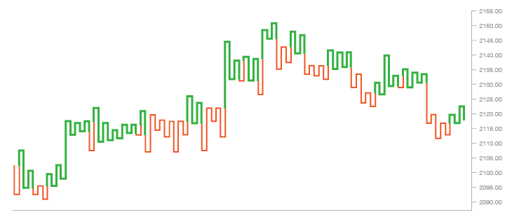
On the origins of the Kagi Chart, Steven Nison states that:
“The Kagi chart is thought to have been created around the time that the Japanese stock market started trading in the 1870s.”
“The name kagi chart comes from the Japanese word “’kagi,” which was an old fashioned key that had an L-shaped head. This is the reason that kagi charts are also called key charts by some Japanese. Other names for the kagi chart include the price range chart, the hook chart, the delta chart, and the string chart.”
– Beyond Candlesticks (1994), p. 213
You can find more on Kagi Charts on this dedicated page here.
The Renko Chart
Like a Kagi Chart, a Renko Chart is a trading tool, that is time-independent and filters out the noise typically found on a Candlestick Chart. Renko Charts use a series of coloured blocks positioned at a 45-degree angle to each other to visualise price movements:
Source: Investopedia
On where the name ‘Renko’ came from, Nison explains that:
“The individual blocks that form the renko chart are sometimes referred to as bricks (the term renko may come from “renga,” which is the Japanese word for bricks).”
– Beyond Candlesticks (1994), p. 197
Further reading on Renko Charts:
- Book: Beyond Candlesticks (1994), Steve Nison, p. 197-207
- Renko Chart Definition and Uses. – Investopedia
- Renko Charts. – StockCharts.
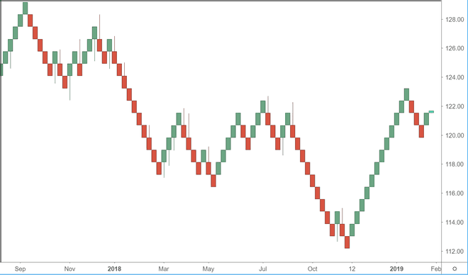
The Three Line Break Chart
This trading tool visualisation was also imported from Japan by Steve Nison and is something between a Candlestick Chart and a Renko Chart:
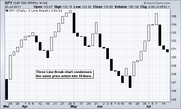
Source: Stockcharts
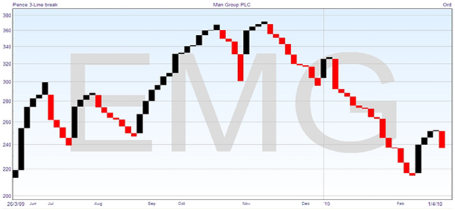
Source: Financial-Bet Spreading.com
More information on Three Line Break Charts can be found:
- Beyond Candlesticks (1994), Steve Nison, p. 167-191
- Three Line Break Charts – StockCharts
- Trading With Three-line Break Charts – Ditto Trade
- Line Break Charts Explained Plus A Simple Trading Strategy – Netpicks
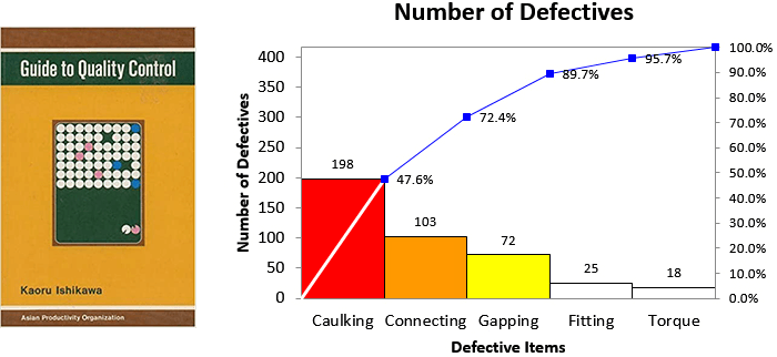
The Pareto Chart?
Unlike all the charts previously mentioned, this visualisation isn’t for market analysis and trading. A Pareto Chart instead is used as a decision-making tool for quality control and optimisation. A Pareto Chart can also be employed in any situation where the goal is to reduce factors in a process to improve it.

But what connection does this visualisation have to Japan? Wasn’t the Pareto Chart invented by Italian civil engineer, sociologist, economist, political scientist, and philosopher, Vilfredo Pareto?
Well actually, no, but he’s definitely the main influence for it.
Pareto was known for his contribution to the development of Elite Theory and the observation that 80% of the wealth in Italy belonged to about 20% of the population.
It wasn’t until management consultant Joseph M. Juran discovered that this observation from political science could be applied to quality control. Juran then coined the term “Pareto Principle”, also known as the 80/20 rule, which redefined Pareto’s original observation into:
“A theory maintaining that 80% of the output from a given situation or system is determined by 20% of the input.”
Since Juran is known for developing this concept in the context of quality control, he is also attributed to being the inventor of the Pareto Chart. However, some have argued otherwise and have presented the argument that Juran wasn’t the first to publish the Bar Chart and cumulative line graph combination that we know today as the ‘Pareto Chart’.
Instead, the credit goes to Japanese organisational theorist and engineering professor Kaoru Ishikawa, whose book The Guide to Quality Control (1968) contained the first published example of a Pareto chart. Ishikawa is also credited for developing the Fishbone Diagram.
Juran visited Japan often over his life and was well acquainted with Ishikawa, so the inspiration for the Pareto Chart didn’t come from nowhere. Just like with the Candlestick Chart, the development of the Pareto Chart was a cumulative effort on the part of Vilfredo Pareto, Joseph M. Juran, Max Otto Lorenz, and Kaoru Ishikawa.

