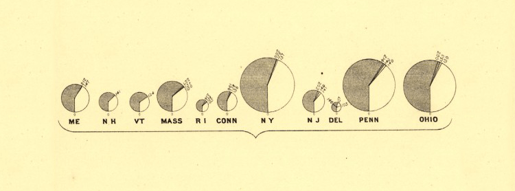
Previously in the last post, I had looked through the different variations of Proportional Area Charts that I knew and had come across while researching for this blog post. But in this post, I wanted to focus primarily on the combination of a Proportional Area Chart with other forms of data visualisation.
Proportional Area Charts have a simple construction (the shape’s area is proportional to the data value that it represents). This makes Proportional Area Charts simple to attach to other charts, as you’re only adding an additional graphical marker, whose visual variable is based on area.
+ 100% Stacked Bar Chart
By combining with a 100% Stacked Bar Chart, the shape area is split into multiple segments to communicate a part-to-a-whole relationship.
In the example below, each square represents a country’s GDP and the amount of that GDP that is debt represented in red. By dividing each square into two parts you can see which countries are in the most amount of debt.
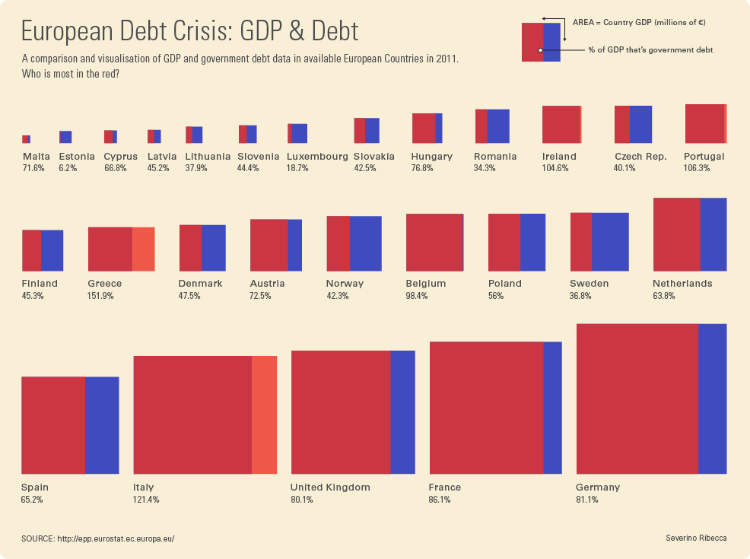
Source: European Debt Crisis: GDP & Debt, Severino Ribecca
I discovered a much earlier iteration of this style of Proportional Area Chart from the Statistical Atlas of the Ninth Census (1870) by Francis A. Walker. Here, the shape areas for each US state are divided based on the proportions of each church domination that is present in that population:
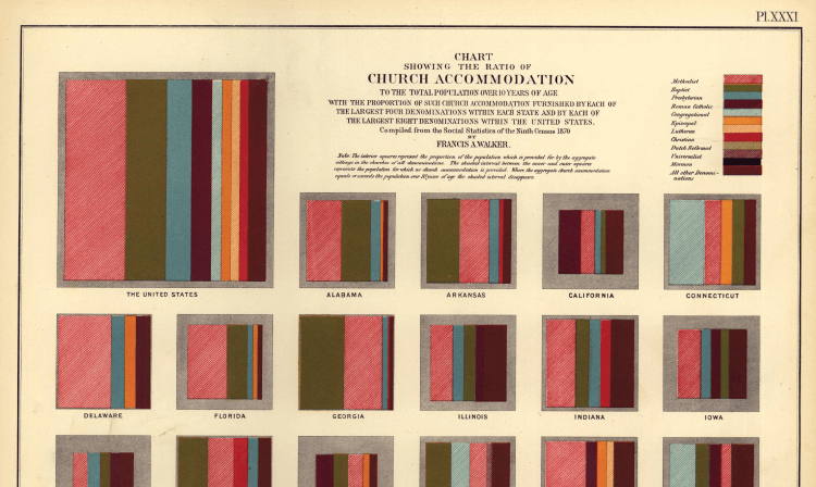
Source: RADICAL CARTOGRAPHY
+ Bar Chart
By combining with a Bar Chart, you can provide an additional variable to the chart, by placing shape areas at the base of each bar.

Below, is part of an infographic titled The Analytical Tourism Map of Piedmont, which has used split Proportional Area Chart together with a Bar Chart to visualise tourism flows in the Italian region of Piedmont:
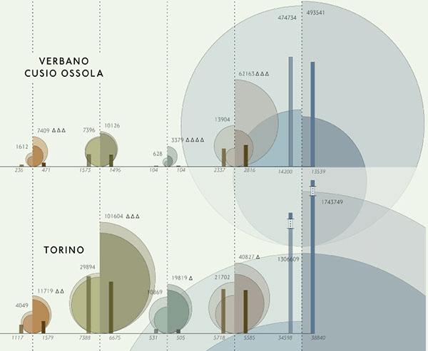
Source: The Analytical Tourism Map of Piedmont, Behance
+ Table / Matrix
You can combine a Proportional Area Chart with a table to form a chart that works as a correlation matrix. This is done by having a categorical dimension for the rows and another in the columns and drawing shape areas within the table cells where the two categories intersect. In the example below, the size of the circles is relative to the amount of time each team spent on a given task:
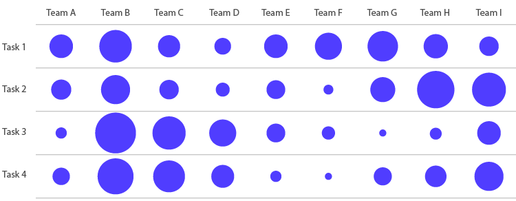
This chart can be useful for discovering correlations between two categories or variables and for finding patterns in the data.
+ Heatmap (Matrix)
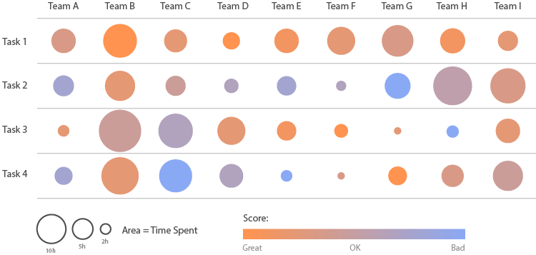
We can add an additional variable to the previous chart by varying the colours of the shape areas relative to that additional variable (like in a Heatmap).
+ Calendar
Combining with a Calendar works in the same way as in with a table. Shapes areas are placed within each date cell to visualise values occurring on a particular date. Here, you can see how values change over a particular month. An additional variable can be displayed by varying the shading or colouring of each shape area in proportion to the variable. You can find other forms of data visualisation combined with a Calendar here in this post.

+ Illustration Diagram
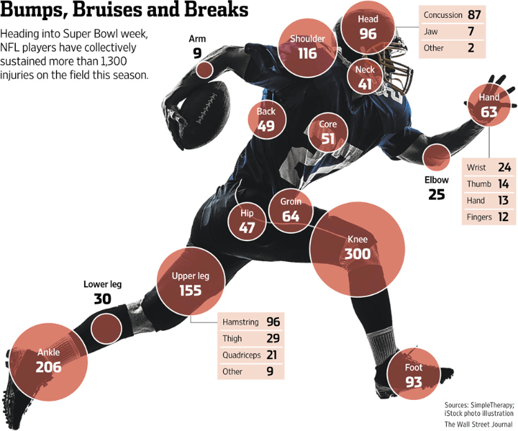
Proportional Area Charts can be overlaid over illustrations or photographs to provide more information on a subject, producing an Illustration Diagram that can display quantitive values. In this example below from The Wall Street Journal, circle areas are displayed over parts of the NFL player’s body to illustrate where injuries occur the most.
Source: The Wall Street Journal
+ Map
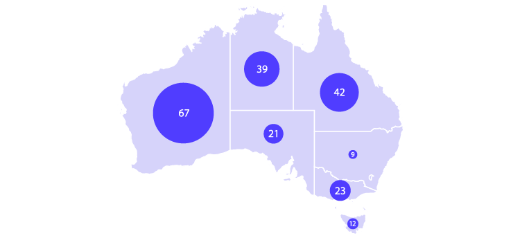
Combining a Proportional Area Chart with a map produces a Bubble Map (if you use circles). Here, circles are displayed over an assigned geographical region with the area of the circle proportional to its corresponding value in the dataset. Of course, you could substitute circles with squares if you want, but circles tend to look nicer.
+ Connection Map
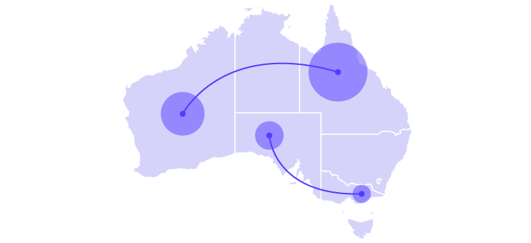
It’s also possible to apply a Proportional Area Chart to a Connection Map by drawing shape areas on each pair of connected points. Here, quantitive values can be added to each point on the map to provide additional data.
+ Tile Grid Map
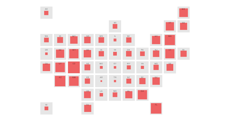
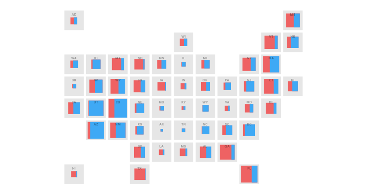
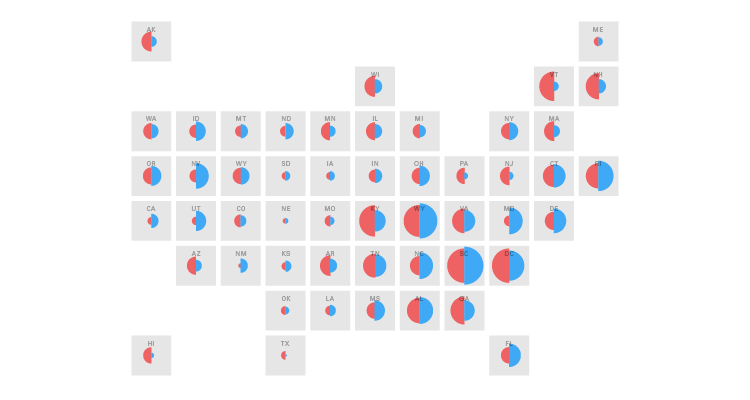
By combining with a Tile Grid Map, you can display shape areas over geographical blocks. The lack of varying region sizes makes for easier comparison across each region. Below, are a few examples that use different variations of a Proportional Area Chart.
+ Cartogram
You can combine a Cartogram with a Proportional Area Chart by converting the geographical regions on the map into shapes and varying their size based on the data. The shape areas then need to be organised and positioned in a way that loosely resembles the original topology.
If you use circles, then this type of chart is known as a Dorling Map.
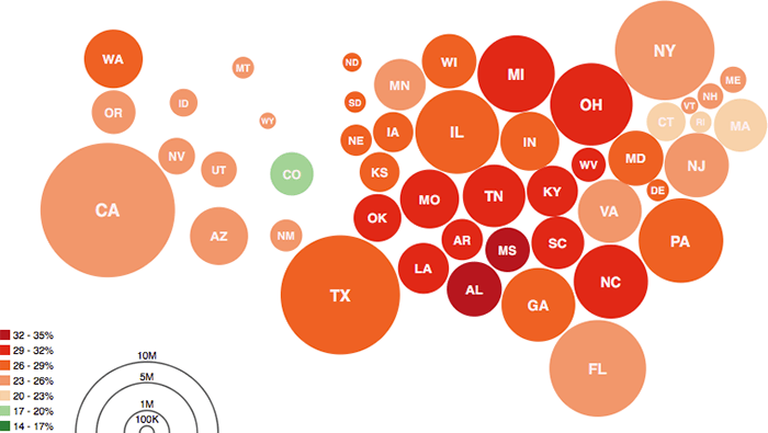
Source: Protovis
If you use squares, then this type of chart is known as a Demers Cartogram.
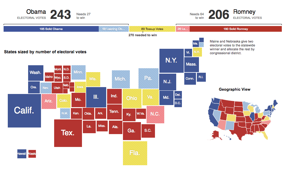
Source: The Electoral Map: Building a Path to Victory, The New York Times
+ Scatterplot
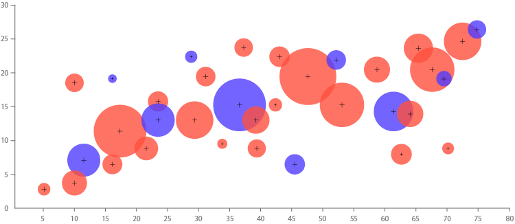
Combining a Proportional Area Chart with a Scatterplot, of course, produces the well-known Bubble Chart. Here, the points are converted into varying sized circles whose areas are proportional to a third variable.
+ Connected Scatterplot
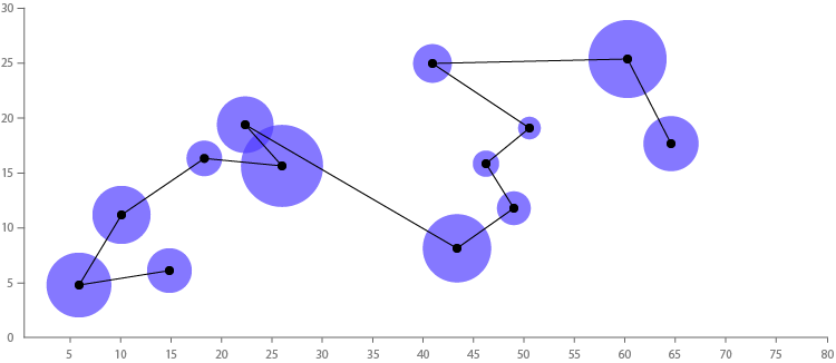
When combining with a Connected Scatterplot, shape areas can be applied to each point to visualise an additional variable.
+ Line Graph
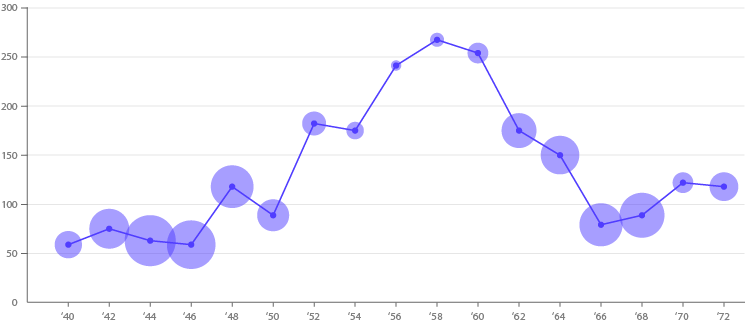
You can apply the same method when combining with a Line Graph and provide an additional variable to time series data.
+ Slopegraph
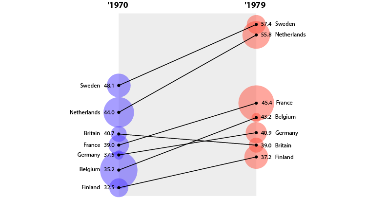
When combining with a Slopegraph, you can see how an additional variable changes between the two points in time.
+ Radar Chart
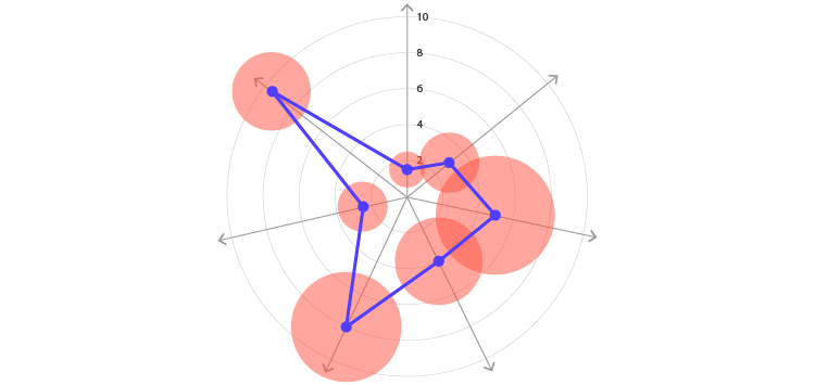
Like with all charts that plot points, it’s easy to attach a shape area to these points to display an additional variable. By combining with a Radar Chart you get a chart that looks like the one below.
+ Span Chart
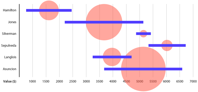
To provide an additional variable to ranged data, you can combine a Proportional Area Chart with a Span Chart. Here, the shape areas are attached to the middle of the bars instead of being added to each end of the maximum and minimum values.
+ Connected Dot Plot / Dumbbell Plot
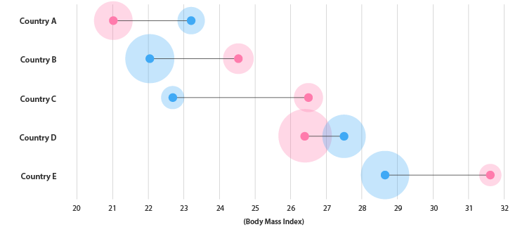
If you want a chart that focuses more on the minimum and maximum values in ranged data, then combining with a Dumbbell Plot would be a better solution. With the example below, there are two variables connected together: male BMI (blue) and female BMI (pink). This visualises how much of a difference (in BMI) exists between the two sexes, across different countries. An additional variable can be added together with each of these two variables and displayed via a shape area displayed on each point.
+ 2-way Dumbbell Plot
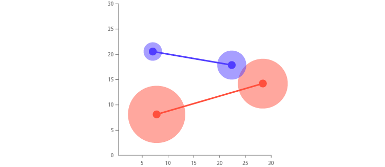
I was not sure what to call this chart, but it functions somewhat like a Scatterplot where each of the axes is a variable and points are plotted. However, with this chart, you can plot the before & after values of categories, like in Slopegraph, but also provide additional values on each point, which is visualised with the shape area size. Below I’ve demonstrated this, where blue is one category and red is another:
+ Dot Plot
Combining with a Dot Plot is simple, just add a shape area to each dot to visualise an additional variable.

+ Double Dot Plot
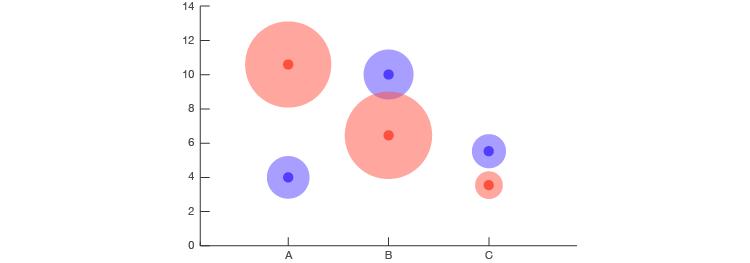
Dot Plots also have the option to display the before & after changes in a dataset or to compare two variables to one another by having two dots with different colours on the same line. Of course, an additional variable can be added by varying the size of a shape area.
+ Lollipop Chart
Combining with a Lollipop Chart works in exactly the same way as in with a Dot Plot (placing shape areas where the points are).

+ Ternary Plot
Combining with a Ternary Plot allows you to visualise four different variables at once (the fourth being represented in the shape areas size).
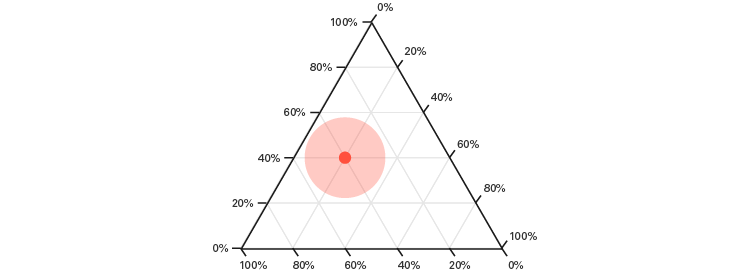
The interactive example below even uses what could be described as a ‘Ternary Bubble Graph’. Although this example visualises only four variables (3 for each political candidate and the shape area size is determined by the number of votes cast in each district) a fifth variable could be assigned to the colour shading (in the example below, the colours are still determined by the 3 political candidate variables). Read more here on this chart’s construction.
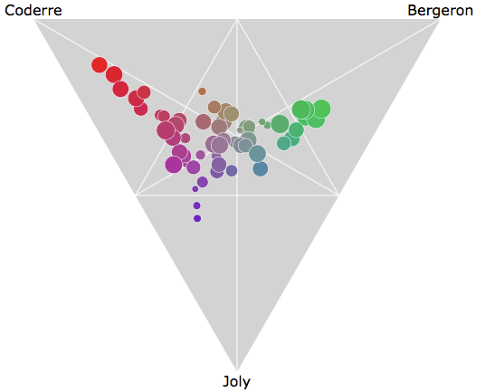
Source: Montreal Mayoral Election 2013, nicolas.kruchten.com
+ Bullet Graph
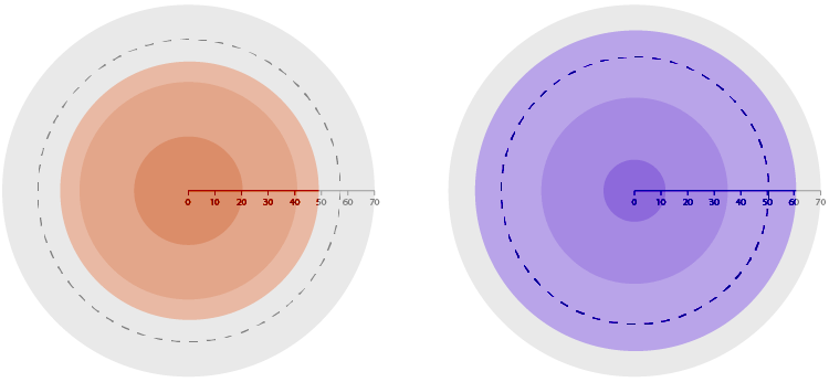
It’s possible to make a Proportional Area Chart version of a Bullet Graph. Below, I’ve used the area of a circle to create a ‘Circular Bullet Graph’ but it’s possible to use a square as well to construct this chart.
In the below example, the qualitative score ranges are represented by the three grey circle areas and the feature measure (the score) is represented with the coloured circle area. A scale is provided to help with reading the values and the comparative measure (target) is represented with a dashed line.
+ Pie Chart
Varying the area size of a Pie Chart is a way of visualising proportions. However, in terms of best-charting practices, I would strongly advise against the use of this, as people cannot accurately read and compare each wedge when this is done. Also, the varying size of wedges could be used as a way to mislead people.
+ Waffle Chart
Another way to visualise percentages and proportions together would be to combine a Proportional Area Chart with a Waffle Chart.

+ Treemap or Marimekko
It’s possible to combine with mini Treemaps or Marimekko Charts by varying the sizes of each block. Of course, between all the blocks, the categories and variables need to be consistent and use the same dataset.

Although not strictly the same, these two old examples from the Statistical Atlas of the Ninth Census (1870) provide a couple of nice examples:
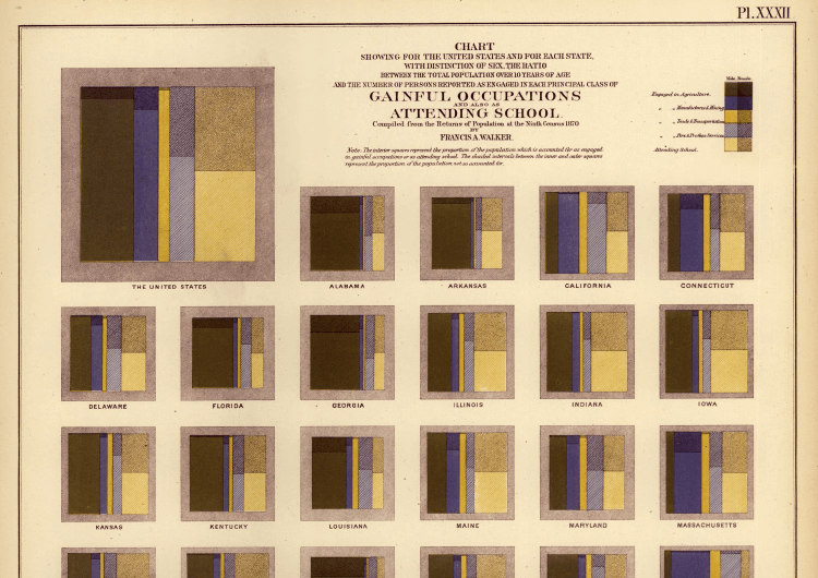
Source: Statistical Atlas of the Ninth Census (1870), RADICAL CARTOGRAPHY
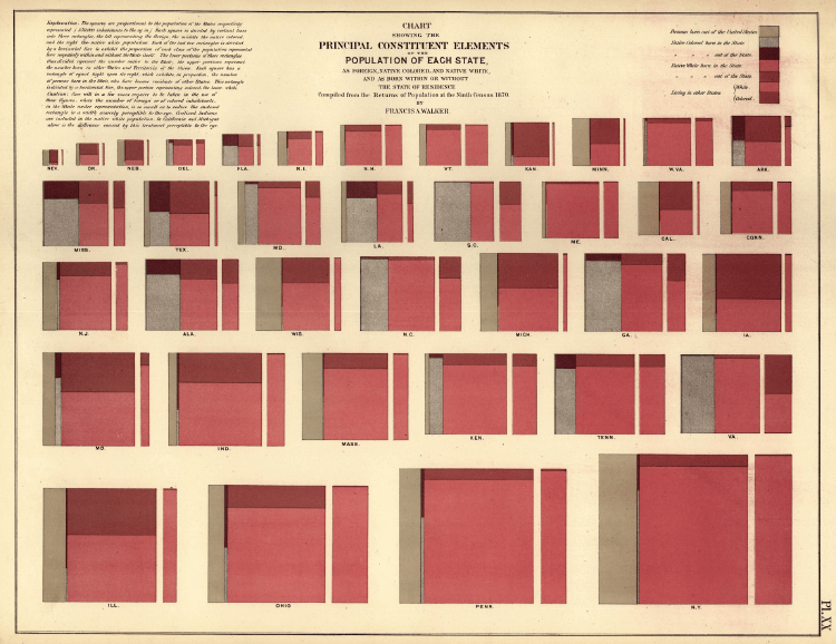
Source: Statistical Atlas of the Ninth Census (1870), RADICAL CARTOGRAPHY
+ Timeline
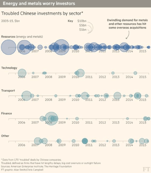
Combining with a Timeline can be done in a couple of ways. First (on the left), by directly placing shape areas over the Timeline, with the positioning of the shape’s centre being at the date associated with the data. Secondly (on the right), you can position the shape areas away from the Timeline, but use callout lines to more clearly display what date the shape areas corresponds to. This second option also allows you to counter the clutter caused by many shapes overlapping by having the possibility to vary the positioning vertically.

You can compare the data across multiple categories by having a Timeline for each category and arranging them in a row. The Financial Times has a nice example of this below:
Source: The Financial Times
+ Network
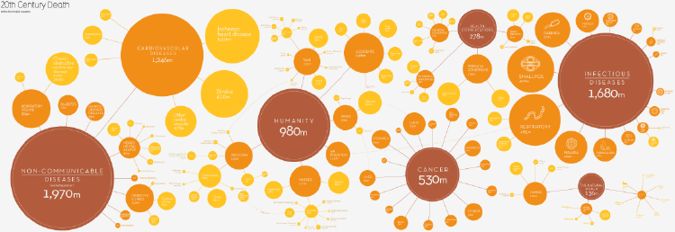
You can combine a Proportional Area Chart with a Network Diagram by varying the area size of the network’s nodes and making them proportional to quantitive values. A nice example of this is from the infographic 20th Century Death from Information is Beautiful, where different causes of death for humans are linked together categorically and the amount of death caused under each category or subcategory is represented in each circle’s area size.
Source: 20th Century Death, Information is Beautiful
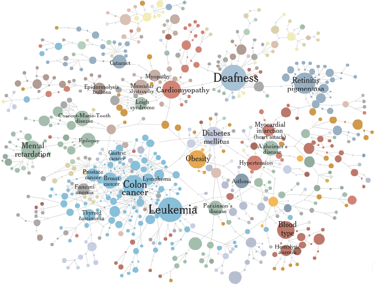
Another good example is from The New York Times, who have mapped out the many different human diseases or disorders and varies the size of the nodes in proportion to the number of genes associated with that disease or disorder.
Source: Mapping the Human ‘Diseasome’, NYTimes
+ Tree Diagram
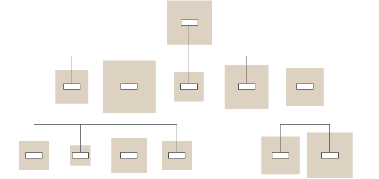
Proportional Area Charts can be used with hierarchal data by combining with a Tree Diagram. Here, additional quantitative values can be displayed on each node/member of the Tree Diagram in order to provide more information about them.
+ Circular Tree Diagram
Instead of a linear format, you can apply the combination also to a circular layout for a Tree Diagram. The diagram below is a bit mysterious (all I can find is that it was designed by “Sophie” and was done for a company called “Help”) but it provides a nice example of this combination.
Although, it’s unclear what the area size or the colours of the circles represent, this diagram displays the overwhelming array of over-the-counter drugs available for a simple headache. Starting at “I have a headache”, this diagram takes you through the various decision-making processes you might go through when selecting a particular brand.
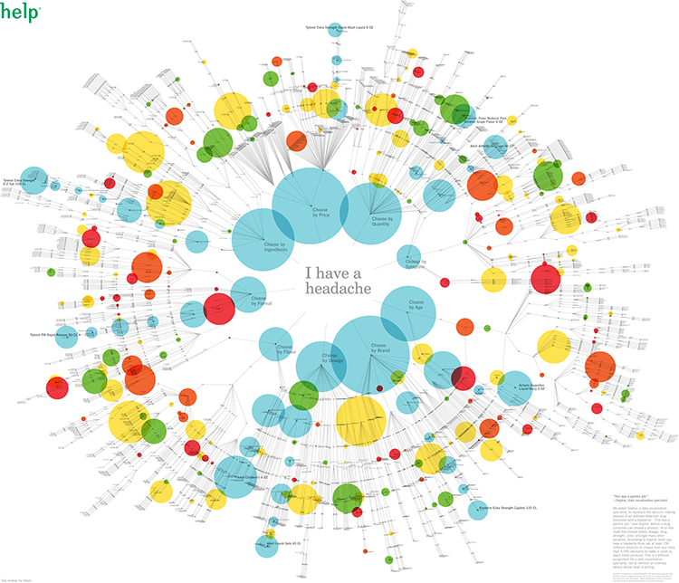
Source: Infographic Of The Day: The Insane Choices You Face At The Drugstore, FastCompany
+ Arc Diagram
When combining with an Arc Diagram, shape areas are placed on the nodes to provide an additional variable related to it. The example below by Martin Dittus visualises data from IRC (Internet Relay Chat) communication behaviour to see who is speaking to whom, and who is namedropping whom. In this visualisation, arcs represent references, while the circles represent the users, with the size of the circles is proportional to the number of messages sent by that user and the colouring is shaded based on the average message length.
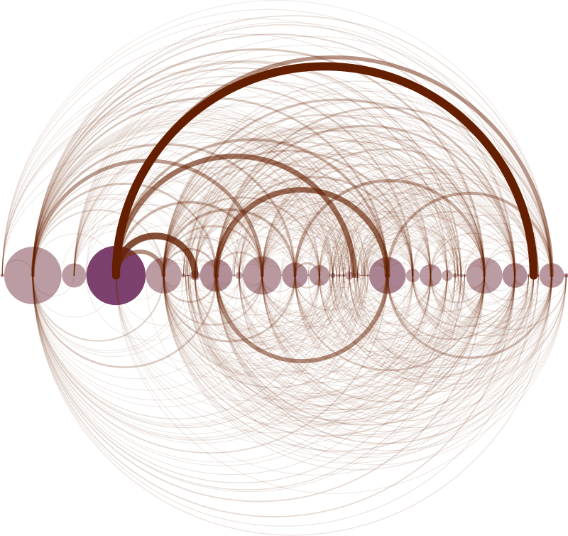
Source: IRC Arcs
+ Chord Diagram
Combining with a Chord Diagram can be done by placing shape areas at the connection nodes. In this interactive example below titled BeerViz, users can see what beers are similar to each other (based on the parameters: appearance, aroma, taste, and overall rating) through the connecting lines. The area size of the circles represents the popularity of each beer (based on the number of user reviews).
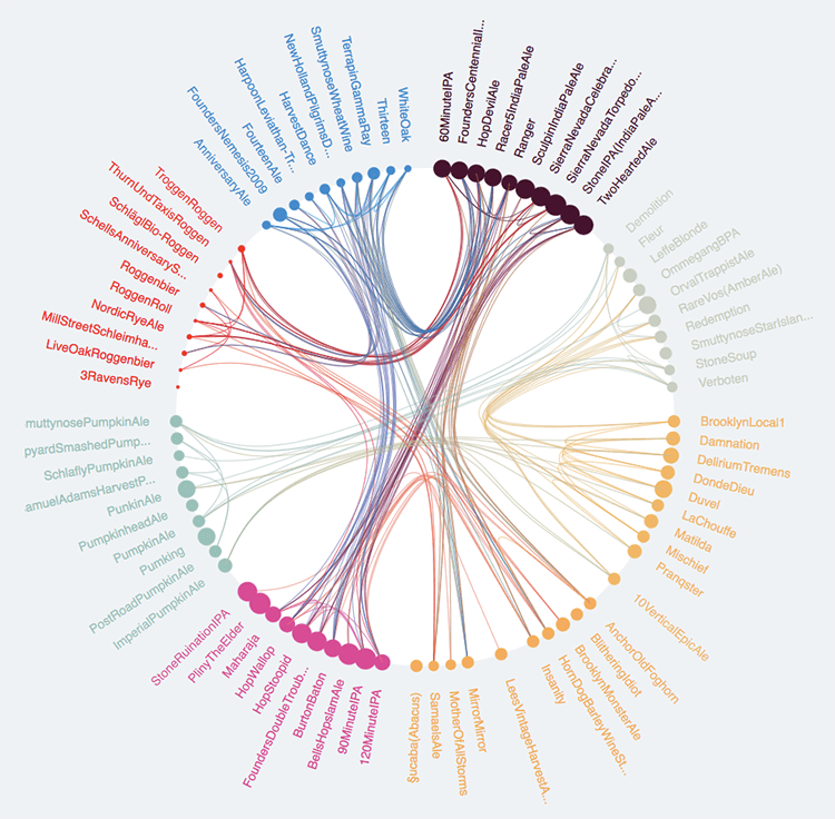
Source: BeerViz
+ Spiral Plot
One combination I’ve not seen is with a Spiral Plot. The construction here is straightforward: instead of bars, use circles, base their area size on one variable, and the colour shading on a second variable.
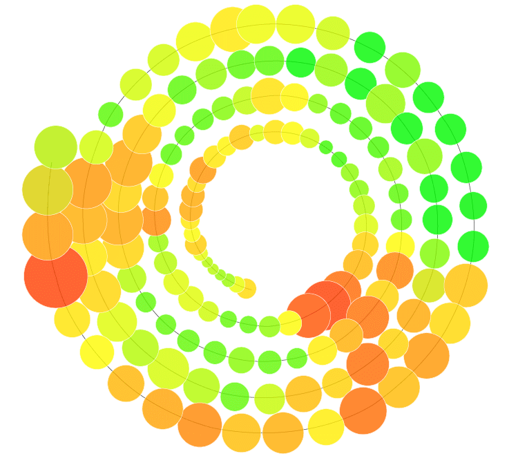
So here we can see 34 different charts that can be combined with a Proportional Area Chart. I’m sure it’s possible to do even more combinations, but I believe I’ve covered enough for now. Many of these charts listed may not be practical in most projects, but the goal of this post was more to see what’s possible.
