 Page top
 Previous
 Homepage
 Next
Next
Bubble Chart

Description
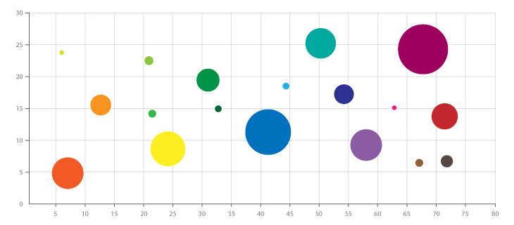
A Bubble Chart is a multi-variable graph that is a cross between a Scatterplot and a Proportional Area Chart.
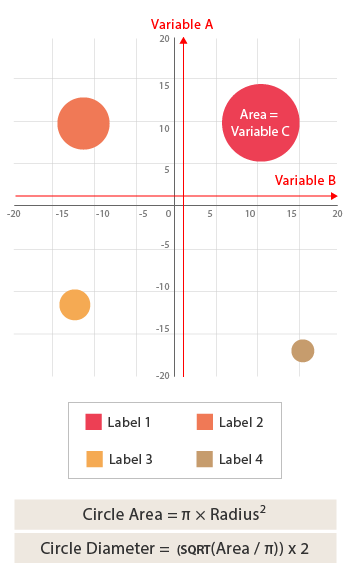
Like a Scatterplot, Bubble Charts use a Cartesian coordinate system to plot points along a grid where the X and Y axis are separate variables. However. unlike a Scatterplot, each point is assigned a label or category (either displayed alongside or on a legend). Each plotted point then represents a third variable by the area of its circle. Colours can also be used to distinguish between categories or used to represent an additional data variable. Time can be shown either by having it as a variable on one of the axis or by animating the data variables changing over time.
Bubble Charts are typically used to compare and show the relationships between categorised circles, by the use of positioning and proportions. The overall picture of Bubble Charts can be used to analyse for patterns/correlations.
Too many bubbles can make the chart hard to read, so Bubble Charts have a limited data size capacity. This can be somewhat remedied by interactivity: clicking or hovering over bubbles to display hidden information, having an option to reorganise or filter out grouped categories.
Like with Proportional Area Charts, the sizes of the circles need to be drawn based on the circle’s area, not its radius or diameter. Not only will the size of the circles change exponentially, but this will lead to misinterpretations by the human visual system.
Functions
Anatomy

Tools to Generate Visualisation
Code-based:
AmCharts (JS)
AnyChart (JS)
CanvasJS (JS)
Chart.js (JS)
FusionCharts (JS)
ggplot2 (R)
Google Charts (HTML5)
Highcharts (JS)
jChartFX (JS)
JSCharting (JS)
Observable (D3.js)
Python Graph Gallery (Python: Matplotlib + Seaborn)
React Graph Gallery (React/JS)
R Graph Gallery (R: plotly)
Vega
Vega-Lite
ZingChart (JS)
Webapp:
Columns.ai
Datylon
Flourish
Google Docs
Infogram
RAWGraphs
Slemma
Desktop App:
Apple: Numbers / Keynote / Pages
Microsoft: Excel / PowerPoint / Word / PowerBI
Tableau


