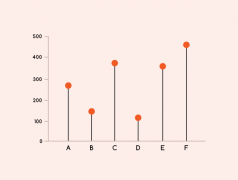
Looking at: Lollipop Chart, Triangle Bar Chart, Back-To-Back Bar Chart, Progressive Bar Chart, Waterfall Chart, Change Bar Chart, Pareto Chart and more.
Data Visualization
Posts related specifically to the subject of data visualization.
Exploring some of the different ways Proportional Area Charts can be used.
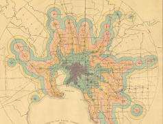
Exploring the many variations of Isochrone Maps from both the past and present.
I was invited to give a talk at a UX / UI Design conference CIEMNA STRONA #4: Stranger Things, which took place on 21st March in Kraków, Poland.
I recorded an online interview with Finn Fitzsimmons explaining his projects in more detail.
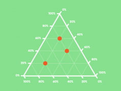
This post explores the various kinds of triangular (tri-axes) graphs that are currently being used. Most notably, Ternary Graphs are their variations.
Here I’ve demonstrated and experimented with 30+ ways you can combine a timeline with other forms of data visualization.
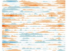
Here will I look into visualizing data in calendars by experimenting with different combinations of calendars with other types of charts.
In this post, I will look through the many types of Area Graphs that exist, that I haven’t touched on in the past.
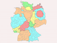
Instead of displaying data over geographical regions, Cartograms communicate data values by manipulating the forms of those geographical regions.
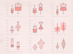
While I’ve already covered Box Plots, there are a series of Box Plot variations that can display the distribution of data over two, three or even more dimensions.
Originally introduced and popularised by the American mathematician John Wilder Tukey, a Box Plot (also known as a Box and Whisker Plot) is a type […]
As I advertised a few months ago, I would provide a talk at the design conference Designers Fiesta on the subject of expanding ones data […]
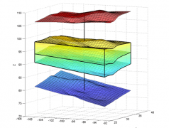
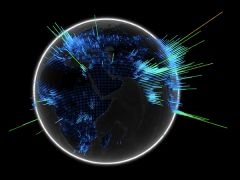
In the last two posts (#1 and #2), I specifically looked a range of 3D charts, but didn’t included any 3D maps to display geographical […]
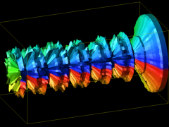
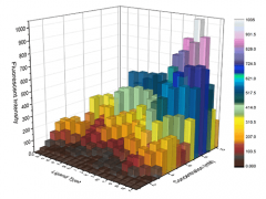
In Further Exploration #1, I looked at charts that visualise data in 3D. In this post, I will continue to showcase and catalogue the different […]
While it appears that I’ve covered a huge number amount charts on the main page, there is still an abundance of different charts out there that I have […]
Back in 2015 I contributed a series of blog posts to Visualoop that looked deeper into each of the chart type I had already covered by […]
The Data Visualisation Catalogue isn’t the only library of data visualization methods out there. A number of individuals have also taken it upon themselves to […]
