Another year has passed now and a new set of website statistics for 2021 is here, which will reveal what visualisation reference pages are the most popular.
The data we will explore here is taken from the English site and is from 1st January 2021 – 31st December 2021, with the previously mentioned years following the same date range.
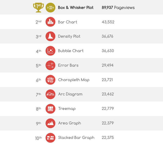
First, we have the list for the top-10 visualisation reference pages in 2021 based on page-views:

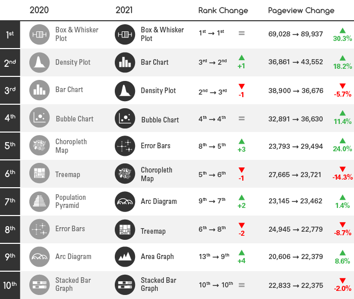
If we compare back to the data from the previous year (2020) we can see that some shifts in ranking have taken place, but nothing too dramatic:

The Box & Whisker Plot, Bar Chart, Density Plot and Bubble Chart pages have all remained on the top 4, with just an exchange of rankings between the Density Plot and Bar Chart pages.
All of the chart reference pages from the previous year all remain in the top 10, apart from the Population Pyramid page, which had a massive drop in popularity by going from 7th to 23rd place (24,207 page-views in 2020, while only getting 15,728 in 2021, which is a 35% decrease).
Replacing the Population Pyramid’s place in the top 10 was the Area Graph, which jumped from 13th place to 9th place.
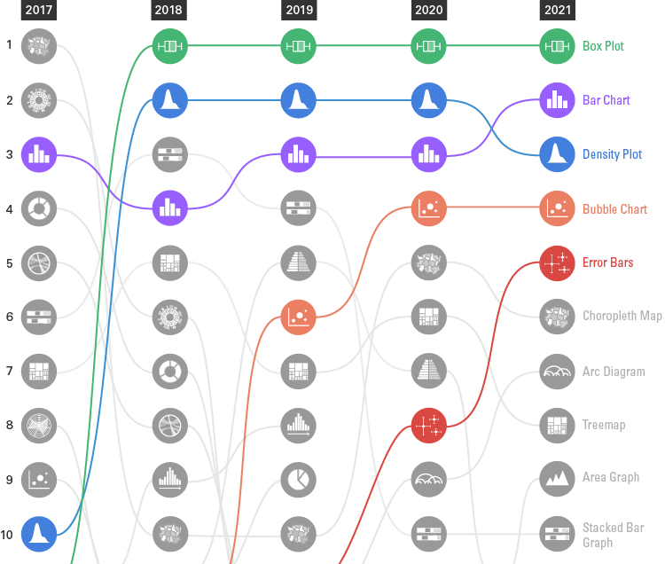
To get a view of how these rankings have changed over the past five years, let’s look at the data through a Bump Chart:

Straight away we can see that the Box & Whisker Plot page has remained in first place for four years in a row now. While the Bar Chart and Density Plot pages still have remained within 2nd to 4th place in the past four years.
The Bubble Chart page has remained strong and the Error Bars page continues to grow in strength.
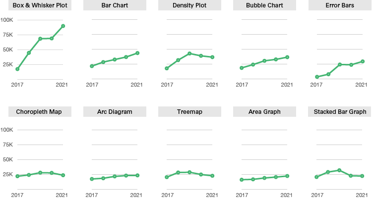
If we look a the page-view statistics through the use of small multiple Line Graphs, we can get a better picture of how much growth has happened over the past five years:

The Box & Whisker Plot page had a big jump in page-views in the past year as it continues its trend of increasing popularity.
The rest on the top row of charts have seen a steady increase over the years, while the bottom row seems to be all stagnant with not much growth.
. . .
So, that’s all there is, for now, hope this has been interesting. It’s always good to analyse the website statistics, as they may provide some indicator of what visualisation types are most commonly being used or taught.
Previous yearly top-10 posts:

What is the basis of the study? Is there any information on the sample size and statistical inference?
Not sure what you’re referring to. This post is just a report of the website statistics for the previous year. It’s a not study.