After finishing the post analysing the website statistics for the English website for 2021, I thought it would be interesting to also examine and compare the results for the other language versions of the Data Visualisation Catalogue:
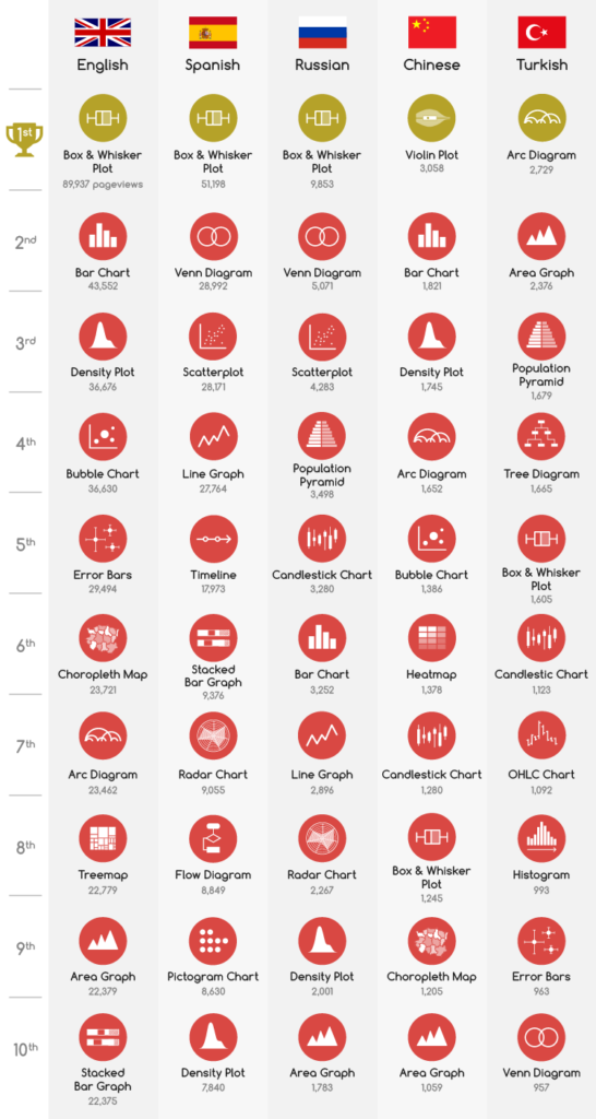
As you can probably see, this table reveals that some charts are popular across multiple languages. However, it’s also interesting to see how chart usage differs across different cultures and language groups.
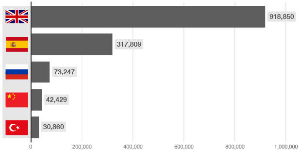
The bar chart below visualises the total page views on all chart reference pages across the five different languages (1 Jan 2021 – 31 Dec 2021). This provide some perspective on the usage and size of each of the different language sites: