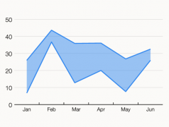
Examining the use of this ranged-focused variation of an Area Graph, along with examples.
Data Visualization
Posts related specifically to the subject of data visualization.
This variation of an Area Graph is used to emphasise comparisons more than the trends.
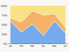
Here’s a way of visualising a part-to-a-whole relationship changing over time
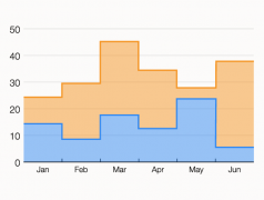
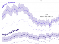
Let’s look this graph enhancement that offers more detail and context to data changing over time.
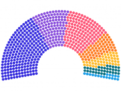
A chart for displaying the distribution of seats in a parliamentary government or election result.
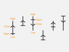
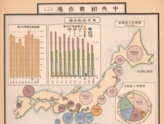
Exploring what’s known about this mysterious chart type from Japan’s past.
The potential start of a new post series exploring new chart types in brief with examples.
Speculation on how AI tools like ChatGPT will impact data visualisation professionals in the future.
Exploring what’s currently possible with the new AI tool ChatGPT and looking at its usefulness for data visualisation work.
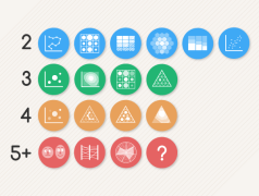
Deciding on a chart is not as simple as identifying which can display the right number of variables, but it can be a helpful starting point.
I’ve started to compile a list of academic papers and any related articles that study or use a particular type of visualisation.
Exploring some historical examples of Japanese data visualisation and the charts that were invented there.
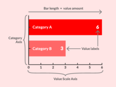
Demonstrating the potential new content structure being implemented on the Bar Chart visualisation reference page.
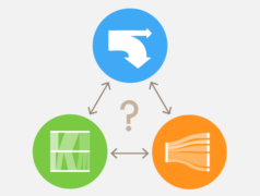
An attempt at clarifying their differences.
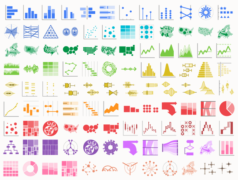
Which chart type do I select to communicate a particular message and/or analyse the property of a dataset?
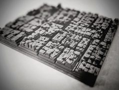
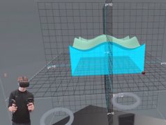
Looking at projects that have used 3D Treemaps that use extrusion to visualise an additional variable.
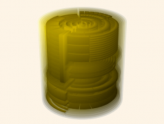
Continuing on at exploring 3D Treemaps, this post takes a look at Treemaps that use spheres or cyclinders in their design.
Here we’ll explore whether this claim is correct and what evidence exists.
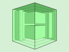
Looking through 3D Treemaps that use a cube design, such as the Information Cube, the Treecube, and the Magic Treemap Cube.
