A Parliament Chart, also known as an Arc-Dot Chart, serves as a visual representation of the distribution of seats in a parliamentary government or election result.
Resembling the seating arrangement of governmental chambers, particularly the US Senate, this chart arranges dots in a semi-circle to display the composition of politicians in various political parties through the use of colour coding.
This form of visualisation is a valuable tool for revealing political trends, such as the imbalances between various political parties, or the current ideological distribution within the government.
By highlighting the number of seats controlled by each party, the Parliament Chart helps viewers discern majority or minority stances, providing a clear understanding of how different political forces could collaborate to shape policies for citizens.
Tools to generate this chart:
Examples
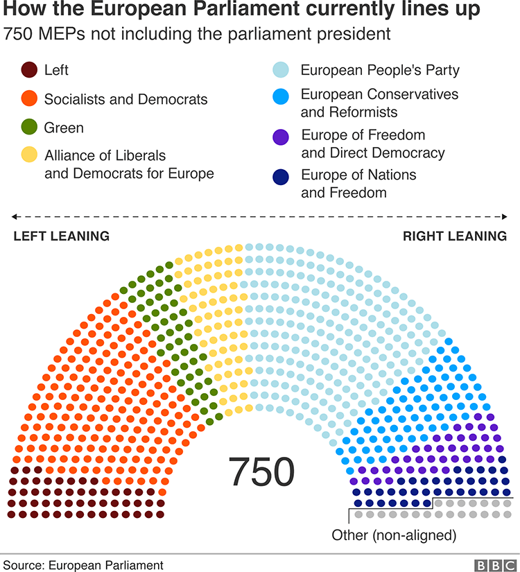
A really simple guide to the European elections, BBC News:
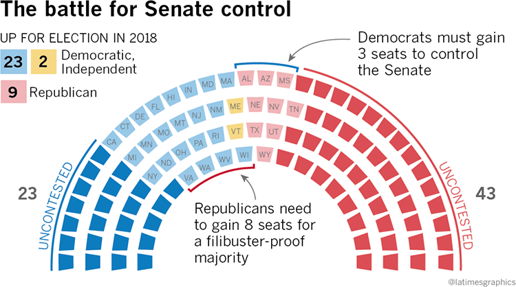
Here’s why the 2018 Senate election will be crucial for President Trump and his Democratic foes, Los Angeles Times:
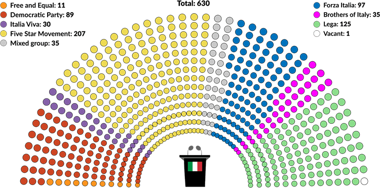
Matteo Salvini’s fate and the future of Italy, GIS Report Online:
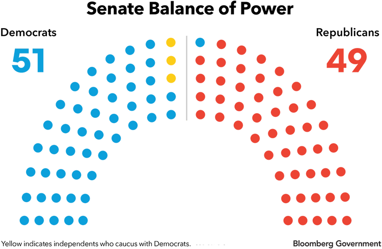
What is the balance of power in the Senate? Bloomberg Government:
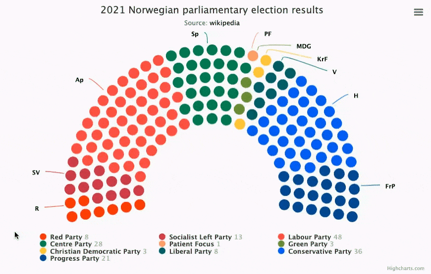
2021 Norwegian Parliamentary Election Results, Mustapha Mekhatria at Highcharts.
Parliament chart template from Flourish:

