For two years in a row now, I’ve published what chart reference pages have been the most popular on the website.
In the initial post in April 2017, I looked at this data from the launch of the website (26th December 2013) till 1st February 2017 (so around 3 years worth of data). While, the post from last year looked at the data from 6th Jan 2017 to 6th Jan 2018, which only showed the page views from a single year.
So like in the previous year, I will only be looking at the page views data from the past year (2018).
Also, even though I’ve launched a few different language versions of the website, I will be only using the analytics data from the English website. The number of page views shown is for the entire year (start of Jan 2018 to Jan 2019).
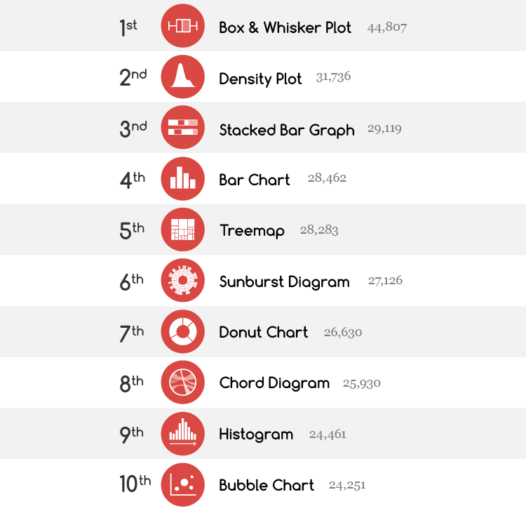
Now without further ado, here are the top 10 chart reference pages for 2018:

So in 2018, Box & Whisker Plot came in at first place, followed by Density Plot and Stacked Bar Graph.
But how does this result compare to last year?
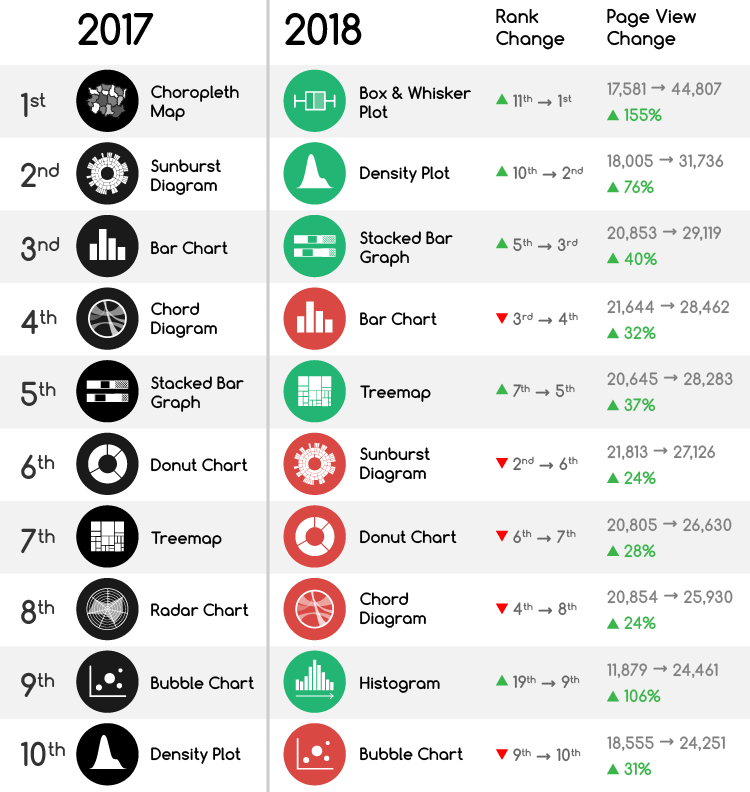
Below I’ve displayed in a table the change in rankings and page views between 2017 and 2018. Charts that have increased their rank are highlighted in green while those that have dropped in rank are coloured in red.

This year there have been a few dramatic shifts in ranking. The Box Plot has completely dethroned the Choropleth Map, which doesn’t even come in at 10th place (it was knocked down to 11th place)!
The Radar Chart was also knocked out from the top 10. While the Histogram managed to catapult itself onto 9th place all the way from 19th place with a whopping increase in page views of 105.9%!
But across the board, all the listed chart reference pages have all increased their number of page views over the year.
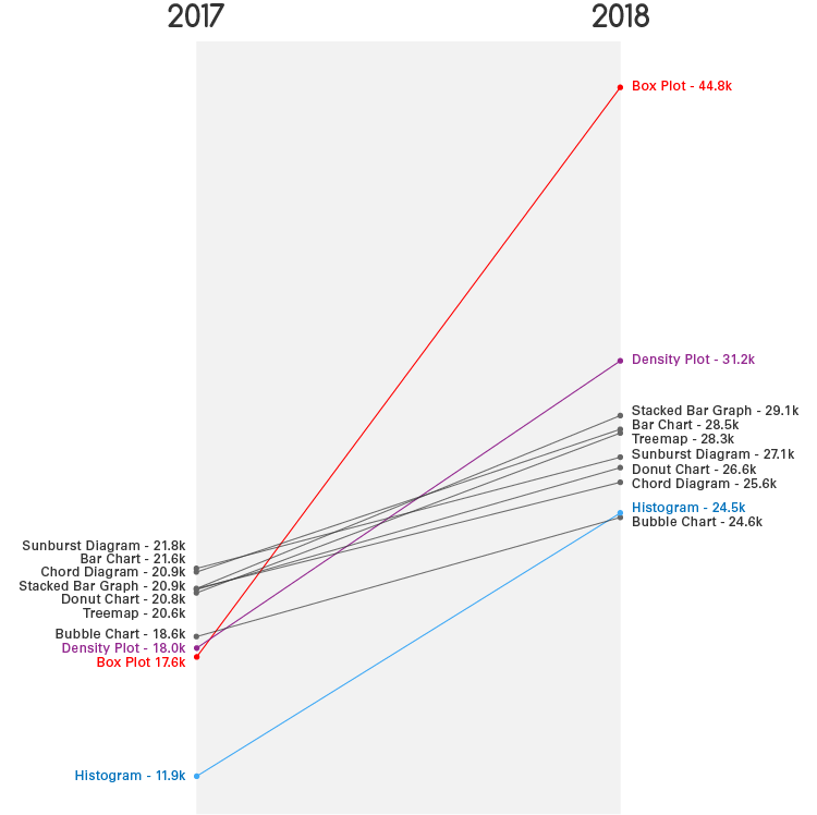
I drew a Slopegraph visualising the difference between page views between 2017 and 2018, as this chart better displays the gap between values and provides more detail.

Here we can clearly see a dramatic increase over the year for the Box Plot (154.9%), Density Plot (76.3%), and Histogram (105.9%). The Box Plot reference page has not just reached first place, but it skyrocketed there with a massive 44,807 page views that year.
All three of these charts that have seen a large increase in their viewership are used to visualise data distribution. Maybe that’s some clue to why they’re popular this year?
Another possible reason we’ve seen an increase, is that I had written a few related blog posts, which some do link back to these reference pages. One that’s been quite popular is the post on Box Plot variations. I also did a post on multidimensional Box Plot variations as well.
The rest of the chart reference pages are clustered close together in both years and have only had a yearly increased ranging between 24.3% to 39.6%.
Anyway, it’s been interesting looking through this data. Maybe next year when I have data for 3 years (2017, 2018 and 2019) I can then use a Bump Chart to visualise the shift in ranking over those years.
