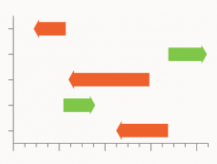
Exploring with examples this Bar Chart variation that’s useful for communicating change.

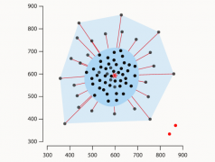
Looking at how Bagplots work, their usefulness, along with some examples.
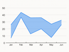
Examining the use of this ranged-focused variation of an Area Graph, along with examples.
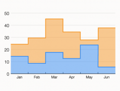
This variation of an Area Graph is used to emphasise comparisons more than the trends.
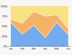
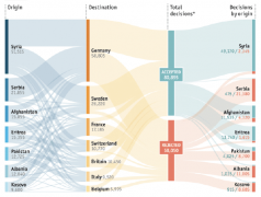
Here’s a way of visualising a part-to-a-whole relationship changing over time
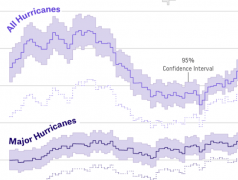
Let’s look this graph enhancement that offers more detail and context to data changing over time.
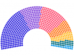
A chart for displaying the distribution of seats in a parliamentary government or election result.
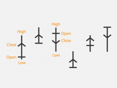
Exploring what’s known about this mysterious chart type from Japan’s past.
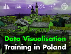
New on-site, introductory training in Kraków, Poland.
The potential start of a new post series exploring new chart types in brief with examples.
Let’s look back at the site’s launch and the stats for the previous year.

How useful are these games in dataviz training?
Bonne nouvelle pour les francophones du monde entier.


Speculation on how AI tools like ChatGPT will impact data visualisation professionals in the future.
Exploring what’s currently possible with the new AI tool ChatGPT and looking at its usefulness for data visualisation work.
Visualising the website statistics for the past year on the most popular chart reference pages.
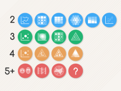
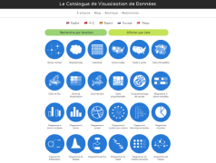
Deciding on a chart is not as simple as identifying which can display the right number of variables, but it can be a helpful starting point.

