The Data Visualisation Catalogue has just recently passed its 10-year anniversary. It’s hard to believe I’ve been working on this website for 10 years now, but the years have passed so quickly.
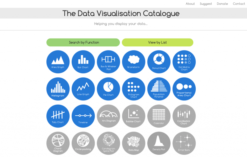
The website was launched back on 26th December 2013 and was started as a side-project to help develop my own knowledge of data visualisation. You can see how the front page looked in the first couple of months from this screenshot from the Wayback Machine:
Since then there’s been a lot of developments, not just aesthetically. On 6th January 2017, all 60 chart reference pages were completed. Subsequently, a shop was introduced, and later, this blog was added to provide additional content and learning. Notably, the website underwent translation into five additional languages, namely Chinese, French, Russian, Spanish, and Turkish.
However, any plans for future development of this website are unclear. Economically, it doesn’t look like any major developments will be possible this year. Yet, although I struggle to produce enough content for this blog, I am committed to making new posts when possible.
Chart Reference Page Statistics for 2023
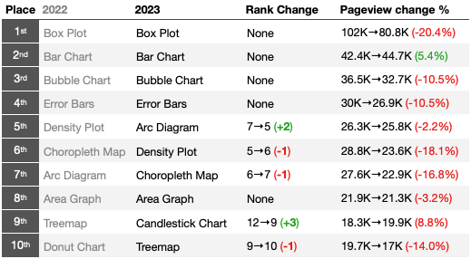
Every year since 2017, I’ve examined and published the website statistics for the 60 chart reference pages in English to see what pages rank the highest in terms of page views. Below you can see the top 10 pages for 2023:
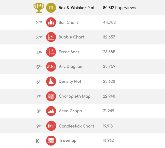
The top 4 positions have not changed from the previous year. The Box & Whisker Plot has remained in 1st place since 2020 and it doesn’t look like it will lose that position anytime soon. Overall, there’s been no dramatic shifts in ranking, but there’s been a significant drop in page views across the board.
Using the page view data for these 10 pages (since 2017), I tried out a “line graph race” to illustrate the trends over time and to demonstrate the gap in page views between the Box Plot page and the rest. If you hover or click on one of the lines, you can isolate it. It’s possible to replay the animation after doing so as well, which can make it clearer to view the changes over time for a single page:
Over the past decade, this website has played a pivotal role in introducing numerous individuals to the field of data visualisation. It has not only broadened their visualisation vocabulary but also offered valuable guidance on crafting charts, while also establishing itself as a useful overall resource. I hope that The Data Visualisation Catalogue will persist in fulfilling this role in the years ahead.

