In Further Exploration #1, I looked at charts that visualise data in 3D. In this post, I will continue to showcase and catalogue the different types of 3D chart that I have discovered from my research.
3D Bubble Chart
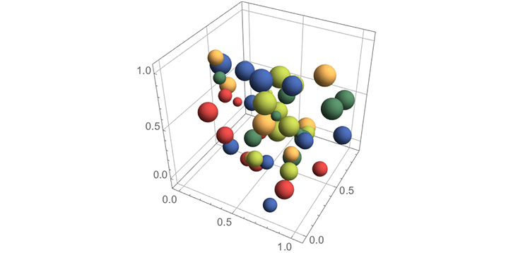
2D Bubble Charts allow for multivariate (multiple variable) data analysis from using their two axes (X & Y), the circles’ areas and even the circles’ colouring to visualise each variable. 3D Bubble Charts allow for an additional variable to be visualised by utilising a third Z-axis.
Like with many 3D charts, the larger shapes can obscure smaller ones and it’s hard to align the shapes with the axes. This can of of course remedied by interactivity: rotation to reveal hidden bubbles and “drop-lines” can be displayed to link the bubble to their position on the axes.
3D Treemap
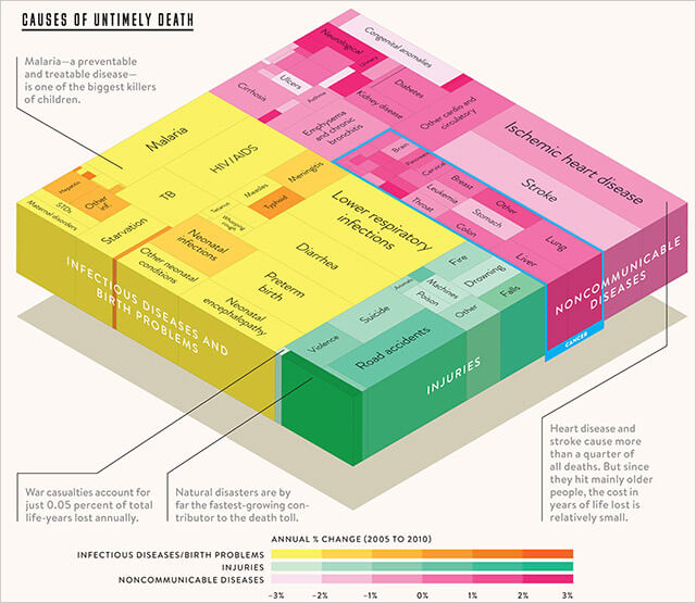
Even Treemaps have been attempted in 3D, like in this example below from an edition of WIRED magazine. I found this graphic on a blog post on Stephen Few’s blog discussing this chart.
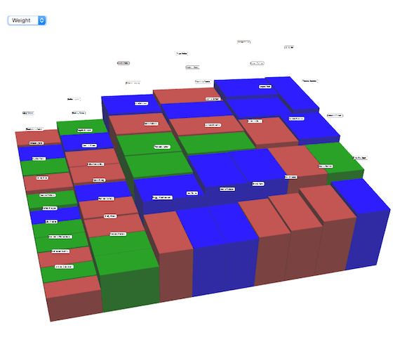
The individual blocks in the Treemap can also be extruded to represent an additional variable. You can see an example of this in the interactive visualisation below:
3D Circle Packing
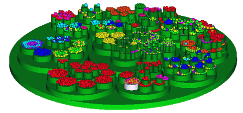
Circular Treemaps / Circle Packing Charts when rendered in 3D, resembles a bizarre flower garden arrangement:
3D Scattergraph
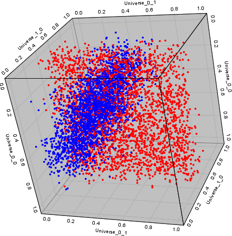
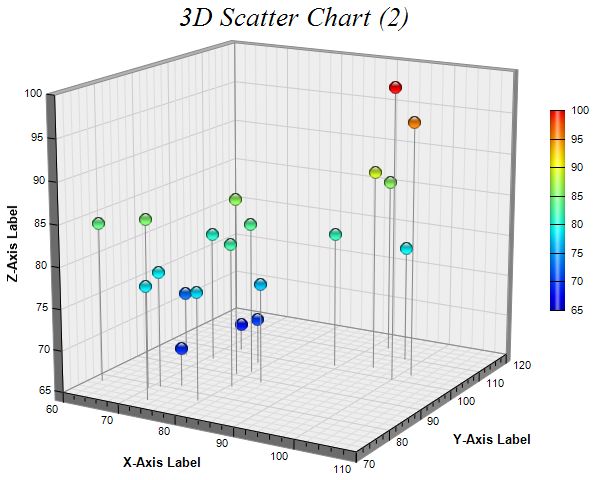
While 2D Scattergraphs use the X and Y axes to visualise two variables, 3D Scattergraphs have an additional Z-axis, which allow for a third variable.
Also, like with 3D Bubble Charts, drop-lines can be used to mark where on the scale the points are positioned.
The main concern I would have with this 3D chart, is that it may be difficult to read any correlation patterns that might be displayed. Interactivity would have to be used to rotate the chart at the right angles to discover any patterns.
3D Contour Plot
In 2D Contour Plots, 3-dimensional data is displayed in a 2D chart to display the potential relationships between three variables. The two predictor variables are plotted on the X and Y scales, while the response variable is represented by the varying colour shades on the plot. So for example, dark regions could represent high Z-axis values and light regions could represent low Z-axis values.
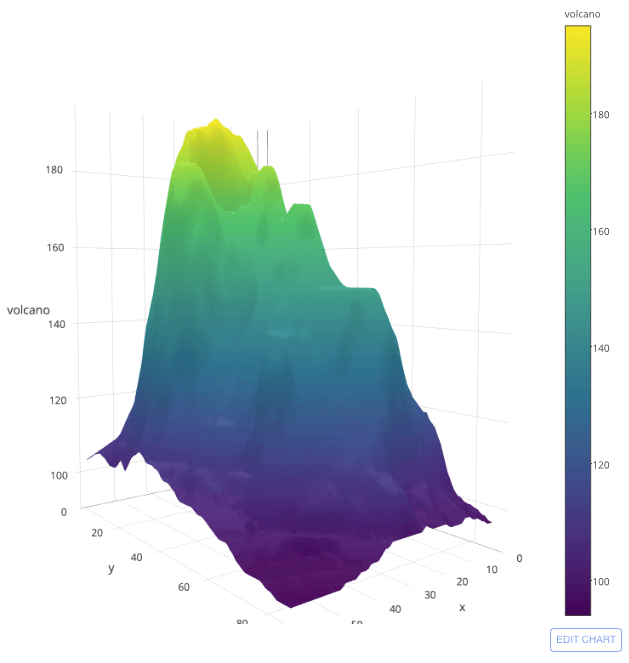
With 3D Contour Plots, the response variable (Z-values) can now be plotted on a Z-axis as a surface plot. Colour-coding can still be used to represent the third response variable.
More on Contour Plots:
– Contour plots and 3D surface plots
– Wikipedia: Contour line
Kiviat Tube
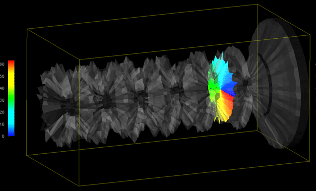
This interesting looking object is a 3D chart version of a Radar Chart. Kiviat Tubes are used to display multi-variable data changing over time.
The structure of a Kiviat Tube consists of a row of Radar Charts, each representing the data at a single point in time, placed along a time axis with a common centre. This creates a tube-like shape seen in the example provided. Below is how the chart looks with a single time interval highlighted:
More on Kiviat Tubes:
– Implementation of 3D Kiviat Diagrams
– 3D Axes-Based Visualizations for Time Series Data
