Overlaying data over maps can provide you with insight into geographical regions or help you communicate how the data relates to those regions. I’ve already produced five reference pages on various data maps which you can find on the main site under the Location category. Also, in third post in this series, I looked at 3D maps that visualize data geographically.
However, there are still many more charts that visualize geographical data that I want to touch on. In this post, I will be looking at a particular set of data maps knowns as Cartograms. Instead of displaying data over geographical regions, Cartograms communicate data values by manipulating the forms of those geographical regions.
Contiguous Cartograms
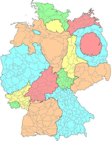
This type of data map distorts the geometry of geographical regions in proportion to the data value associated with that region. So the larger the value, the more distorted and enlarged the region’s area is. You can see an example of this below, where the states and districts in Germany are resized accord to the population.
While Cartograms distort the shape of geographical regions, they are still strict at preserving the connections between neighbouring regions.
Non-Contiguous Cartograms
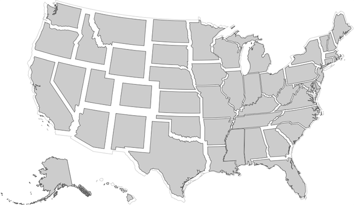
Non-Contiguous Cartograms preserve the shape or outline of geographical regions and rescale each region from its centre-point, in proportion with the data values assigned to them. The Non-Contiguous Cartogram was invented by Judy M. Olson.
Dorling Maps
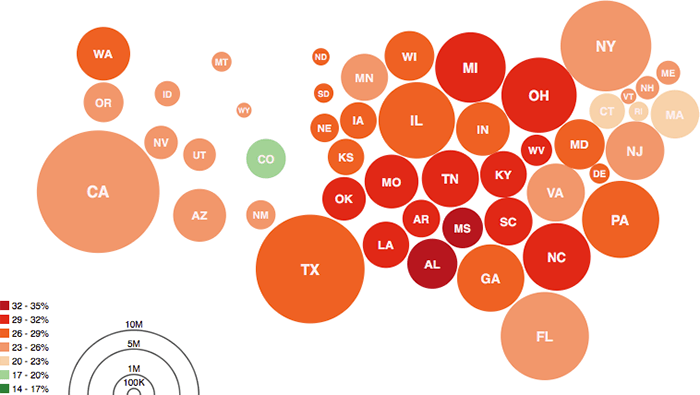
Another variation of the Cartogram, is the Dorling Map, which was named after the guy who invented it: Professor Danny Dorling. In this chart, geographical regions are converted into circles and are organised and positioned in a way that loosely resembles the original topology. Like in a Proportional Area Chart, the area of the circles are in proportional to the values they represent.
Useful links:
Demers Cartograms
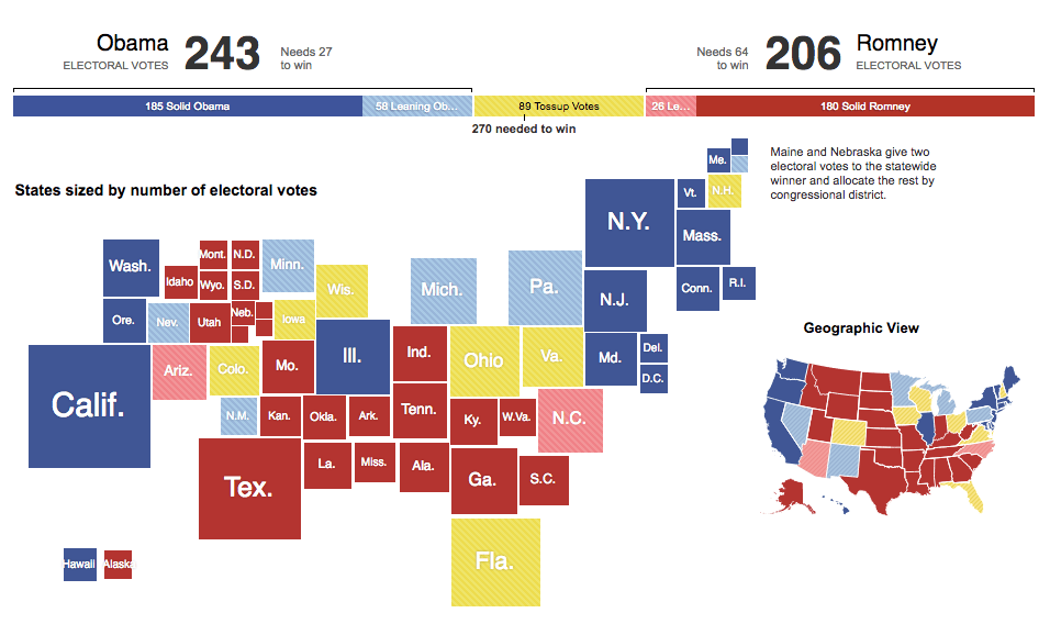
This chart is very similar to a Dorling Map in that way it visualises data but uses squares instead of circles, which helps reduce the gaps between each geographical region.
Useful link:
Mosaic Cartograms
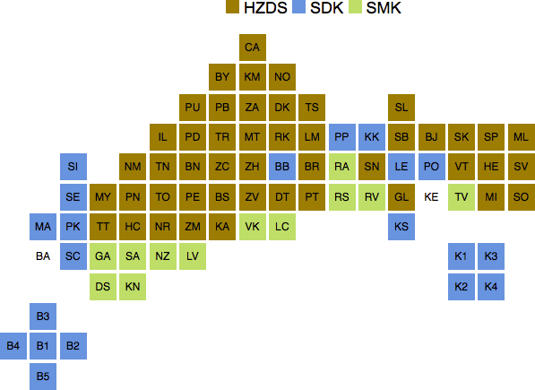
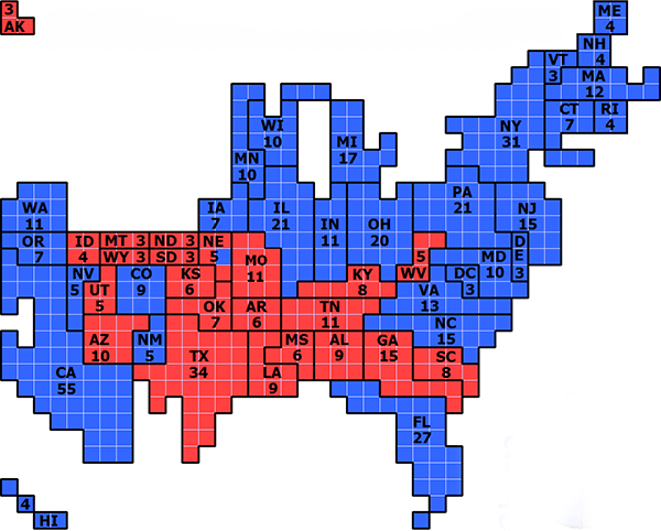
Unlike a Demers Cartogram which uses squares of varying sizes, this Cartogram variation keeps the size of the squares uniform. There’s a couple of ways this chart can be used:
To have each square completely represent a geographical region:
Or to use the squares to represent nominal units (for example 1 square = 1 electoral unit), then construct the geographical regions out of the total amount of units contained within each region like a piece of mosaic art.
Cartogram Hexmaps / Tilegrams
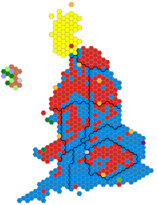
This Cartogram functions in the same way as the previous one (Mosaic Cartograms) but uses hexagons instead of squares. There’s a cool tool you can use called Tilegrams, which allows you to generate these charts.
Further reading:
- Helecxagon mapping, Kenneth Field
- The population of the internet, in one map, Vox.com
Distance Cartograms
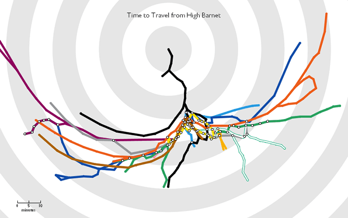
This type of Cartogram distorts a map (either geographical or an abstract travel network map) to show the travel times from a particular position on that map.
Useful links:
- Travel Time Tube Map, Tom Carden
- Animated cartogram showing train travel time in the Netherlands
- Integrated Time and Distance Line Cartogram: a Schematic Approach to Understand the
- Narrative of Movements, Menno-Jan Kraak, Barend Köbben, Yanlin Tong
– – –
Read more on Cartograms:
- Evaluating Cartogram Effectiveness, Sabrina Nusrat, Md. Jawaherul Alam, Stephen Kobourov
- The State of the Art in Cartograms, Sabrina Nusrat and Stephen Kobourov
- Cartogram entry on WikiGIS
- What is a Cartogram?, Population Education
- US election 2016: battle of the maps, Esri UK
