Also known as Side-by-Side Bar Chart, Back-to-Back Bar Chart, Paired Bar Chart, Butterfly Chart, Bilateral Bar Graph, Deviation Bar Graph.
Not to be confused with the visually very similar Tornado Diagram or Population Pyramid.
A Diverging Bar Chart is a visualisation of (typically) two contrasting data series displayed horizontally and side-by-side. It’s a variation of a Bar Chart where the bars for one dataset are plotted to the right of a central baseline, while bars for the other dataset are plotted to the left.
Each dataset typically represents discrete and categorical dimensions, allowing for a comparison of two opposing or diverging perspectives, such as agree or disagree, for or against, or for different grades of diverging views like on a Likert scale. However, this is not always the case and sometimes this chart is used to simply compare and contrast a pair or group of categories together. Also, this chart is not suitable for visualising neutral dimensions or continuous data. Colour coding is used to differentiate categories and the colours for each side of the chart are ideally contrasting.
Diverging Bar Charts can display both numbers and percentages and each data series has its own axis, with bar lengths representing the values in proportion to their respective variables. While the units of measure and value scales for each side might not always be the same, they typically should be.
Reading a Diverging Bar Chart involves assessing on both sides the difference in lengths, if there are any patterns, and evaluating the symmetrical or asymmetrical distribution.
Tools to generate this chart:
Everviz
Vizzlo
Examples
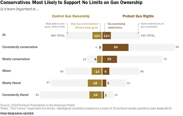
Conservatives Most Likely to Support No Limits on Gun Ownership
Pew Research Center
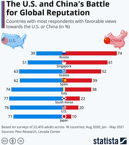
The U.S. and China’s Battle for Global Reputation
Statista
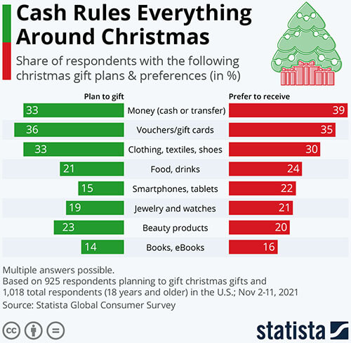
Cash Rules Everything Around Christmas
Statista
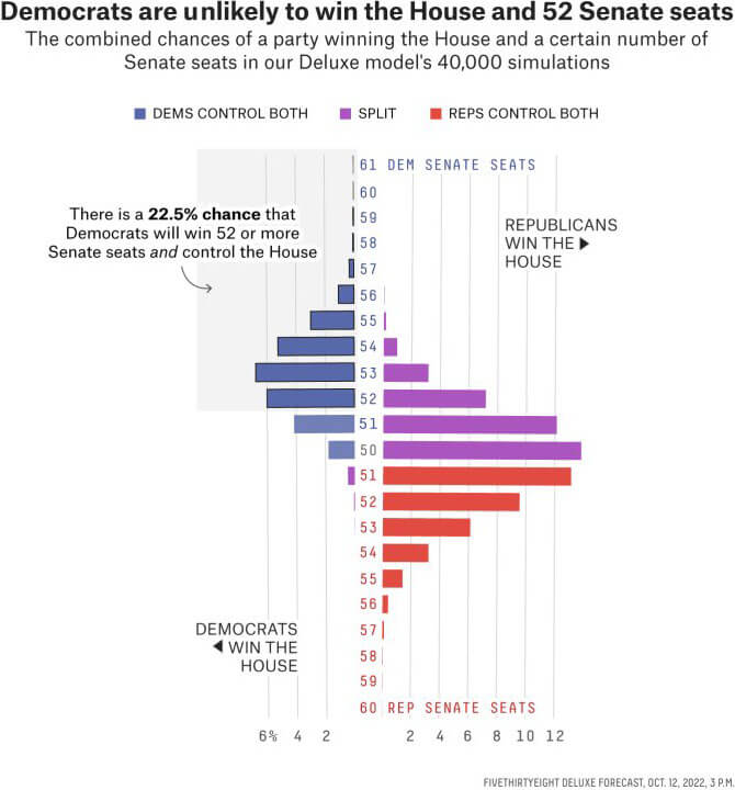
How many Senate seats we expect each party to win
Can Democrats Win 52 Senate Seats And Kill The Filibuster? — FiveThirtyEight
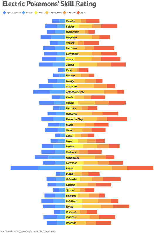
Electric Pokemons’ skill rating
Datylon Report Studio Inspiration Gallery
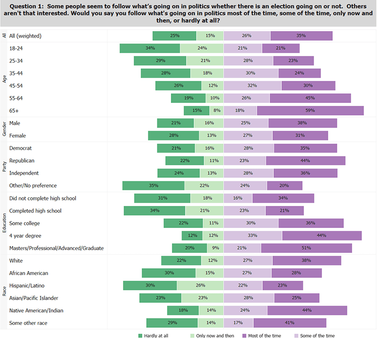
Question 1: Some people seem to follow what’s going on in politics whether there is an election going on or not. Others aren’t that interested. Would you say you follow what’s going on in politics most of the time, some of the time, only now and then, or hardly at all?
Divergent Stacked Bars & Survey Data — The Bar Chart Guy
Related posts:
Further Exploration #11: Bar/Column Chart Variations

