Also known as a Bee Swarm Box Plot, Swarm Plot. Not to be confused with a Jitter Plot.
A Beeswarm Plot is a type of visualisation that displays individual data points in a way that they don’t overlap, resulting in a plot that resembles a swarm of bees. The main aim of a Beeswarm Plot is to display the distribution and density of data along a numerical axis more clearly.
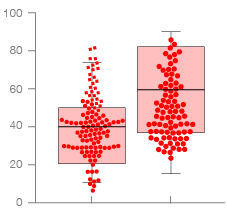
In this visualisation, data points are arranged compactly along a single axis, ensuring they do not overlap. Rather than random jittering (like on a Jitter Plot), points are shifted minimally to avoid overlapping. This method ensures all data points remain visible, enhancing the visibility of density and variation. Additionally, colour can be used to represent different categories or an additional variable.
Tools you can generate a Beeswarm Plot with:
Amcharts
Flourish
RAWGraphs
R Charts / ggplot2
Python Graph Gallery
Seaborn / Python
Vega
Examples
# of Unique Words Used Within Artist’s First 35,000 Lyrics
The Largest Vocabulary In Hip Hop — The Pudding

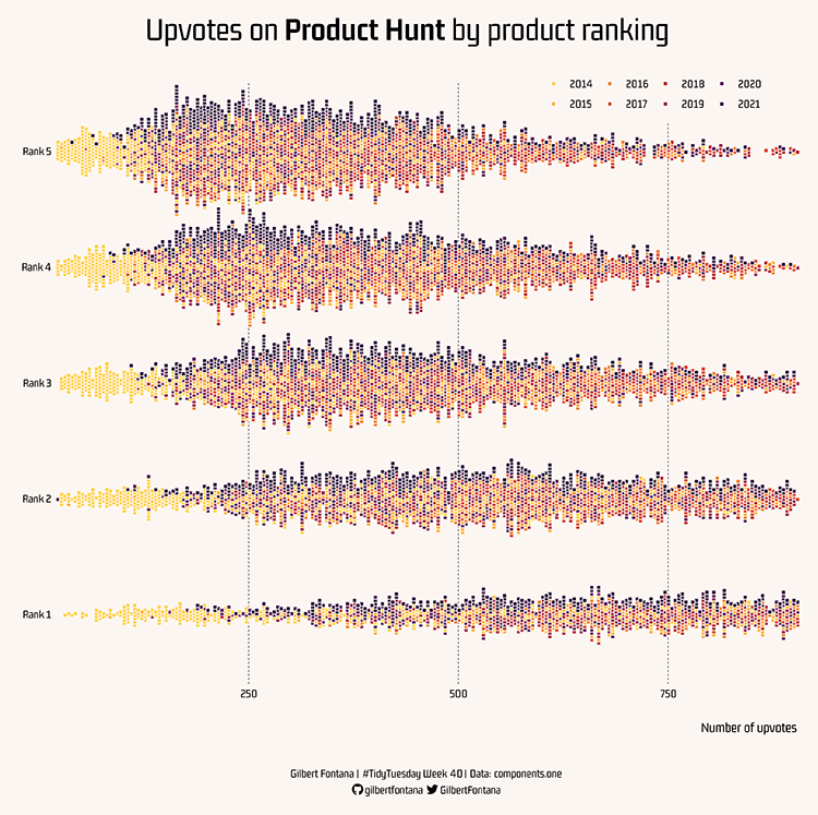
Upvotes on Product Hunt by product ranking
Week 40: Product Hunt products — Gilbert Fontana
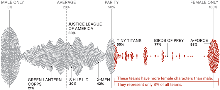
Female percentage of every team.
Analyzing the Gender Representation of 34,476 Comic Book Characters — The Pudding
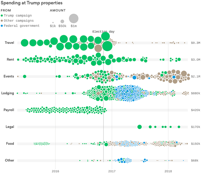
Spending at Trump properties
By the numbers: How Trump properties profited from his presidency — Axios
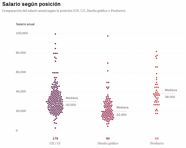
Salario según pisición
Salaries visualization — Gemma Busquets
Related posts:
Further Exploration #4 — Box Plot Variations

