A Functional Box Plot is a visualisation used to explore and analyse functional data, which are data that can be represented as curves or surfaces. While this visualisation technique is a variation of the classic Box Plot, a Functional Box Plot is visually very different and instead plots a combination of lines and areas to communicate the various data ranges.
The key features of a Functional Box Plot includes:
Data Ordering: The functional data (e.g. curves or surfaces) are ordered from the centre outwards using a notion of band depth or modified band depth. This allows for the definition of functional quantiles and the identification of central and outlying observations.
50% Central Region: Similar to the interquartile range in a standard Box Plot, the 50% central region is defined by the deepest or most central observations, encompassing 50% of the data. This region provides a robust measure of the spread of the central 50% of the curves.
Median Curve: The median curve represents the most central observation and serves as a robust statistic for centrality.
Outlier Detection: Outliers can be identified using an empirical rule based on 1.5 times the size of the 50% central region, akin to the 1.5 IQR rule for traditional Box Plots.
Extensions: The Functional Box Plot can be expanded to include the 25% and 75% central regions. It can also handle spatio-temporal data by employing a volume-based surface band depth to order sample surfaces.
Examples
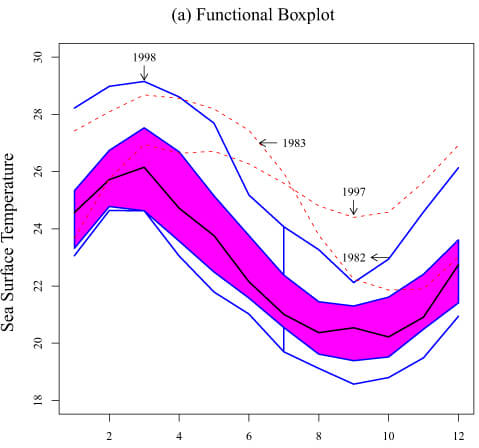
Functional Boxplot of Sun Surface Temperature.
Wikipedia
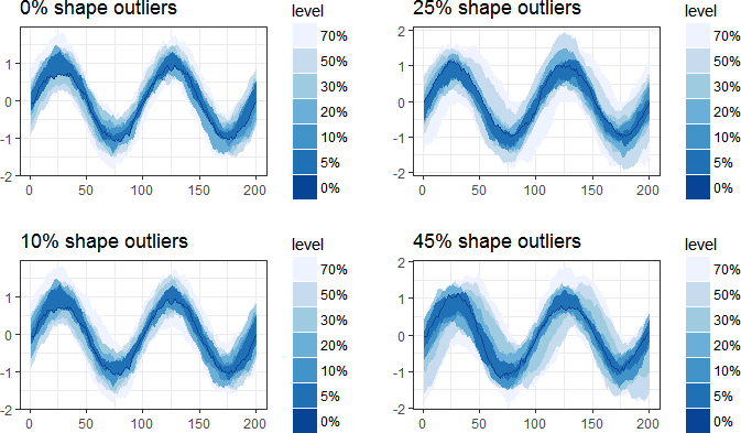
Functional boxplot for data polluted with 0%, 10%, 25%, and 45% shape outliers.
Double functional median in robust prediction of hierarchical functional time series
Research Papers and Articles
Functional Boxplot
Ying SUN and Marc G. GENTON, October 2010, Journal of Computational and Graphical Statistics 20(2).
DOI:10.2307/23110490
Adjusted functional boxplots for spatio-temporal data visualization and outlier detection
Sun, Y. and Genton, M.G., 2012, Environmetrics, 23: 54-64.
https://doi.org/10.1002/env.1136
Functional boxplots for multivariate curves
Sun, Y. and Genton, M.G., August 2018, Stat 7(3):e190.
DOI:10.1002/sta4.190
Sparse Functional Boxplots for Multivariate Curves
Zhuo Qu, Marc G. Genton (2021).
https://doi.org/10.1080/10618600.2022.2066680
Related posts:
Further Exploration #5 Multidimensional Boxplot Variations

