An Area Unit Chart is an axes-less variation of a Dot Plot / Unit Chart that organises unit shape markers or icons into groups to display quantities between categories.
The unit markers displayed on an Area Unit Chart can represent a single count or any number (e.g. a count of 10). Any shape can be used for the unit markers, but usually, circles or squares are used.
Unit markers are grouped into categories and can be coloured based on them or to distinguish subcategories between groupings.
Area Unit Charts are great for clearly and simply displaying quantities for discreet categorical data in a format that is countable. This allows for more generalised comparisons between the numerical proportions between categories.
A Dot Matrix Chart is basically a form of Area Unit Chart that organises dots into a matrix layout. Another variation is the Parliament Chart / Arc-Dot Chart, which organises the unit markers into the seating arrangement of governmental chambers and colour units based on party affiliation.
Tools that can generate Area Unit Charts:
- Amit Kapoor’s Block: Multiple, Rectangular (Vega-Lite)
- Datylon
- Flourish 1, Flourish 2
- ZingChart (JS)
- Vizzlo
Examples of Area Unit Charts
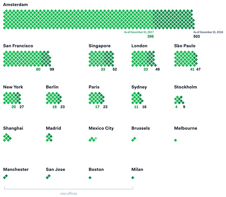
Adyen’s full year 2018 FTE growth (873 FTE in 2018 and 668 FTE in 2017).
Adyen’s Shareholder Report — Visual Cinnamon / Nadieh Bremer
An illustrated guide to all 6,887 deaths in ‘Game of Thrones’ — The Washington Post

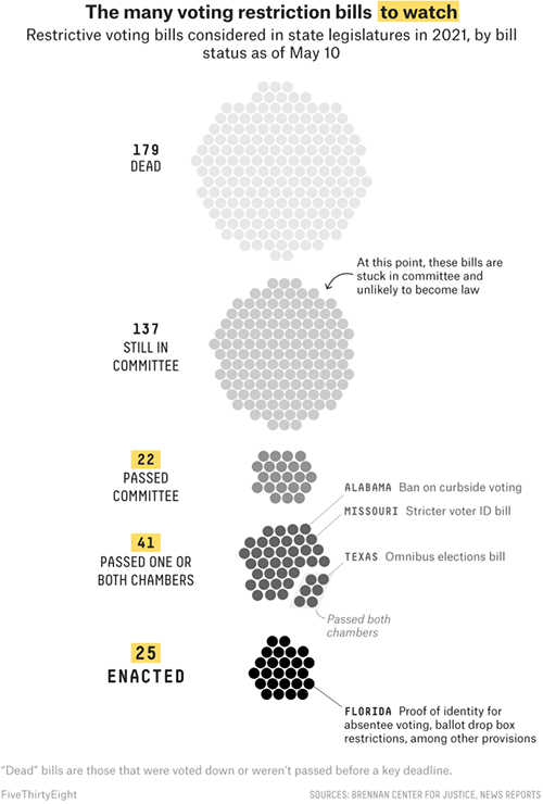
The many voting restriction bills to watch.
Where Republicans Have Made It Harder To Vote (So Far) — FiveThirtyEight
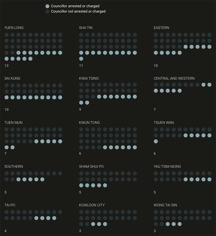
Councillors arrested by district.
The mass arrest of Hong Kong’s opposition figures — South China Morning Post
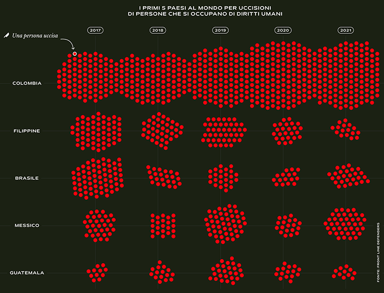
The 5 Countries in the World with the Highest Number of Killings of Human Rights Activists.
Grow or Die: Indigenous people fighting Narcos in Colombia — Visualeyed
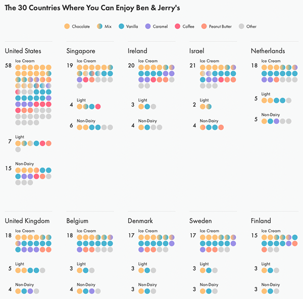
A World of Flavors: The 30 Countries Where You Can Enjoy Ben & Jerry’s.
The Inside Scope of Ben & Jerry’s: A look at the 98 ice cream flavors available around the world — By Hesham Eissa & Lindsey Poulter
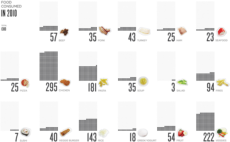
Food Consumed in 2010.
Food Dots — Lauren Manning
Related posts:
Chart Snapshot: Dot Plots & Unit Charts
Chart Snapshot: Parliament Chart / Arc-Dot Chart + Examples
