When you’re first considering how to visualise your data, one important factor is the number of variables present in the dataset.
Often the term ‘dimension’ is used, but it’s interchangeable with the term ‘variable’. So the terms multidimensional, multivariate and multivariable in data visualisation tend to all mean the same thing. But a mathematician might argue otherwise, so we’ll stick to the terms variable and multivariable.
A dataset that contains two or more quantitative variables provides the possibility to investigate any relationships between them. There are certain charts that are excellent at visualising a certain number of variables or even any number of variables.
However, deciding on what chart to use isn’t as simple as identifying which chart can display the right number of variables, but it can be a helpful starting point. Therefore, I’ve constructed a guide below that lists charts based on the number of variables they can visualise.
Each list contains a few different charts, but to narrow down the potentially right chart for your purposes you also need to consider what you want to analyse or communicate.
For the guide below I’ve left out charts that are good for analysing a single variable and time has (mostly) been ignored as a variable.
Two Variables
Here’s a list of charts useful for visualising the relationship between two variables:
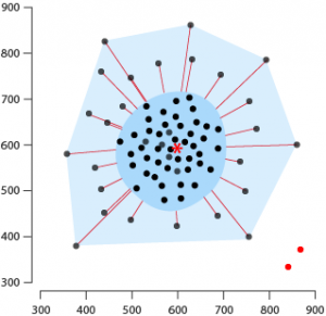
Bagplot
This chart is essentially a bivariate (two variable) Box Plot, as it allows one to visualise the distribution between those two variables. More specifically, a Bagplot can help identify the location, spread, skewness, and outliers within a two-variable dataset.
More on multivariable Box Plot variations can be found in a previous post Further Exploration #5 Multidimensional Boxplot Variations.
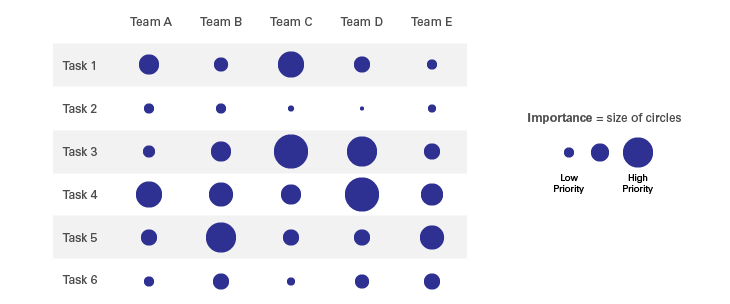
Correlation Matrix
A matrix showing correlation coefficients between a set of variables. The strength of the correlation between two variables is represented the area size of the circle inside their intersecting cell.
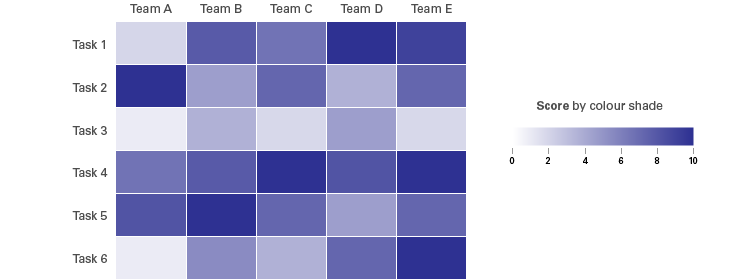
Heatmap
Like with a Correlation Matrix, table/matrix based Heatmaps visualise correlation coefficients between a set of variables. The difference with Heatmaps is that they colour the table’s cell in proportion to the strength of the values between the two variables.
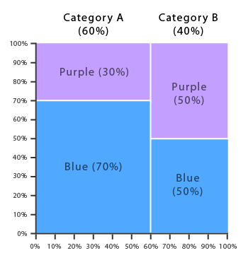
Marimekko Chart
Using this type of chart, you can see how two categorical variables are related by examining the proportion of each category across the two variables. In a Marimekko Chart, the width and height of each segment are both determined by the percentage scale of the two axes.
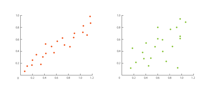
Scatterplot
This chart is the classic solution to finding a correlation between a pair of variables. The pattern produced on a Scatterplot can provide a lot of detail on correlation, such as the strength of the correlation, its shape, or whether the correlation is positive, negative or null.
Connected Scatterplot
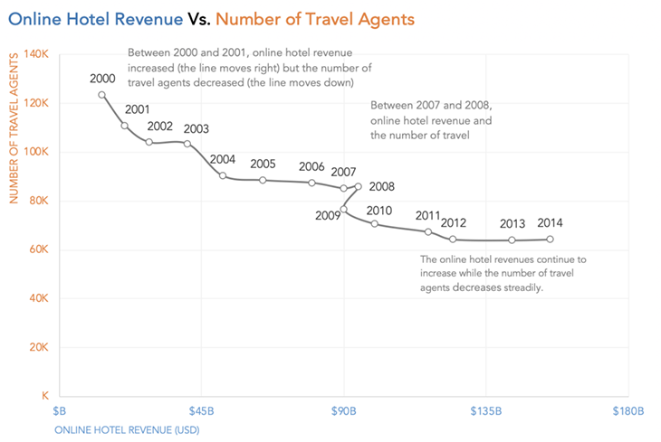
Although I’ve left time-based visualisation out of this list, I thought it would be important to show this variation of the Scatterplot. Connected Scatterplots show the relationship between two variables changing over time. Like on a Scatterplot, each axis is the scale for a variable, but unlike on a Scatterplot, the points represent a position in time and are each connected with a line to show the evolution.
Source: Connected scatterplots: explained with an example, Daydreaming Numbers
Hexagonal Binning
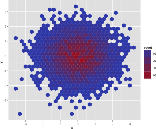
Scatterplots that try to visualise high density datasets can run into the problem where the chart is flooded with too many points and becomes too overwhelming to make any meaningful analysis. It may occur that many of the plotted points may be overlapping or hidden due to heavy clustering.
Hexagonal Binning is a solution to this problem. Instead of plotting everything, data points are aggregated into hexagonal bins. Colour is used to indicate the number of records in each bin.
By displaying a binned representation of the data, patterns may be more discoverable than in a regular Scatterplot.
Source: Scatterplot with too many points, stackoverflow.com
Three Variables
If you want to see the relationship between three different variables, then these charts can help:
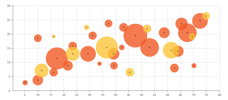
Bubble Chart
Functions exactly like a Scatterplot, but adds a third variable by varying the size of the ‘bubbles’ in proportion to that third variable. More on Bubble Charts.
Contour Plot
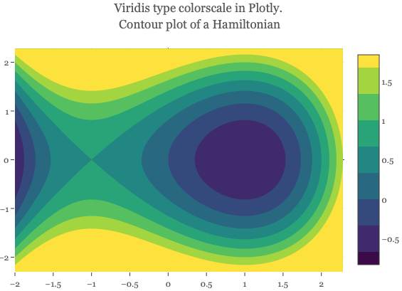
A 2D graphical representation of the relationships between three numerical variables. The X and Y axes are used to plot two variables, and a third variable uses the Z axis to plot the contour levels. Contour levels are drawn as curved lines, and the areas between them can be colour-coded to indicate interpolated values.
Source: Chart Studio Plotly
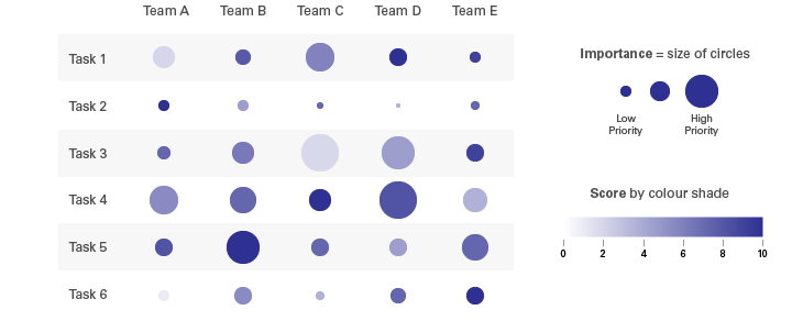
Correlation Matrix (Colour-shaded Circles)
A third variable can be added to a Correlation Matrix by shading the circles in proportion to the values in that third variable.
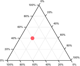
Ternary Graph
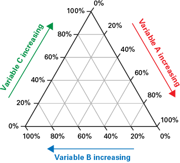
This triangular-shaped chart plots data with three variables, where the sum of all three is constant. The visualisation is generated by placing a dot along each of the three axes (using barycentric coordinates) to represent the ratios among the three variables. More on Ternary Graphs in Further Exploration #8 – Triangular Plots.
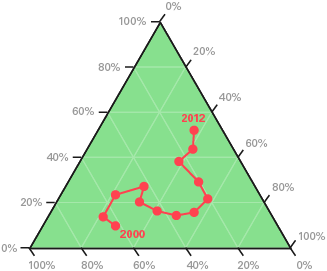
Connected Ternary Graph
This chart is essentially the Ternary Graph version of a Connected Scatterplot.
Four Variables
Below is a list of charts handy for visualising the relationship between four variables:
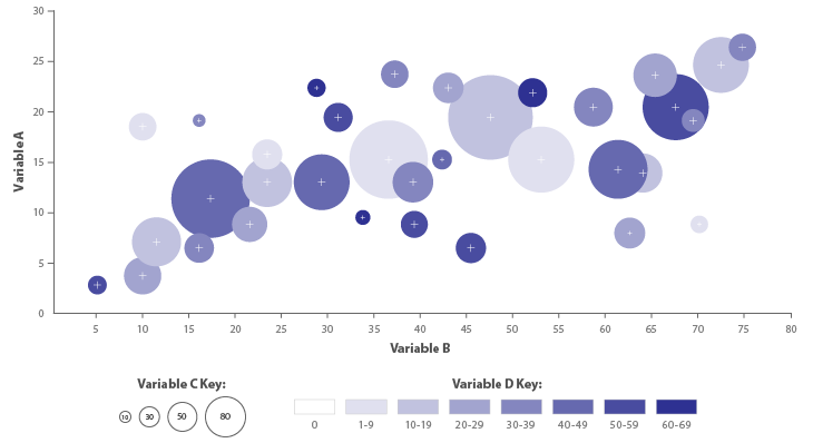
Bubble Chart (Colour-shaded Bubbles)
A fourth variable can be added to a Bubble Chart by shading the bubbles in proportion to the values in that fourth variable.
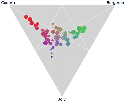
Ternary Bubble Graph
You can create a Ternary Graph with four variables by varying the size of the data points’ areas.
Source: Montreal Mayoral Election 2013, nicolas.kruchten.com
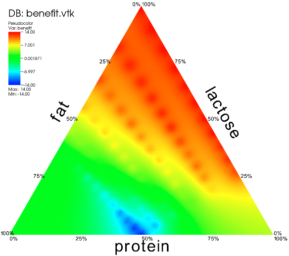
Ternary Contour Graph
Another way to add a fourth variable to a Ternary Graph is to use a contour plot.
Source: VisItusers.org
Many Variables
Included here are charts that can visualise five or more variables in a single visualisation.
Chernoff Faces
This chart presents multivariable data in the form of human faces. The variables are represented by the shape, size, position, and orientation of the eyes, ears, mouth, and nose. It is thought that humans are able to recognise faces easily and notice minor changes with little difficulty. However, the effectiveness Chernoff Faces has often been questioned and criticised.

Source: Wikipedia
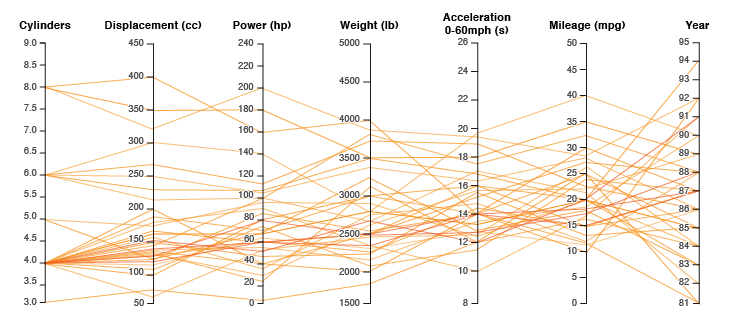
Parallel Coordinates Plot
This visualisation is ideal for comparing many variables together and seeing the relationships between them all. For example, you might compare the specifications of various computer or car models (comparing specs across a range of products). In a Parallel Coordinates Plot, each variable is assigned an axis and the values are plotted as a series of lines that are connected across all the axes.
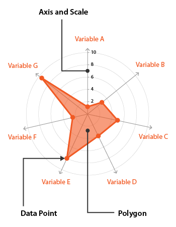
Radar Chart
Each variable on this chart has an axis and a polygon is plotted along all axes. Radar Charts are commonly used for seeing which variables have similar values or if there are any outliers amongst each variable. Since Radar Charts use a polar grid, they’re not as good at comparing values across as graphs that use a cartesian coordinates system.
Custom Marker Design
If none of these charts listed interest you, then a more creative option would be to just create a custom visualisation design that visualises multiple variables. Essentially, this would be a series of graphical markers (shapes) whose form and colour change in proportion to the values in each variable.
An example of this is OECD’s Better Life index ‘flower’ visualisation, which has each ‘petal’ correspond to a topic variable (housing, income, jobs, etc.).
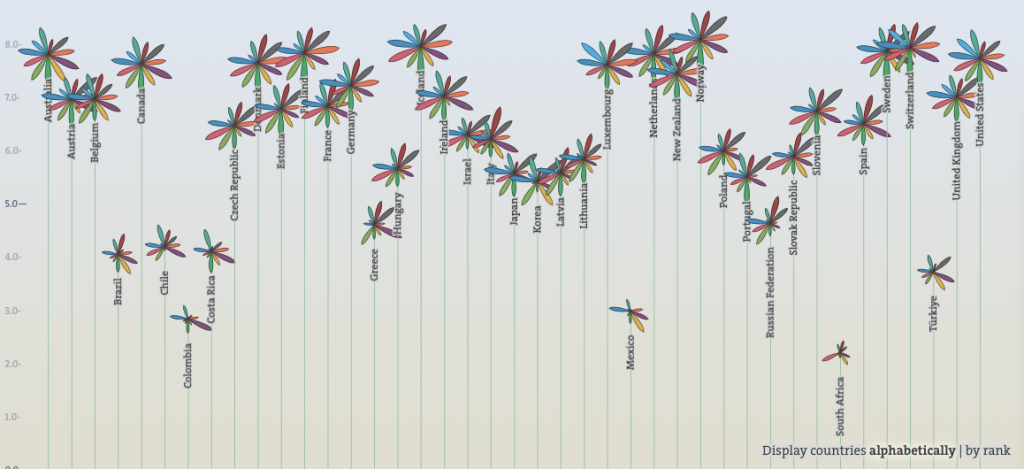
Souce: OECD Better Life Index, OECD
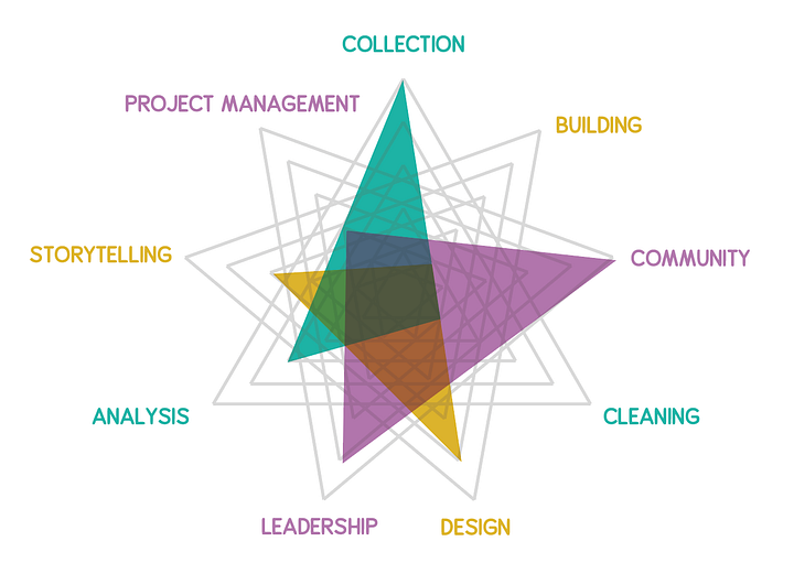
Another example is the badges generated for members of the Data Visualization Society. The appearance of each member’s badge corresponds to their skillset, which they entered in the registration questionnaire.
Source: Data Visualization Society Logo: Behind the scenes, medium.com/nightingale
Summary Table
Below you can find a table with all the charts listed arranged based on the number of variables they can visualise:
| 2 Variables | 3 Variables | 4 Variables | Many Variables |
|---|---|---|---|
| Bagplot | Bubble Chart | Bubble Chart (Colour-shaded Bubbles) | Chernoff Faces |
| Connected Scatterplot | Contour Plot | Ternary Bubble Graph | Custom Marker Design |
| Correlation Matrix | Correlation Matrix (Colour-shaded Circles) | Ternary Contour Graph | Parallel Coordinates Plot |
| Heatmap | Ternary Graph | Radar Chart | |
| Hexagonal Binning | Connected Ternary Graph | ||
| Marimekko Chart | |||
| Scatterplot |
