On the main part of the website, I’ve already covered Area Graphs and Stacked Area Graphs. You could also include Streamgraphs, which are a variation of a Stacked Area Graph but with a varying baseline.
But these only count for a few of the forms that Area Graphs take. So for this post, I want to go over the other types of Area Graph that I’ve come across.
Stepped Area Graphs
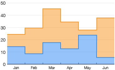
Instead of plotting points and connecting them like in an Area Graph or Line Graph, a Stepped Area Graph plots a series of steps to visualize values over time. In this book, Information Graphics A Comprehensive Illustrated Reference, Robert L. Harris mentions what makes a Stepped Area Graph useful over your usual Area Graph:
Stepped area graphs are sometimes used to differentiate various data series more clearly, to highlight differences or comparisons rather than trends, and to emphasize the nature of the data such as abrupt changes and then constant values – for example, prices, interest rates, plant capacity, etc., that change abruptly and then remain level for a period of time.[…]
– Page 17, Information Graphics, R. L. Harris
100% Stacked Area Graphs
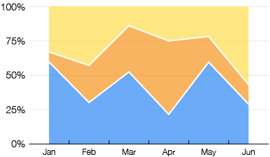
In this chart, data values are plotted against a Y-axis that ranges from 0 to 100%, with the chart being a fixed height to show a part-to-a-whole relationship. This makes a 100% Stacked Area Graph ideal for showing the changing percentages between each of the categories over time.
100% Stepped Stacked Area Graphs
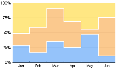
As the title suggests, this chart is a combination of a Stepped Area Graph and a 100% Stacked Area Graph. This chart is useful for seeing the shifts in percentage ratios changing over time.
Radial Area Graphs
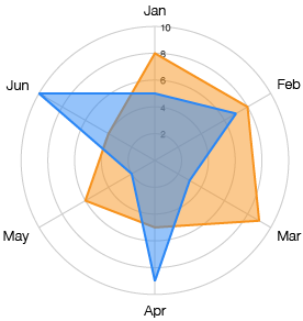
While this chart is drawn in the same way as a Radar Chart, the major difference here is that each axis isn’t an individual variable, but an interval in time. A Radial Area Graph is effectively an Area Graph plotted on a polar grid.
100% Radial Area Graphs
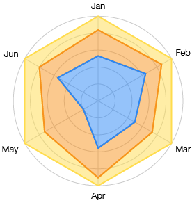
With standard a Radial Area Graph, multiple data series overlap one another, like in a Radar Chart. However, with a 100% Radial Area Graph, a part-to-a-whole relationship is displayed on this chart. The positioning of each data point depends on its relationship to the total amount, which takes up the entire axis.
Stacked Radial Area Graphs
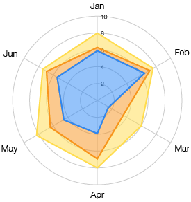
Of course, if you don’t want to show a part-to-a-whole relationship, then you can also stack values. This chart is effectively a Stacked Area Graph but plotted on a polar grid. So unlike a Radial Area Graph, the polygon shapes here are not overlapping one another.
Range Area Graphs
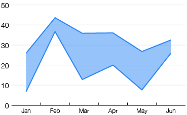
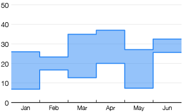
This variation of an Area Graph visualizes the high and low (or a range) changing over time. Each data series is constructed from two line plots (one for the high values and another for the low values) with the area between them filled in.
Range Step Area Graphs
Instead of line points, this variation plots a series of steps to visualise ranges changing over time.
Radial Range Area Graphs
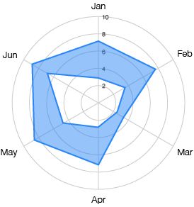
This is another variation of a Range Area Graph, that plots values onto a polar grid.
Joy Plots
Also known as Ridgeline Plots.
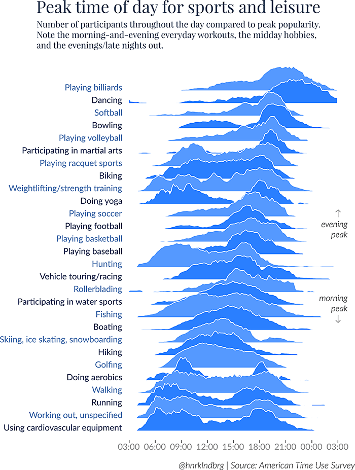
Brought into the mainstream conscientiousness by Joy Division’s Unknown Pleasures album cover, the Joy Plot is a series of successive Area Graphs (or Density Plots) that are partially overlapping and arranged on a column.
Further reading
Horizon Charts
Another chart useful for comparing many Area Graphs together is the Horizon Chart. This chart displays a series of bands that only show a section of each individual Area Graph and (typically) colours positive values blue and negative values red. This makes an Horizon Chart a more space-efficient option for displaying a dense amount of data.
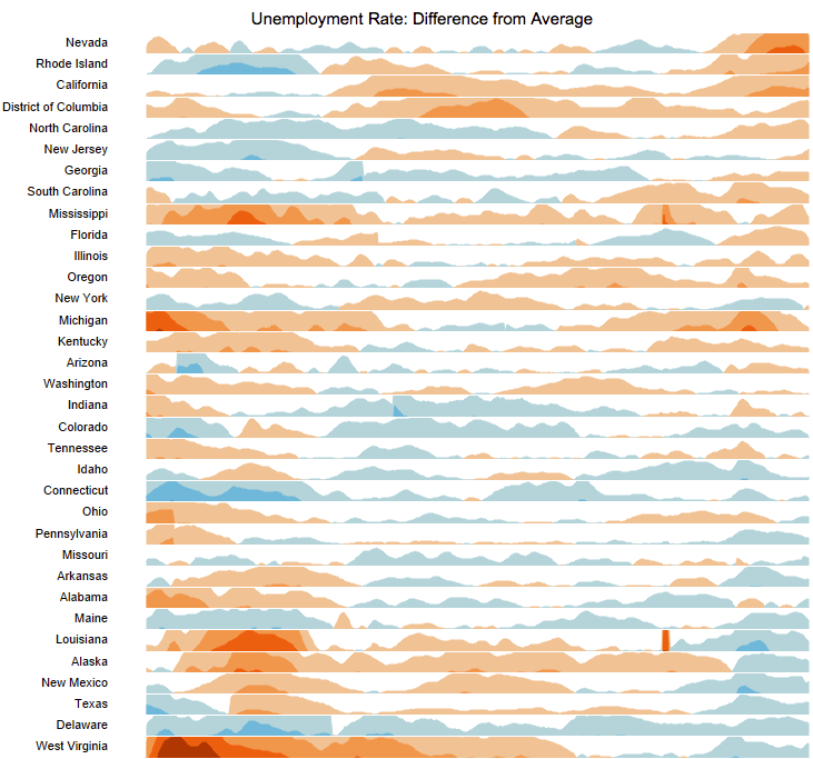
Image Souce: How to create a horizon chart to display dense data
