Also known as a Jittered Strip Plot.
A Jitter Plot is a Strip Plot / Dot Distribution Plot variation that provides a better view of any overlapping data points by adding a small amount of random shifting to the position of plotted dots. By slightly randomising the positions of data points, Jitter Plots help reduce the obfuscation of data points caused by overlapping, allowing for a clearer view of the data distribution.
The function of a Jitter Plot is to visualise the data distribution across multiple categories by plotting dots along a value axis. Each dot can represent a single data point or a count. A Jitter Plot can be displayed either horizontally or vertically. Sometimes a median marker in the form of a small line is displayed.
The dots in a Jitter Plot can use colour coding to distinguish categories apart or visualise an additional variable. Reducing the opacity of the dots can help the visibility of data points that may still be obscured by overlapping.
A Beeswarm Plot is visually very similar to a Jitter Plot, but instead of randomly jittering data points, a Beeswarm Plot will shift the position of points to avoid any overlapping from occurring. A Beeswarm Plot provides more emphasis on the distribution shape, as it tries to maintain the plotted position on the axis, leading to ‘bulges’ in the ‘swarm’ where values are concentrated.
Tools that can draw Jitter Plots:
- D3.js
- Datylon
- Excel
- Flourish
- Highcharts
- plotly / R / ggplot2
- R / ggplot 2
- Python / Altair
- Python / bokeh
- Python / seaborn
- Tableau
- Vega-Altair
- Vega-Lite
Jitter Plot Examples
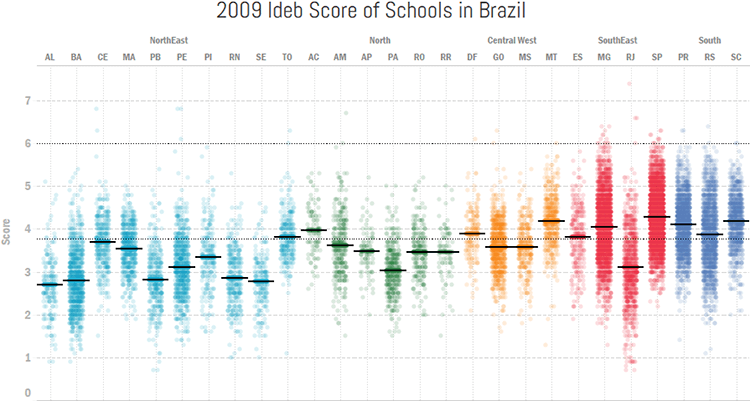
2009 Ideb Score of Schools in Brazil.
How to Create Jitter Plot (Strip Plot) in Tableau — DoingData
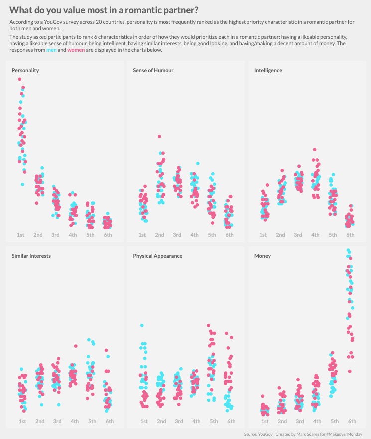
What do you value most in a romantic partner?
Creating Jitter Plots in Google Data Studio — Marc Soares
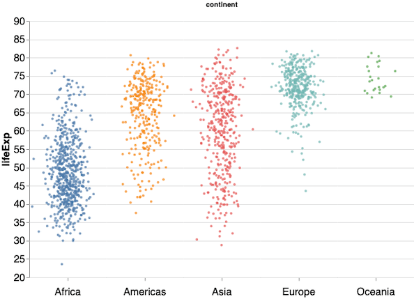
Simple Stripplot with Altair of life expectancy across all continents.
How To Make Stripplot with Jitter in Altair Python?
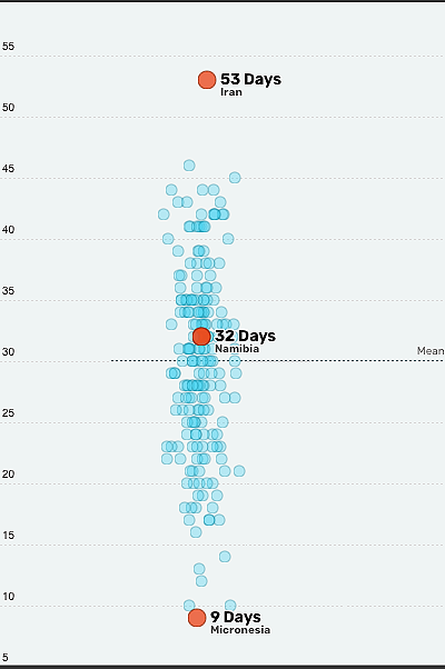
How many paid vacation days do employees get in Namibia compared to the rest of the world?
Onechart
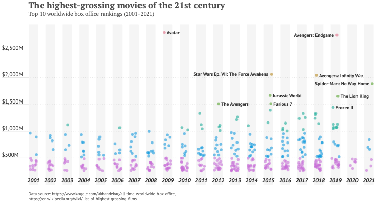
The highest-grossing movies of the 21st century.
Datylon Inspiration
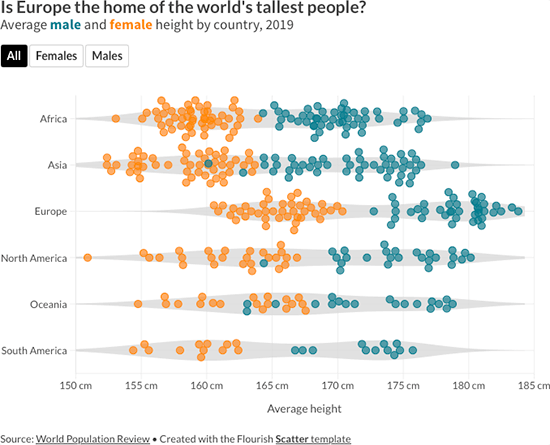
Is Europe the home of the world’s tallest people?
How to identify trends and patterns with data visualization — Flourish Blog
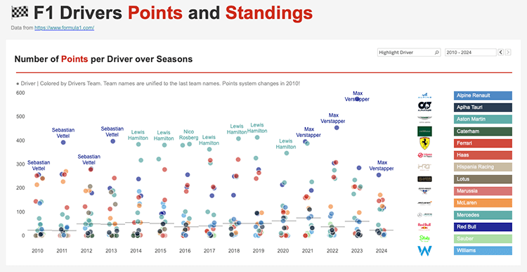
Number of Points per Driver over Seasons.
F1 Drivers Points and Standings by Anastasiia Kuznetsova
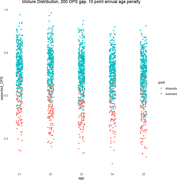
Mixture Distribution, 200 OPS gap, 10 point annual age penalty.
An Approach to Survivor Bias in Baseball — Baseball Prospectus
Related posts:
Chart Snapshot: Beeswarm Plots
Chart Snapshot: Counts Plots
Chart Snapshot: Dot Distribution Plot
