As known as a Strip Plot, Dot Strip Plot.
A Dot Distribution Plot visualises the data distribution across multiple categories by plotting dots along an axis. Each dot can represent a single data point or a count.
There are two variations of Dot Distribution Plot: first, the kind that plots a series of dots to compare the distributions between various categories across a single dimension. The other type is an “Instance Chart” that plots dots along a time axis to show the occurrence of multiple categories over time.
Dot Distribution Plots can be displayed either horizontally or vertically. Typically, the dots are a single colour, but colour coding can be used to distinguish categories apart or visualise an additional variable. To help make overlapping values visible, the opacity of the dots can be reduced, which can help to reveal where the data distribution is concentrated.
A Barcode Plot is a variation of a Dot Distribution Plot that uses stripes instead of dots.
Tools that can draw a Dot Distribution Plot:
Dot Distribution Plot Examples
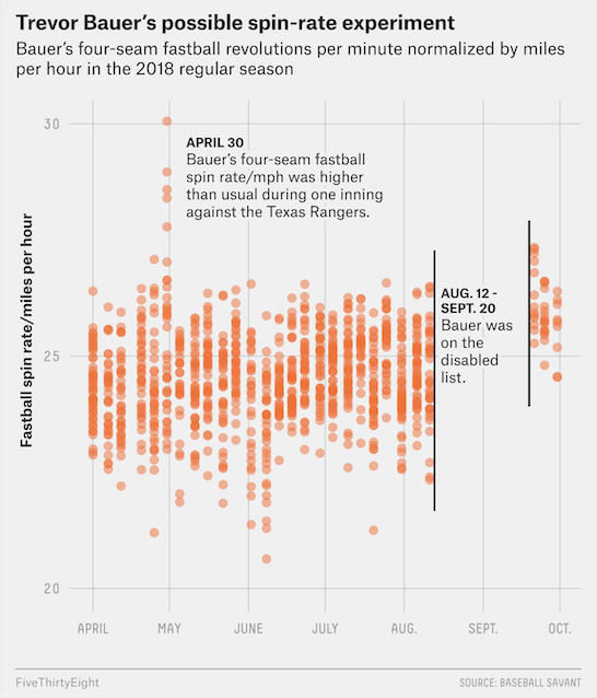
Trevor Bauer’s possible spin-rate experiment.
Baseball’s Top Staffs Have Come Around On The High-Spin Fastball — FiveThirtyEight
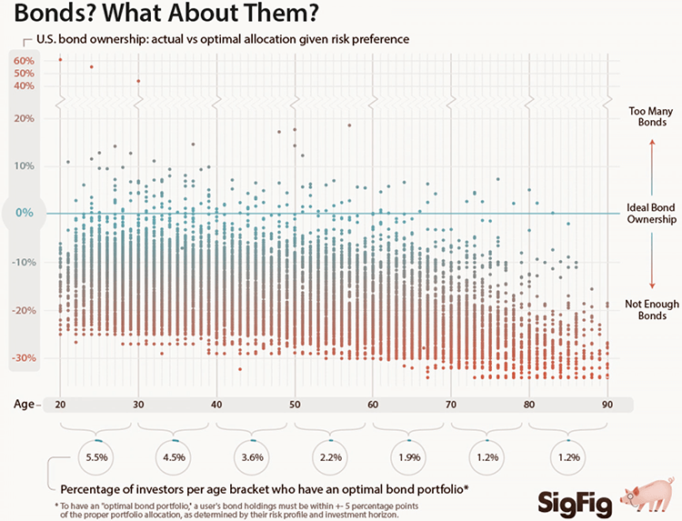
Bonds? What About Them?
Ben Willers For SigFig
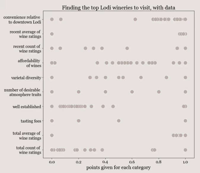
Finding the top Lodi wineries to visit, with data.
A first attempt at data driven wine tasting: Lodi — The Wine Nerd, Rachel Woods
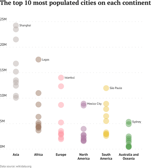
The top 10 most populated cities on each continent.
Datylon Inspiration
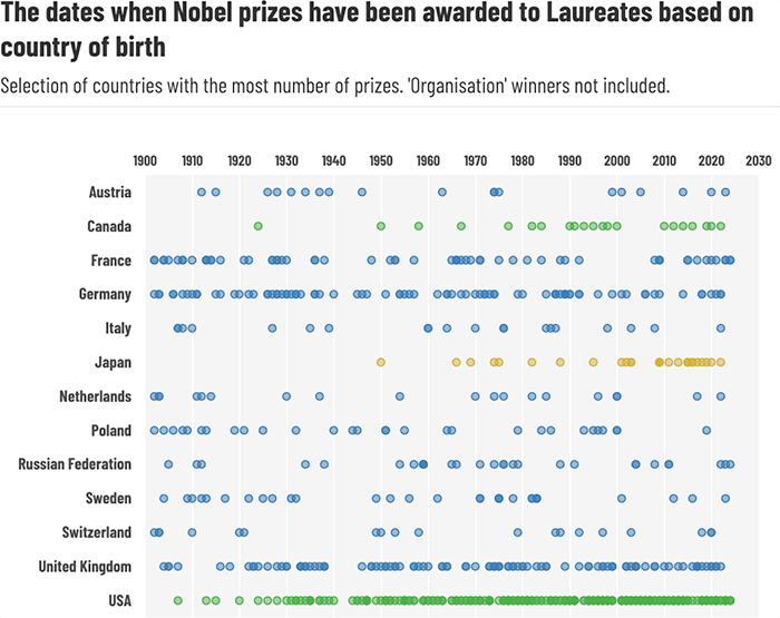
The dates when Nobel prizes have been awarded to Laureates based on country of birth.
6.39.Strip plot — Andy Kirk on Flourish
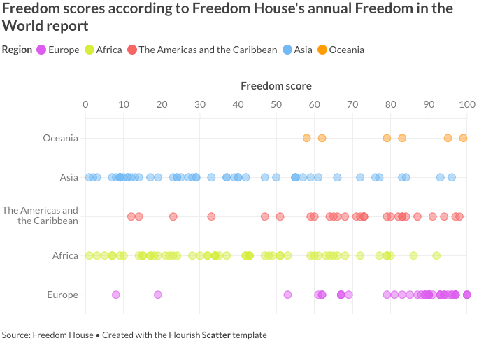
Freedom scores according to Freedom House’s annual Freedom in the World report.
How to identify trends and patterns with data visualization — Mafe Callejón and Vanessa Fillis on the Flourish blog
Related posts:
Chart Snapshot: Barcode Plots
Chart Snapshot: Beeswarm Plots
Chart Snapshot: Cleveland Dot Plots
Chart Snapshot: Counts Plots
Chart Snapshot: Dot Plots & Unit Charts
