Also known as a Strip Plot.
A Counts Plot is a variation of the Strip Plot / Dot Distribution Plot that plots circles of varying area size to help provide a better view of any overlapping data points. Like on a Dot Distribution Plot, the function of a Counts Plot is to visualise the data distribution across multiple categories for comparison.
Each circle on a Counts Plot can represent a single data point or a count with the area size being proportional to the count or number (or the aggregate of values) of data points that would overlap at that position on the axis. Alternatively, the area size of the circles could also be used to visualise an additional variable not present on any of the axes.
A Counts Plot can be displayed either horizontally or vertically. Typically, the circles are a single colour, but colour coding can be used to distinguish categories apart or visualise an additional variable. Also, to help make overlapping circles more visible, the opacity can be reduced.
Another variation of a Count Plot is essentially a Cleveland Dot Plot but with the size of the dots varying in proportion to the count or variable. This could be used to compare single or multiple data series or subcategories (of around 2-4) to each other.
Tools that can draw Counts Plots:
Counts Plot Examples
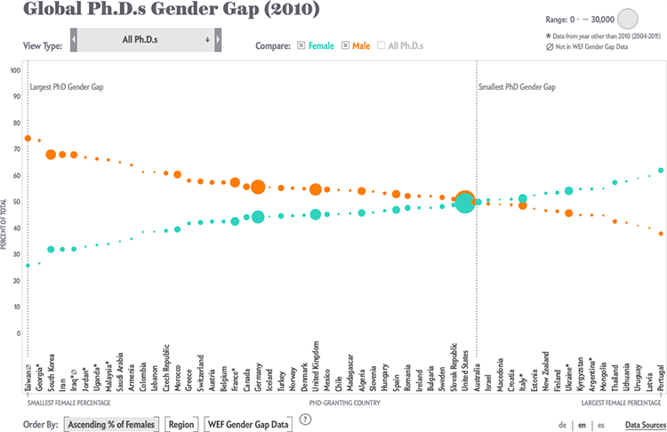
Global Ph.D.s Gender Gap (2010).
How Nations Fare in PhDs by Sex [Interactive] — Scientific American
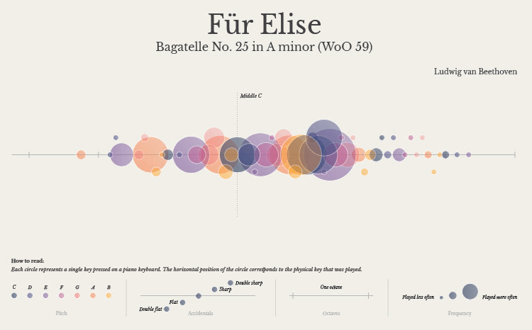
Für Elise, Bagatelle No. 25 in A minor (WoO 59).
Piano Notes by Alice Feng
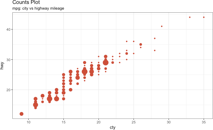
Counts Plot, mpg: city vs highway mileage.
Top 50 ggplot2 Visualizations – The Master List (With Full R Code) — r-statistics.co by Selva Prabhakaran
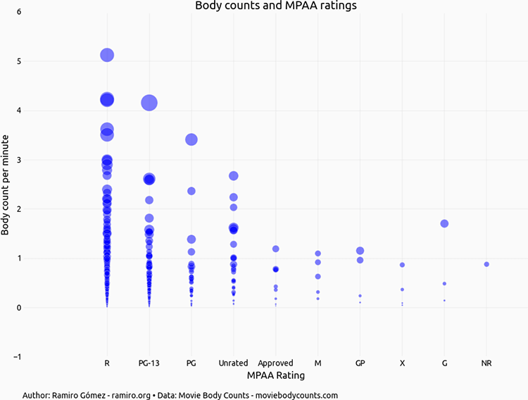
Body counts and MPAA ratings.
Exploring Movie Body Counts — Ramiro Gómez
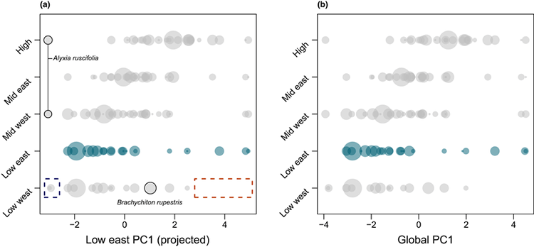
Strip plots showing the position of species recorded in each site along (a) PC1 for low east (760 mm yr⁻¹) projected through each assemblage and (b) PC1 from the global principal components analysis.
Changes in trait covariance along an orographic moisture gradient reveal the relative importance of light‐ and moisture‐driven trade‐offs in subtropical rainforest communities — ResearchGate
Related posts:
Chart Snapshot: Dot Distribution Plot
Chart Snapshot: Cleveland Dot Plots
Chart Snapshot: Beeswarm Plots
