For ages, the naming between Sankey Diagrams, Parallel Sets, and Alluvial Diagrams have been used interchangeably. Are these visualisations that different from one another and is it a bad thing that some misnaming is taking place?
From my research into the various visualisation types, it’s common to see a particular visualisation type being identified under multiple names. So the issue isn’t the use of multiple names for one visualisation type, but a muddling of labelling when it comes to identifying certain visualisations.
Perhaps I’m being pedantic, but I think we need some kind of standardisation when it comes to the naming of visualisations. I don’t think it’s super important, but I think some confusion and inconsistency is taking place when discussing certain visualisation types. Of course, I’m been guilty of this myself, but I’d like to rectify that.
So to return to our three charts in question, why are they often confused with one another?
I think the answer to that is that they’re visually very similar and all communicate ‘flow’. All three charts display coloured bands (or flow-paths), whose widths are proportional to the quantities the category of a band represents.
But how do Sankey Diagrams, Parallel Sets and Alluvial Diagrams differ? How do we distinguish each of these charts from one another?
To do that, let’s look in-depth at each chart with some examples.
Sankey Diagrams
Irish engineer and captain Matthew Henry Phineas Riall Sankey first developed the Sankey Diagram to demonstrate (in 1898) the energy efficiency of a steam engine. Below you can see a redrawing of Sankey’s original chart.
What is a Sankey diagram? – Sankey Flow Show
As you can see from this example, a Sankey Diagram uses a series of flow paths of varying sizes to communicate how an isolated, abstract process works through its inputs and outputs.
The flow is communicated through the direction of the paths, indicated through the use of arrows. Not all Sankey Diagrams utilise arrows, but they help visually communicate the direction of flow and indicate inputs or outputs.
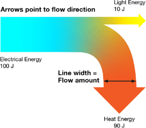
The flow paths in a Sankey Diagram can combine or split apart at any stage of the system’s process to show how quantities in a system are divided up after each changing state. Colour or divider lines can be used to divide the chart into different categories or to show the transition from one state of the process to another.
The thickness of a flow path is proportional to the amount in the dataset it represents. This allows you to compare and contrast the different proportions of each flow path in an entire process or system.
This makes Sankey Diagram great for communicating how an abstract system works or for communicating the magnitude and direction of the flow. Sankey Diagrams are useful for locating the dominant contributions to an overall flow and detecting any inefficiencies within a system, by revealing where the waste is.
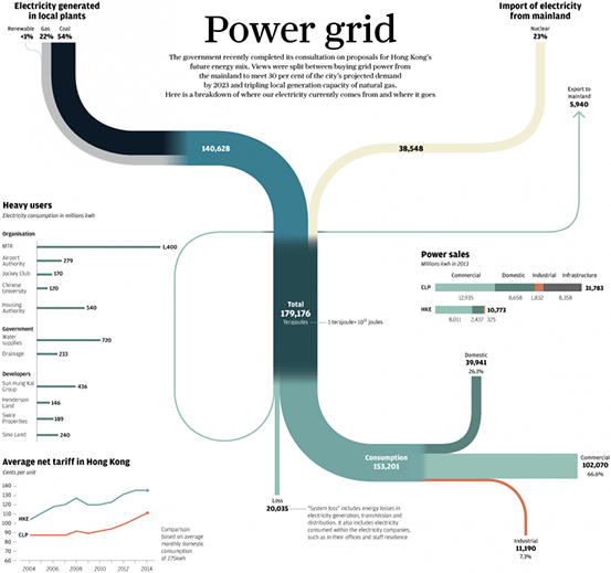
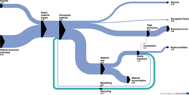
Below are some examples of what I would consider your typical Sankey Diagram to look like:
Power grid – Adolfo Arranz
Example of a Sankey diagram – Wikipedia
Material flow diagram – eurostat
United States budget 2016 – wikibudgets.org
Parallel Sets
Fabian Bendix, Robert Kosara, and Helwig Hauser first introduced Parallel Sets in 2005 in their paper Parallel Sets: Visual analysis of categorical data. This visualisation method was developed as a way to make sense of large and complex datasets with categorical dimensions. Parallel Sets were inspired by the Parallel Coordinates Plot and improved upon its design by making the data clearer when comparing the frequencies across multiple categories across multiple dimensions.
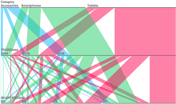
In Parallel Sets, each category is represented with a coloured band (flow-path) and the divided line-set nodes relate to the dimensions/variables in the dataset.
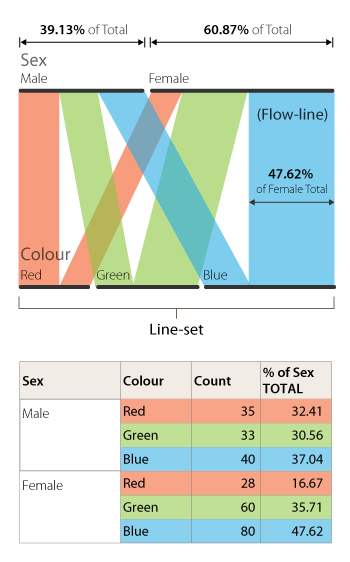
The length of each line slit in a set and the flow-path band that stems from it is determined by the proportional fraction of the category total. Therefore, each line-set displays a part-to-a-whole relationship and must maintain a uniform length as all other line-sets as they represent 100%. For example, in the above anatomy image the category Sex, is divided up into two subcategories (male and female) with the length of each line being proportional to the subcategory’s percentage.
Afterwards, the data is broken down even further into three parts (red, green, and blue), which are each represented with coloured flow-paths. The thickness of these flow-path is proportional to the frequencies across each category and respective subcategory. This allows for the comparison of proportions between each category and for multi-variate analysis.
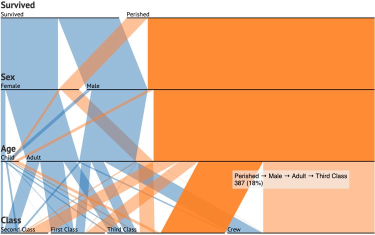
This classic example below of Titanic Survivors demonstrates the effectiveness of Parallel Sets well:
Parallel Sets – Jason Davies
Here we can see the distribution of who survived or perished based on sex, age, and class. Straight away you can see from the abundance of orange that most people who were on board perished, and that most of them were adult men in Third Class or part of the crew.
Some more examples of Parallel Set would include these:
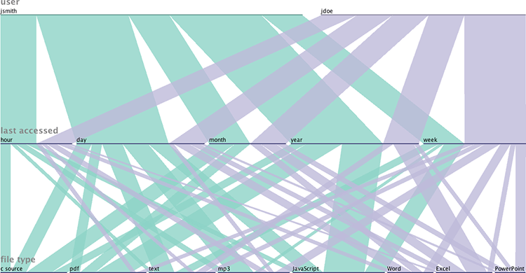
Visualizing filesystems with parallel sets – Mike Harsch’s Blog
Displaying workflow by Jessica Marasco – BIME
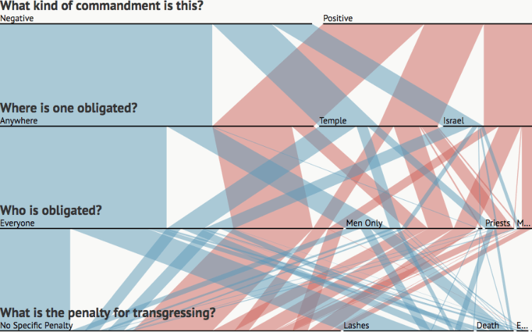
Mitzvot in Sefer Hachinukh – sefaria.org
Alluvial Diagrams
The first use of Alluvial Diagrams I found was in the 2010 paper Mapping Change in Large Networks, by Martin Rosvall and Carl T. Bergstrom, which used this type of visualisation as a way to represent the change in a large and complex network structure over time. More specifically, this Alluvial Diagram from the paper (below) was used to map the changes across a set of scientific fields based on the citation patterns between around 7000 scientific journals over a decade.
When I was first reading this visualisation, I found it a bit confusing to read as there’s hardly any visual distinction between the ‘blocks’ that represent the clusters of nodes and the flow paths between them.
The Parallel Sets equivalent to these ‘blocks’ would be the ‘line-sets’, which are displayed more clearly with simple black lines.
Despite this visual flaw, the blocks represent clusters of nodes and the flow paths between the blocks represent changes over time in the structure of these node clusters. The height of a block is proportional to the size of the cluster and the thickness of a stream field is proportional to the size of the components contained in both blocks connected by a flow path.
Rosvall’s and Bergstrom’s visualisation also makes use of colour to highlight structural changes and any major transitions. By following the coloured streams, you can see how the fields of psychology, neurology and molecular & cell biology have merged to form an entirely new scientific field: neuroscience.
Many others have adapted this chart demonstrated in this paper for purposes other than visualising changes in network structures over time.
Here, however, I think is where a lot of the confusion appears, as many of this kind of adaptation of the Alluvial Diagram are often labelled as ‘Sankey Diagram’. Therefore, I think it would be a good idea to provide some examples of what I would consider as an ‘Alluvial Diagram’.
These Alluvial diagrams I’ll now show function very similar to Parallel Sets, but with the line-sets (nodes) not being of uniform length and adding up to 100%. The flow-paths in these Alluvial Diagrams are also often wavy and overlapping.
An example of this is from The Economist, which shows the flow of migrants seeking asylum. Here, instead of the nodes being used for points in time, they’re used to show where migrants are coming from and to, along with aggregates such as total decisions (on whether they were accepted) and breakdown of those decisions by origin.
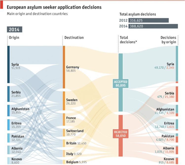
Seeking safety, European asylum application flows: acceptances and rejections – The Economist
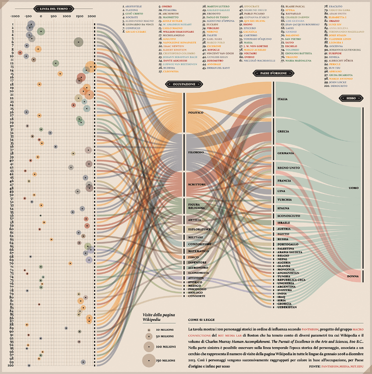
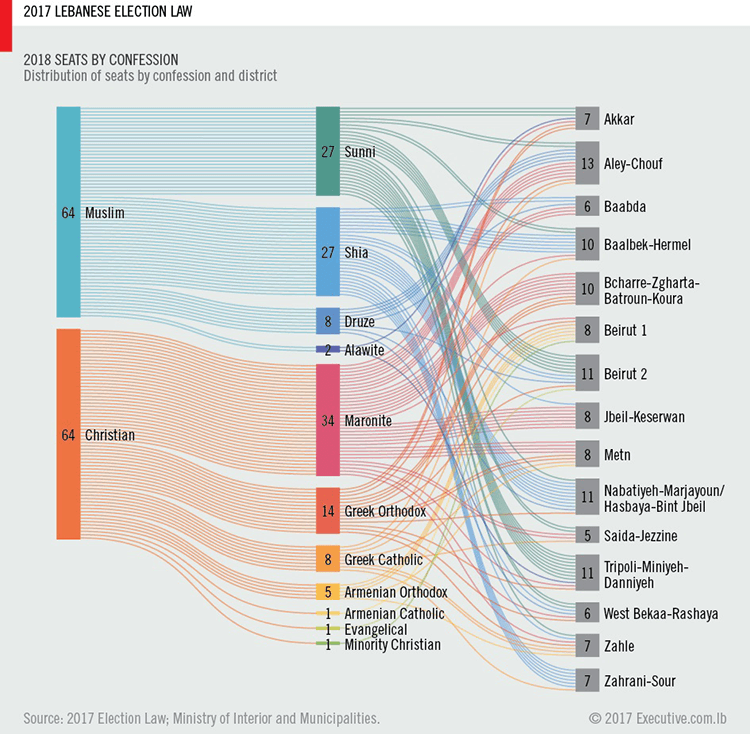
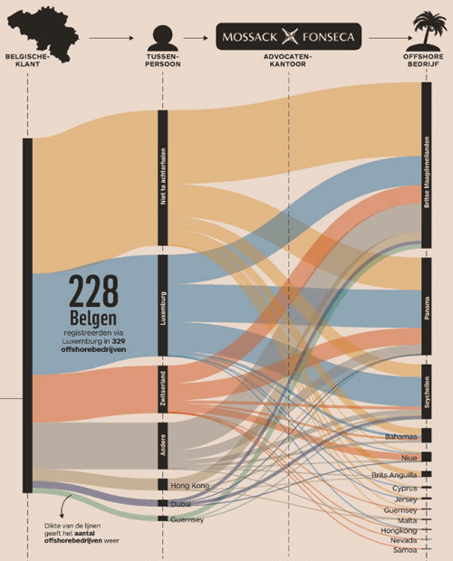
Many of these examples below show Alluvial Diagrams used for multivariate analysis:
PANTHEON: Corriere della Sera, La Lettura #181 – Valerio Pellegrini
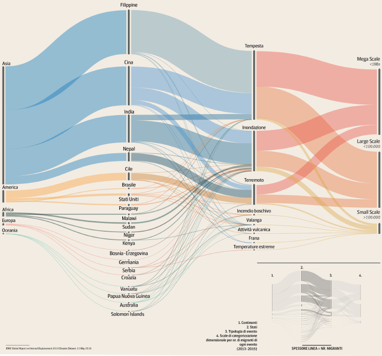
G07: Environmental Migration – DensityDesign Lab
2017 Lebanese Election Law – Ahmad Barclay
The Belgians in the Panama Papers – Maarten Lambrechts
Comparing the Differences
After reviewing each visualisation type and its functionality, let us summarise the differences.
Sankey Diagrams are primarily focused on displaying how quantities from one state in a system or process to another. I think of Sankey Diagrams as a simplified Flow Chart that can also visualise quantitative values at each step of the process.
Like with a Flow Chart, a Sankey Diagram can include cycles, which is something that distinguishes them from Parallel Sets and Alluvial Diagrams.
Also, the flow paths in a Sankey Diagram can combine or split apart at any stage of the system’s process. Whereas on Parallel Sets and Alluvial Diagrams, you tend to get a group of flow paths only going from one side to the other.
Visually, Sankey Diagrams focus on an overall flow of a system and usually do not display a series of nodes. However, many tools for building Sankey Diagrams do include nodes (such as SankeyMATIC and The Sankey Diagram Generator). This is mainly due to the technical constraints of building a Sankey drawing tool, which requires control points to edit the diagram. But the nodes can easily be removed by exporting and refining the visualisation in a vector-image editing application.
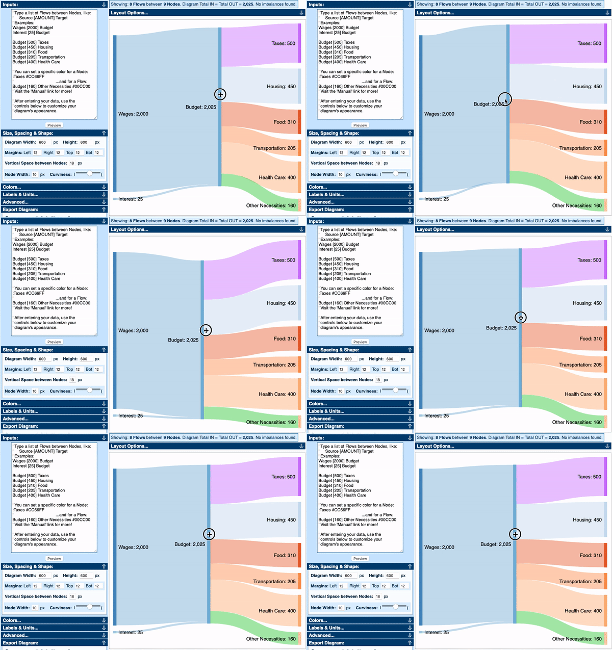
You’ll also never see the use of arrows on Parallel Sets and Alluvial Diagrams, but Sankey Diagrams tend to use them to show the direction of the flow as the diagram is not linear. Arrows are unnecessary on Parallel Sets and Alluvial Diagrams because the flow is only in one direction.
Sankey Diagrams that do display nodes, place them more freely than on a Parallel Sets or Alluvial Diagram. These charts instead require their nodes to be aligned and can’t be randomly placed.
In terms of the data, Parallel Sets and Alluvial Diagrams tend to be used for multi-dimensional (or multivariate) data analysis. More emphasis is given to the frequencies and proportions between various dimensions and the relationships between these dimensions. For example, how things are broken up by asking questions like “how many people have the traits A and B, compared to how many of them have B but not A?”.
Sankey Diagrams, on the other hand, are used to visualise quantities between different stages of a process or system. A Sankey Diagram will visualise the quantity of incoming and outgoing parts of a flow, which helps locate where the dominant contributions are and where quantity is being lost within a process or system.
So far, I’ve mainly made the distinction between Sankey Diagram to Parallel Sets and Alluvial Diagrams. But that’s because Parallel Sets and Alluvial Diagrams aren’t too different from one another.
However, the main difference between these two chart types is that Parallel Sets display a part-to-the-whole relationship, while Alluvial Diagrams only visualise quantities between dimensions.
Visually, this difference can be identified from the consistency of the length of their line-sets/nodes. Parallel Sets will have line-sets that are all uniform in length, while Alluvial Diagrams will have a lot more variation.
– – –
So I hope this post will help make the distinctions between these charts clearer and maintain more consistency in the naming of these charts.
If anyone has any disagreements or comments, then please write in the comment section below.
Other blog posts on the subject:
Chart Snapshot: Alluvial Diagrams
Defining and taxonomizing alluvial diagrams – Cory Brunson
Alluvial plots vs Sankey diagrams – Datasmith.org
