Originally, I started this post exploring and writing about combining Proportional Area Charts with other forms of data visualisation. However, I found that many of the charts I included in the research didn’t fit into the category of chart combinations and instead were just a variation of a Proportion Area Chart.
Many of the differences between the chart variations included in this post and to a simple Proportional Area Chart are just in the way that the shape areas are arranged on the page and in how two or more variables are displayed in relation to each other.
If you’re unfamiliar with Proportional Area Charts, then they are great for comparing values and showing proportions to give a quick, overview of the data, without the use of scales. Proportional Area Charts are constructed by taking a shape (typically a circle or square) and drawing its area in proportion to the data value that it represents. So let’s have a look at the different ways we can use this chart.
Split Proportional Area Charts
This variation is actually a combination of two split Proportional Area Charts that are placed side-by-side, as a way to compare the differences between two different variables. The interactive example below from the Economist uses this chart to show the growth of eBooks over time in comparison to paperback books.
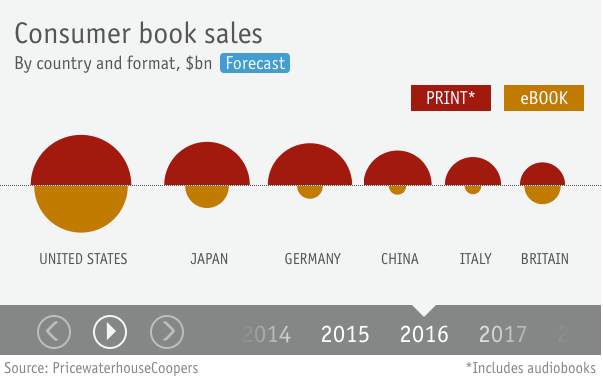
Source: Turning the pixelated page, The Economist
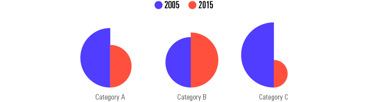
Another alternative use for this chart would be to show the before & after changes between two time periods. So instead of each slice being different categories, you could have a slice for two different years. This would allow you to compare the differences between each year:
x4 Proportional Area Charts
Here in this variation, four squares areas are grouped together to display the proportions between multivariate data. In the example below from the Audipress Visual Report, you can see that the squares are grouped into categories (based on profession type). For the squares in each group, they are each divided into four subcategories: Adulti (Adults in grey), Uomini (men in blue), Donne (women in red), and Responsabili Acquisti (purchasing managers in an off yellow).
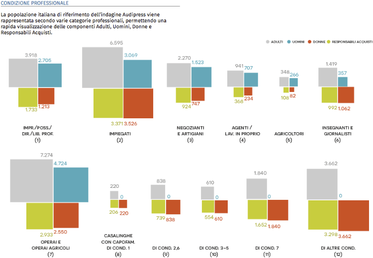
Source: Analisi della popolazione italiana, Visual Report di Audipress
Nested Proportional Area Chart
Here, multiple shape areas are layered. This alternative is a more space-efficient layout format for Proportional Area Charts that can be arranged in a few different ways:

Also, this variation can be used in a few different ways. First, as a way to compare proportions across two or more categories. Another use is to compare both proportions and the part-to-a-whole relationship of each of these proportions. A good example of this is the graphic below from The Washington Post, which compares the exports (of all products) between various nations and also what percentage of a country’s export is made up of petroleum products.
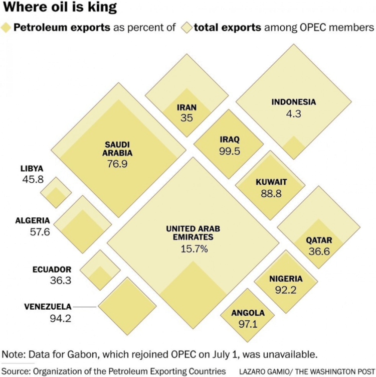
Source: How the crash in oil prices devastated Angola and Venezuela, The Washington Post
You could also use this variation to show the before & after changes between two time periods by having the first shape area for one year and then the second shape area for another year. This has a better visual impact when showing an increase from the first data point, however, the other way around looks a little odd:

If you don’t limit yourself to two points in time, you can use this variation of the chart to communicate growth:

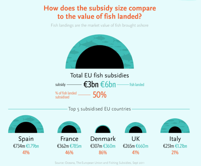
Split & Nested
Both of attributes of the last two variations mentioned are combined together is another thing I thought would be worth mentioning. In the example below, the subsidy size is compared to the number of fish landed across five EU nations:
Showing Change / Before & After
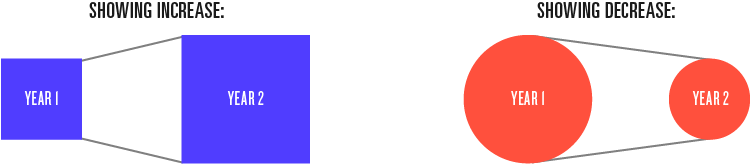
I’ve already shown a couple of ways that you could use a Proportional Area Chart to display and compare the before & after changes in the data. But here I wanted to show another variation that I think could be useful in this scenario. This variation below simply has the before (year 1) and after (year 2) with connecting lines that help emphasise the among of change between the two data points. An increase in value will display an upward slope, while a decrease in value will display a downward slope. How dramatic the change in value will be represented in the steepness of the slope, while no change would generate a straight line.
Using Animation
Animation can be used to show how the data changes over time. The changing area size of a shape when animated gives a nice visual metaphor of growth or shrinking:

Adding a ‘trail marks’ to the animation gives some indication of the maximum values being displayed and where the values over time are concentrated around:

3D Proportional Area Charts
Bringing Proportional Area Charts into the third dimension (physical space) is a great way to give people perspective on numbers. Although technically, I think it might be better to call this type of data visualisation (or data physicalisation) as a ‘Proportional Volume Sculpture’. Instead of using the amount of flat area to communicate numbers, a Proportional Volume Sculpture would represent numbers by the amount of physical space it takes up.
Below is an example created by Austrian artist Michael Marcovici, which displays what one billion US dollars look like if all the bank notes were displayed together:

Source: Marcovici’s Single-Datum Visualizations, List of Physical Visualizations
Another example of the use of a Proportional Volume Sculpture is from the artists, Ruth Jarman and Joe Gerhardt, who created a two-meter spherical wooden sculpture located in a forest in England. The ball represents the take-up and loss of carbon dioxide from the forest trees across one year.

Source: Carbon Exchange Captured in a Wooden Ball, List of Physical Visualizations
It’s not only art installations that this type of data physicalisation could be useful in. I believe you could apply Proportional Volume Sculpture to virtual reality (VR) or augmented reality (AR) projects as well. So far, I haven’t come across any examples of this, so please comment below if you have any.
