To demonstrate the potential new content structure being implemented on an existing visualisation reference page, here’s an example provided for Bar Charts:
Bar Chart
Other names: Bar Graph, Bar Plot
Functions: Comparisons, Rankings
Encodings: Length
Description
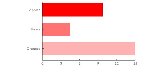
A graph that displays a series of bars plotted on a common axis, whose lengths are proportional to the values they each represent. When the bars are horizontal, it’s known as a ‘Bar Chart’, while when the bars are vertical it’s known as a ‘Column Chart’.
How to Read
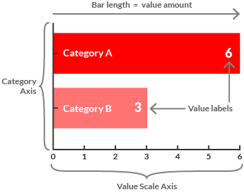
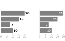
First, locate the value scale axis and the category axis, to identify what is being visualised. Each category is assigned its own bar and the length of each bar is proportional to the value it represents. Colour-coding can be assigned to the bars to distinguish each category in the dataset.
Value labels are sometimes displayed near the bars to display exact values. However, if no value labels are displayed, then value estimates can be made by scanning across from the end of a bar to the value scale.
Usage
Bar Charts are primarily used to show discrete, numerical comparisons across categories.
Bar Charts are distinguished from the visually very similar Histogram, as they do not display continuous data over an interval. A Bar Chart instead uses discrete and categorical data and therefore answers the question of “how many?” in each category.
Best Practices & Tips
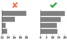
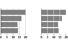
Make sure to start the value axis at 0, as truncation can exaggerate the differences between bars.
Avoid drawing the bars too narrow, as this focuses attention on the negative space more rather than on the bars. Read more here in this Stephen Few article.
Placing value labels with the exact data values on or next to the bars makes them a lot quicker and easier to read. Value labels can be placed on the end of the bars, either on the inside or outside.
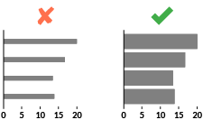
Instead of using gridlines for the values axis, you can divide the bars up based on the value axis. This saves the eye from having to scan across the bars to the value axis.
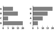
Make sure to keep the ordering of the bars to be logical to your data. Typically, this can be by magnitude (high to low bars and vice versa) or alphabetically (A to Z). See the Five Hat Racks for more.
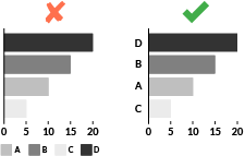
Avoid using a legend as category names should already be displayed on the category axis.
Variations

Column Chart

Grouped Bar Chart

Stacked Bar Chart

100% Stacked Bar Chart

Side-by-side Bars

Tornado Chart

Triangle Bar Chart
Similar Visualisations

Change Bar Chart

Histogram

Lollipop Chart

Pareto Chart

Population Pyramid

Progressive Bar Chart

Radial Bar Chart

Radial Column Chart

Span Chart

Unit Chart

Waterfall Chart
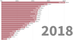
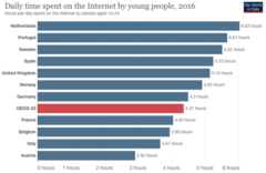
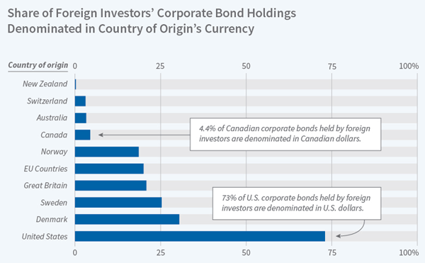
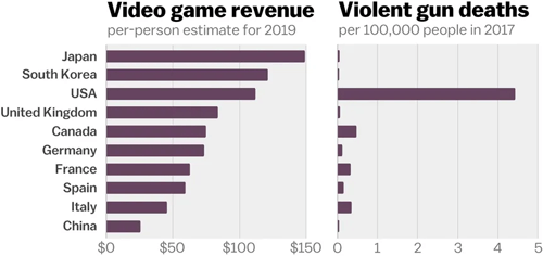
Example Gallery
Click on image to be linked to the original source:
How to Create
Code:
AnyChart (JS)
amCharts (JS)
D3.js (JS)
FusionCharts (JS)
Highcharts (JS)
Google Charts (JS)
JSCharting (JS)
Plotly (JS)
Python Graph Gallery (Python)
R Graph Gallery (R)
Vega (JS)
ZoomCharts (JS)
Webapp:
DataHero
Data Illustrator
Datamatic
DataWrapper
Flourish
Google Docs
Infogram
Online Chart Tool
PlotDB
RAWGraphs
Slemma
ZingChart
Desktop App:
Adobe Illustrator
datylon (Ai Plugin)
Apple Numbers
MS Excel
MS Power BI
RStudio
Tableau
Research Papers
Visual Arrangements of Bar Charts Influence Comparisons in Viewer Takeaways.
Xiong, C., Setlur, V., Bach, B., Lin, K., Koh, E., & Franconeri, S. (2021). IEEE Vis. Published. Link
Neighborhood Perception in Bar Charts.
Zhao, M., Qu, H., & Sedlmair, M. (2019). Proceedings of the 2019 CHI Conference on Human Factors in Computing Systems. https://doi.org/10.1145/3290605.3300462
Readability and Precision in Pictorial Bar Charts.
Skau, D., & Kosara, R. (2017). Eurographics Conference on Visualization (EuroVis). Link
An Evaluation of the Impact of Visual Embellishments in Bar Charts.
Skau, D., Harrison, L., & Kosara, R. (2015). Eurographics Conference on Visualization (EuroVis), 34. Link
Bar charts and box plots.
Streit, M., & Gehlenborg, N. (2014). Nature Methods, 11(2), 117. https://doi.org/10.1038/nmeth.2807
Four Experiments on the Perception of Bar Charts.
Talbot, J., Setlur, V., & Anand, A. (2014). Infovis. Published. Link
A Model of Perceptual Task Effort for Bar Charts and its Role in Recognizing Intention.
Elzer, S., Green, N., Carberry, S., & Hoffman, J. (2006). User Modeling and User-Adapted Interaction, 16(1), 1–30. https://doi.org/10.1007/s11257-006-9002-9
Bars and lines: A study of graphic communication.
Zacks, J., & Tversky, B. (1999). Memory & Cognition, 27(6), 1073–1079. https://doi.org/10.3758/bf03201236
Reading bar graphs: Effects of extraneous depth cues and graphical context.
Zacks, J., Levy, E., Tversky, B., & Schiano, D. J. (1998). Journal of Experimental Psychology: Applied, 4(2), 119–138. https://doi.org/10.1037/1076-898x.4.2.119
