Also known as a Rectangular Cartogram.
A Raisz Cartogram is a Cartogram variation where each geographical region is represented by a rectangle, with the area being proportional to the data value being visualised geographically.
The height and width of each rectangle in a Raisz Cartogram are adjusted to fit within the original geographical region shape as much as possible. Also, each rectangular region is positioned approximately to their corresponding locations on the map without any overlapping of other regions.
Tools to generate this chart with:
D3.js
recmap + github
rectocarto
Examples
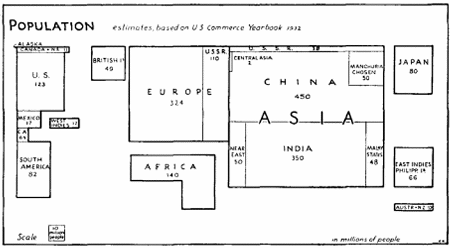
POPULATION estimates based on us commerce Yearbook 1932.
Rectangular Statistical Cartograms of the World — Erwin Raisz
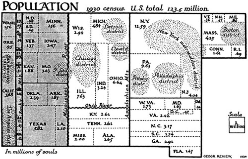
POPULATION 1930 census. U.S. total 123.6 million.
Presence of school cartography in Erwin Raisz’s lifework.
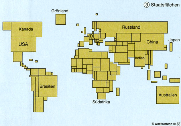
Cartogram in one of the school atlases published by the Westermann firm in 1996.
Hungarian survey on the use of cartograms in school cartography
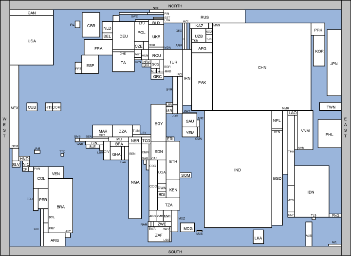
Rectangular Cartograms – World Population.
Eindhoven University of Technology — Bettina Speckmann
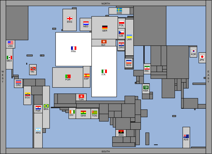
FIFA World Cup Cartograms, Final.
Eindhoven University of Technology — Bettina Speckmann
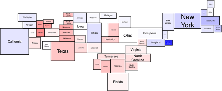
Rectangular Cartogram of the U.S. election 2004.
Draw your own Rectangular Statistical Cartogram with recmap — Christian Panse
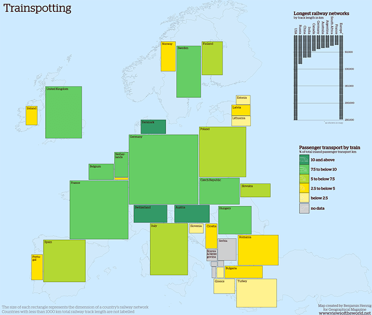
Trainspotting: Europe’s railway lines.
Views of the World — Benjamin Hennig
Related posts:
Chart Snapshot: Cartograms
Chart Snapshot: Demers Cartograms
Chart Snapshot: Dorling Cartograms
Further Exploration #6 Cartograms
