Also known as a Tile Cartogram, Tilegram.
A Mosaic Cartogram is a type of data map where the geographical regions are made up of uniform, square tiles. In a Mosaic Cartogram, each tile represents a nominal unit from a particular variable (e.g. 1 square = 1 million people). Hence, the number of tiles assigned to a region is proportional to the data value assigned to that region.
Colours can be assigned to the tiles in a Mosaic Cartogram to distinguish geographical regions, represent categories, or visualise an additional numerical variable.
The tiles in a Mosaic Cartogram are arranged to give a rough approximation of the original shape and relative position of the geographical regions while preserving recognisable features like peninsulas or islands to aid recognition. The result is a map that resembles a piece of mosaic art.
Tool to generate a Mosaic Cartogram:
R / Python / D3.js
Examples
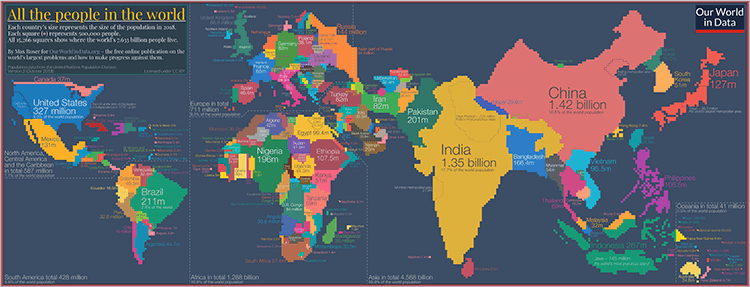
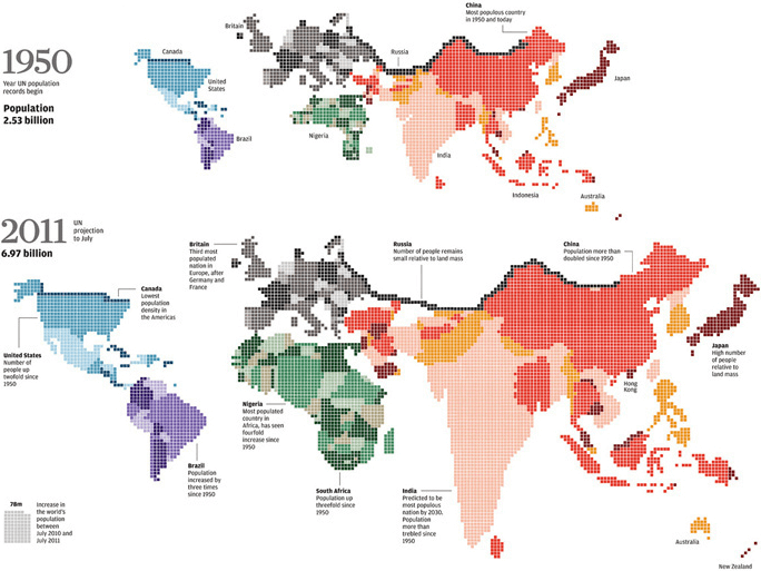
All the people in the world.
Population Growth — Our World in Data
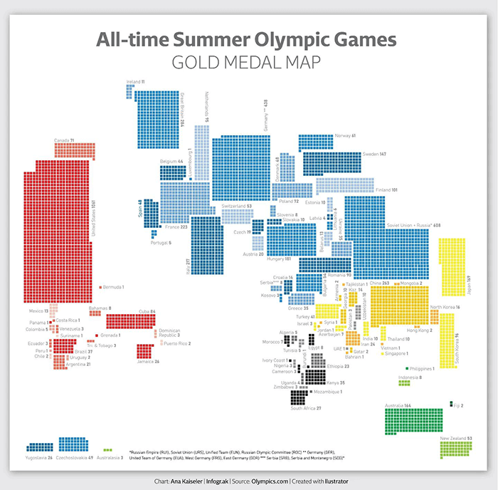
All time Summer Olympic Games Gold Medal Map.
Ana Kaiseler / Infograk
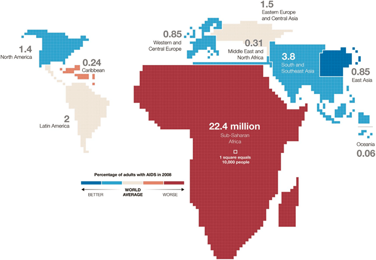
Percentage or adults with AIDs In 2008.
Xaquín González Veira (image source from Improving Visualisation)
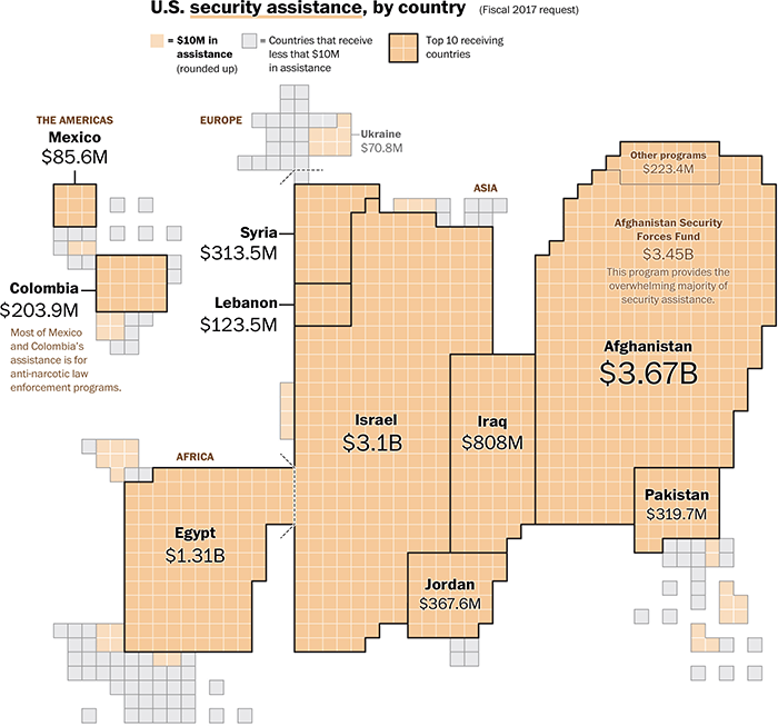
U.S. security assistance, by country (Fiscal 2017 request).
The U.S. foreign aid budget, visualized — The Washington Post
7 billion who space the world.
Infographics and data visualisation — Simon Scarr’s Behance
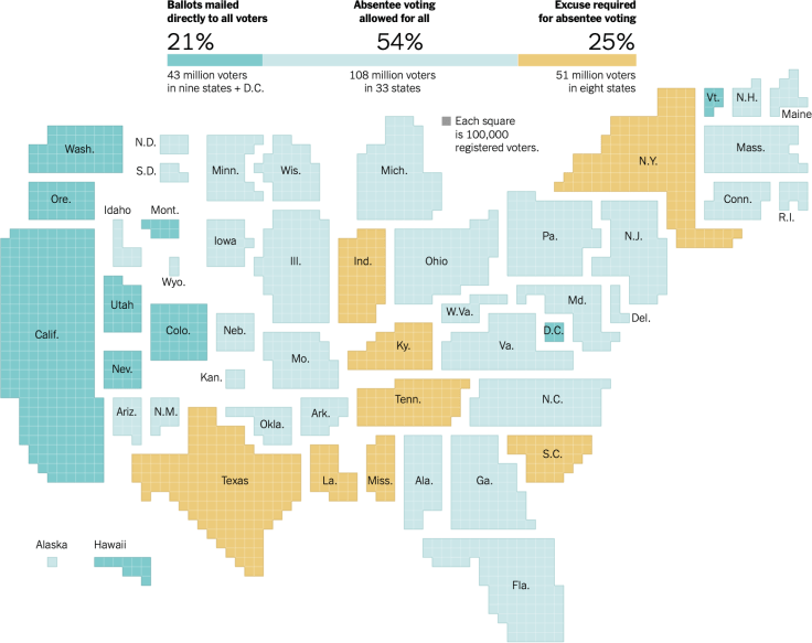
Where Americans Can Vote by Mail in the 2020 Elections.
The New York Times
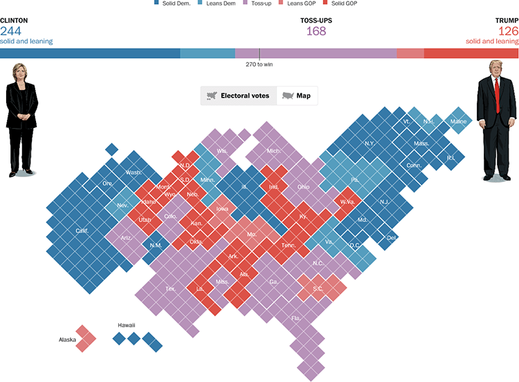
Poll: Redrawing the electoral map.
The Washington Post
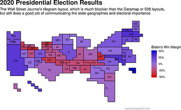
2020 Presidential Election Results.
Building Better State-Level Election Maps with Cartograms and Tilegrams — Conor McLaughlin
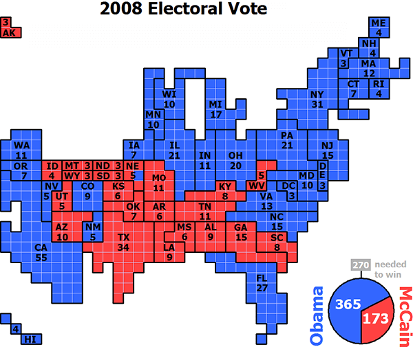
2008 Electoral Vote
Wikipedia
Related posts:
Further Exploration #6 Cartograms
